Falling in love with the tiny details that most people ignore changed the way websites feel to me
Favicons used to be an afterthought. Now they feel like the front door to everything I build online.
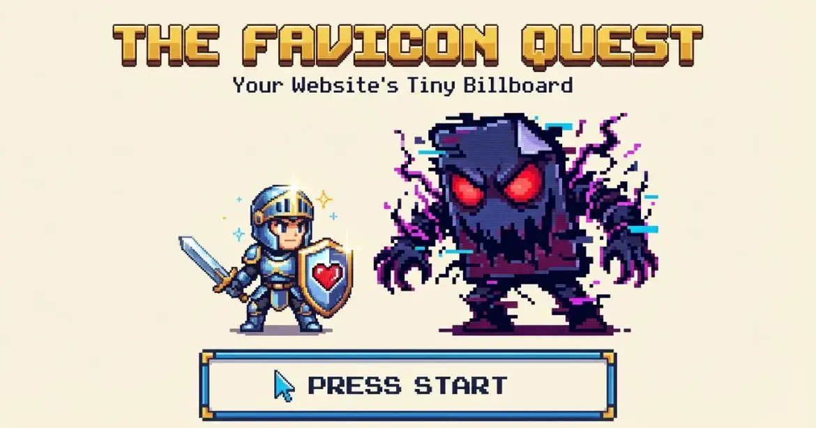
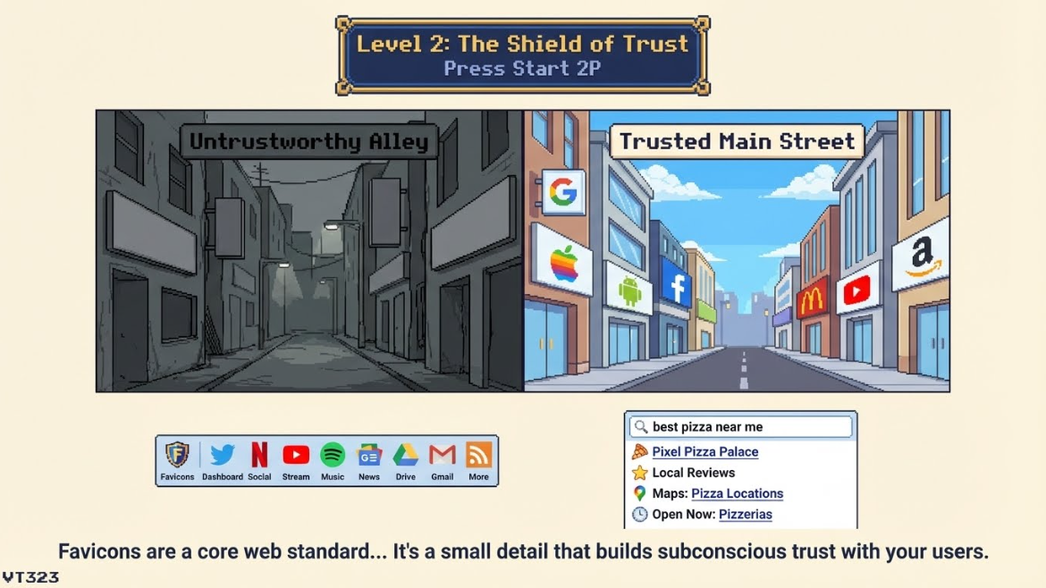
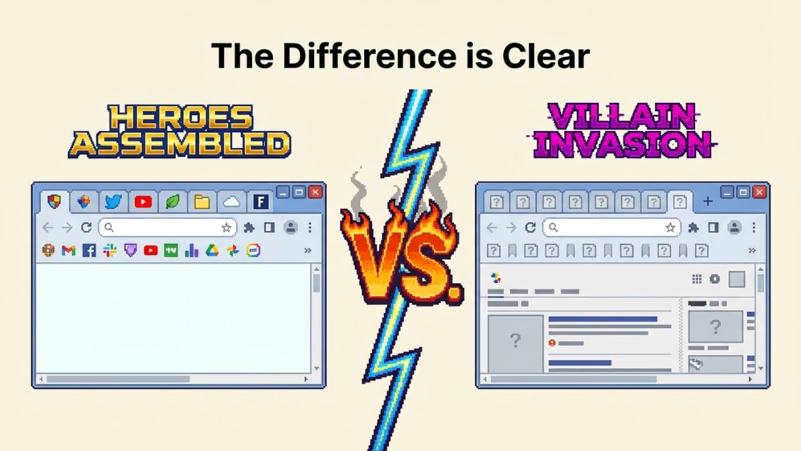
The funny part is that it did not start with some big strategy session. It started with a messy browser full of tabs and a tiny wave of frustration. Every tab looked the same. Gray globe. Blank icon. No personality at all. It felt like walking into a street where every shop had a white door and no sign. Nothing invited you back.
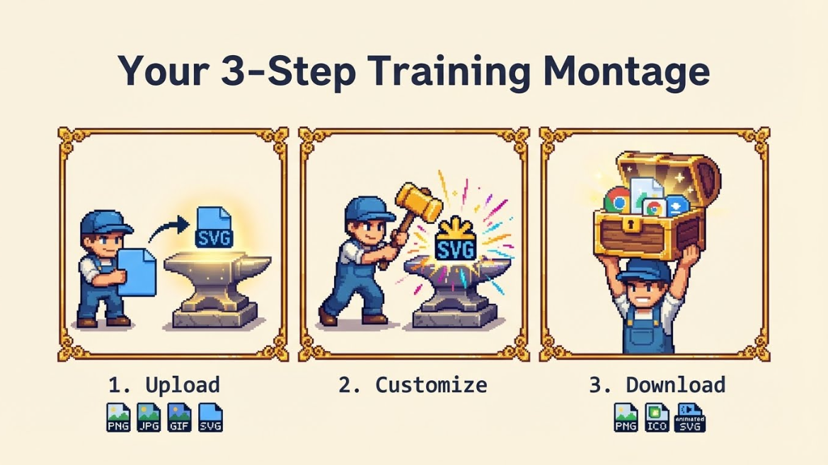
Then I tried something simple. I took a logo that I had used for years and ran it through a favicon generator that worked right in the browser. No signups. No weird exports. Just upload, crop, tweak, and download. Suddenly that same logo turned into a sharp little square that actually held up at 16 by 16 pixels. It looked clean in the tab. It popped in bookmarks. It even looked good pinned to a home screen.
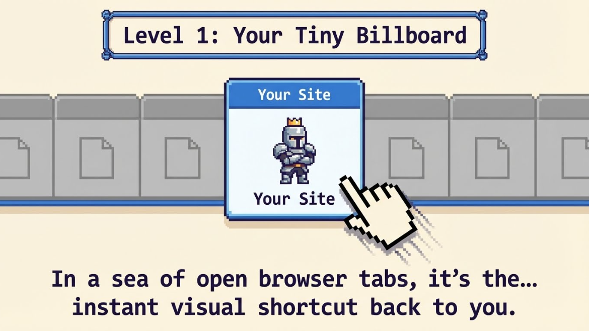
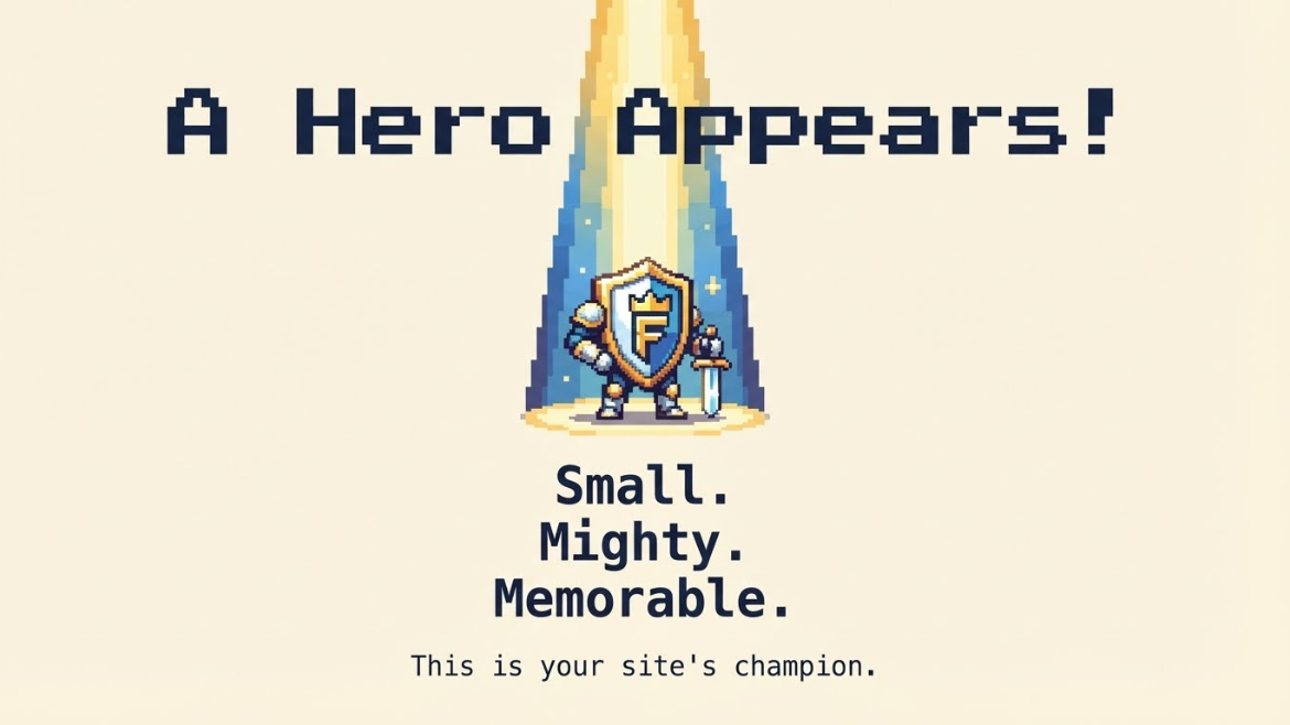
What surprised me most was how emotional it felt. This tiny icon made the project feel real. It was like putting the nameplate on a door after weeks of work inside the room. You know the thing existed before. But once that icon shows up in the browser tab, it feels finished. Not perfect. Just complete in a way that your brain recognizes right away.
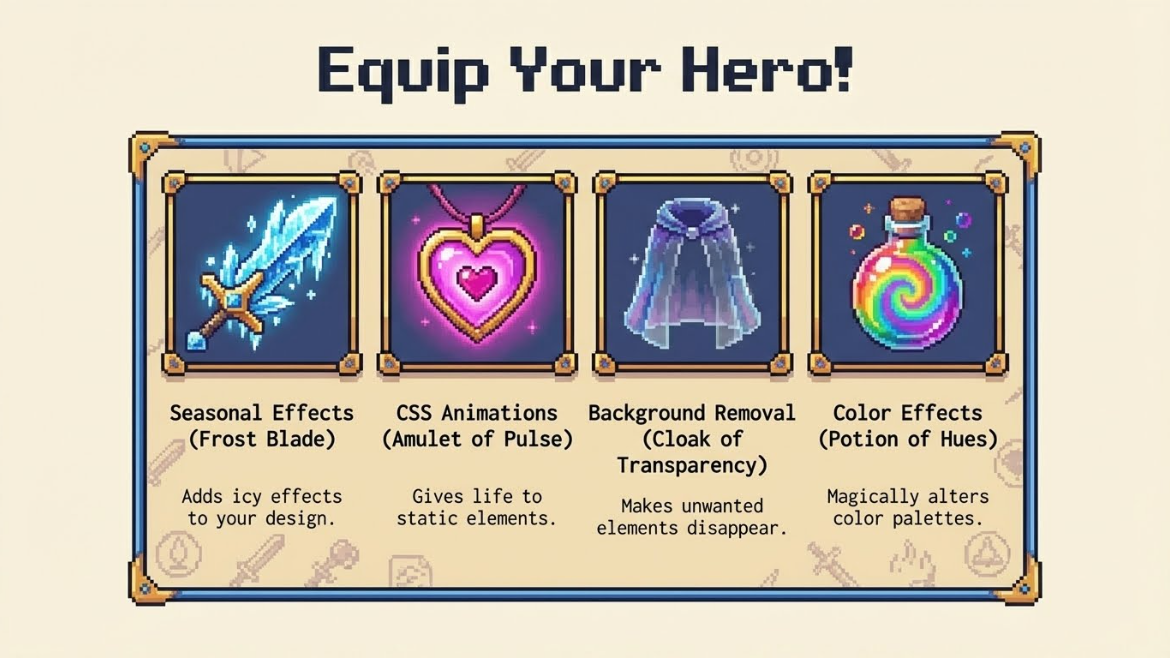
Working with seasonal effects and simple animations made it even more fun. A small snowflake for winter. A soft pulse on a heart icon. A little rotation that made a logo feel alive, but not shouty. It turned into this playground where branding did not feel stiff. It felt like a living thing that could change with time, holidays, or mood, while still staying true to the core logo.
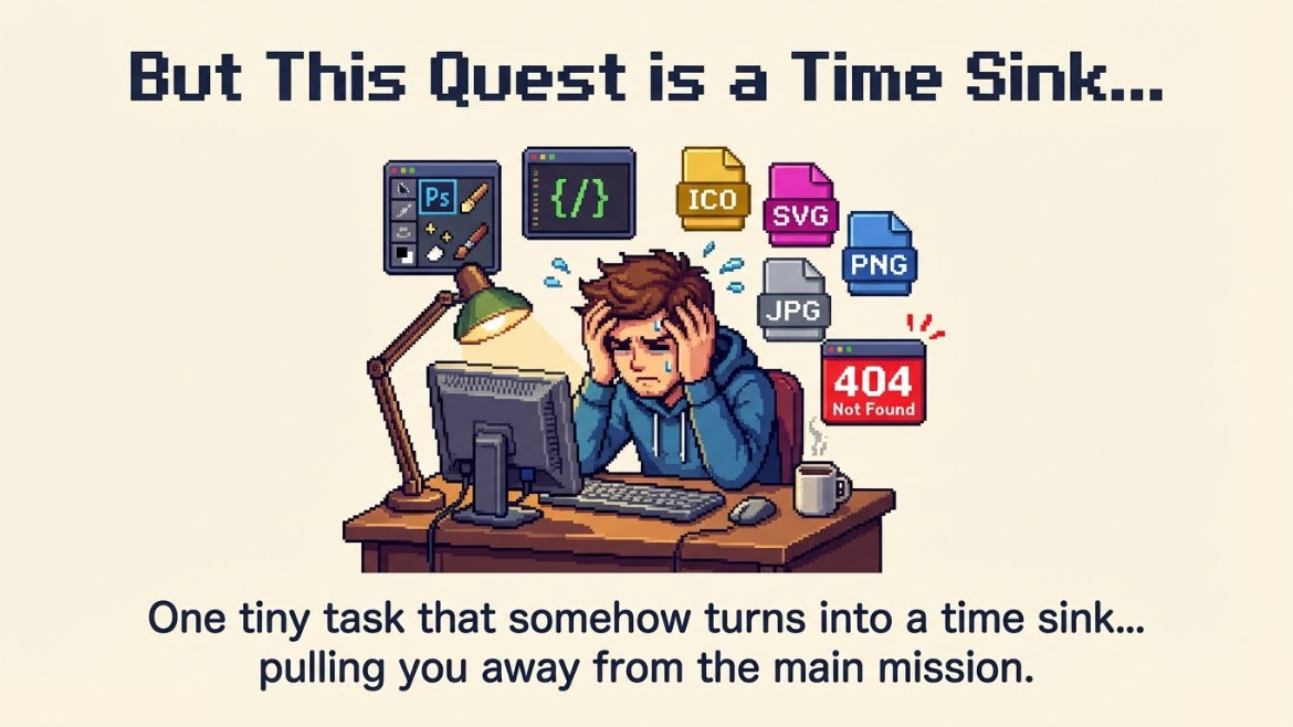
On the technical side it also solved a bunch of small problems that used to be annoying. No need to open a heavy design app just to export a few sizes. No guessing which formats to include for different devices. One tool took care of PNG, ICO, and SVG and made sure everything worked across browsers and platforms. The boring part got handled so the creative part could be the focus.
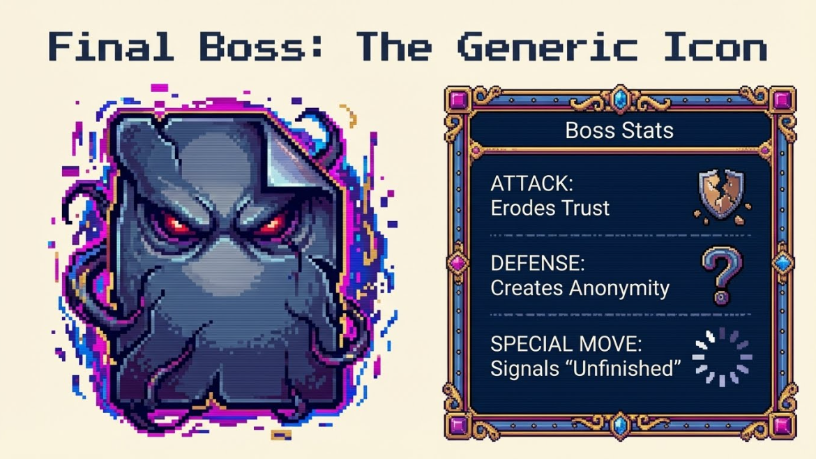
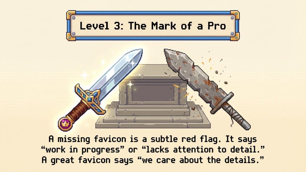
Somewhere along the way a small shift happened in how I think about trust online. A missing favicon started to feel like a subtle warning sign. Not in a harsh way. More like walking past a shop that forgot to turn on the lights. You might still go in. But you think twice. A simple little icon now feels like a promise that someone cared enough to finish the job.
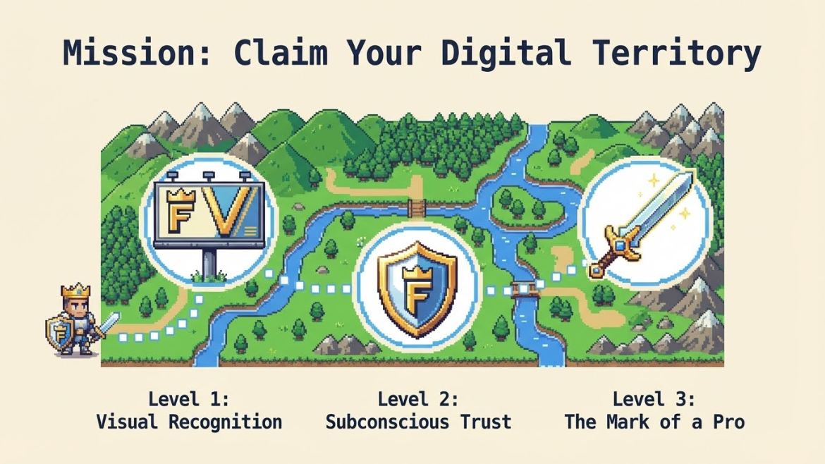
The lesson learned is simple. Small details are not just details. They tell a quiet story about care, craft, and respect for the person on the other side of the screen. A favicon will never be the star of your product. It will not save bad UX or weak copy. But it will make every visit feel a bit more intentional. It reminds people that they are not just passing through some random page. They are visiting a place you built with attention.
So the next time you ship a new site or side project, give that tiny corner of the browser some love. Upload your logo. Crop it until it is clear at the smallest size. Try a seasonal variant. Add a soft animation that matches your style. Watch how different it feels to see your work show up in a full tab bar. It is a tiny change that quietly says this matters to me and I want it to feel like home when you come back.
So peers, check it out: https://peerlist.io/ajbatac/project/faviconlove--professional-favicon-generator
If it helps, I appreciate a vote. Thank you!
Join Allan on Peerlist!
Join amazing folks like Allan and thousands of other builders on Peerlist.
2
6
0