
Designer Commentary: Peerlist Dark Mode
The behind the scenes of bringing our most requested feature to reality.
Jay Kadam
Jan 06, 2025 • 7 min read
Ever since I joined Peerlist (now, a lil over 2 years), the #1 most requested feature has consistently been - DARK MODE and for good reason. When I first joined, we had just a little over 10k users and as the numbers grew, so did the requests for dark mode.

We did understand the arguments about reduced eye strain and battery conservation and other great things that come with it. But for a startup with limited resources, it’s crucial to pick what you spend your development efforts on. So we agreed to build the core features first and start working on dark mode once we reach the big milestone - 100k users.
The previous work
I actually did a test run for dark mode last year when Figma first released variables.
I first converted all our color styles in variables and made a dark theme simply reversing our existing light palette. This was just a test run for how the Peerlist app would look in dark. Getting it right was never the plan.
So, I spent an entire weekend learning semantic naming, and making variables for the new colors and replaced them with the existing color styles.
The result was alright. Nothing too crazy. But what it helped me with, is explaining my devs how we’re going to name these colors and how they should be used in code.
The dev constraints
We had a team meeting (read: argument) where I explained the team about the semantic variable naming and how we should invest time in making it consistent with the code.
Our engineering uses a CSS Framework called Tailwind CSS. The code was set to follow the tailwind color class name pattern, literal color names (like grey, green, red, etc.), and a numeric scale (where 50 is light and 900 is dark) by default.
The argument was that the way our code is set up, it would require an entire rewrite. The devs asked if we could find another way to make it work so I reached out to a few people, who I thought could help. One of them was Luis Ouriach (disco_lu) from Figma.

Luis took a while to respond. So in the meantime, we had another discussion where I tried to come up with a solution to this and tried to sort of, meet-in-the-middle.

You see all of this was a year ago. It did not turn out great but it was a good learning experiment and I just let it be that for the time. As for when we were to actually work on dark mode was not yet clear. We kept using variables in figma but rolled back to our previous naming system.
Oct 2024 - Restarting work
We had reached around 80k users and the milestone we had in our mind for this feature didn’t seem far fetched. It was time to start working on dark mode, again. Except we had a better plan and some learnings this time.
The constraints we had previously about the naming convention were still the same.
The devs however, gave me some room to experiment and were okay with a little rewrite and meeting in the middle.
I had worked on a dark mode project in my previous job. Actually the first website I designed was a dark mode website (no flex) but it was just a fairly simple single-pager which only had dark mode.
This project though, was my first time working on dark mode for an already existing project. And even though it felt pretty straightforward, I thought I should first spend some time making myself familiar with any fundamentals and best practices there are.
We didn't just want to invert colors, we aimed to create a thoughtful, holistic experience that maintained our brand identity.
Understanding what we like
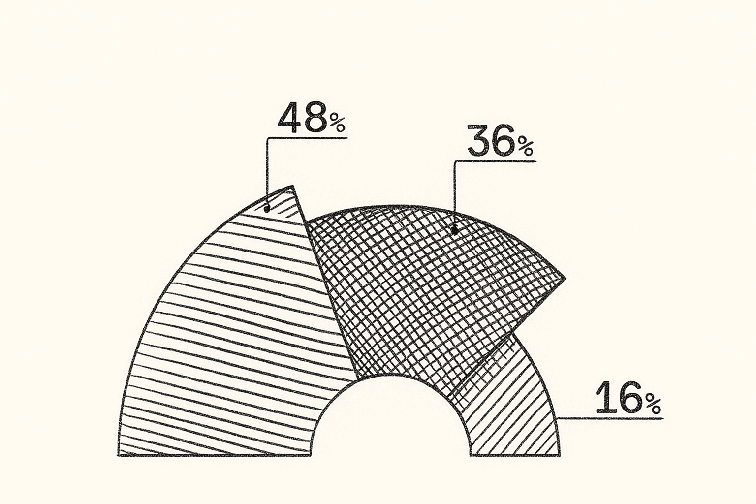
I analyzed many apps to discover the best dark mode implementations. While some apps use pitch-black backgrounds, others take a more balanced approach that's easier on the eyes. Personally, I have always used the darker dark modes but you cannot let your personal biases influence design decisions like these. So we ran a poll to see what the community preferred.
Most people said the preferred the darker darks but some argued that the contrast is too heavy and they prefer the dimmer versions.
We wanted to strike a balance.

New Greys
We don’t use a lot of colors in Peerlist. Most of the app is just White, shades of Grey, and Green - our brand color. A common practice while implementing dark mode in most apps is adjusting your brand / accent colors to suit the darker theme in a way that is accessible. But what we did instead, was create a whole new set of grays that complemented the Peerlist brand colors.

I made 2 versions of the dark mode. One with a dimmer background and the other with a deeper grey and slightly higher contrast and shared with the team.

Internal Feedback
I made a Figma prototype with a few important pages from the app and shared these designs with the team.
First reaction? Total shock - I mean, it looked nothing like the Peerlist they knew! The initial feedback wasn't great (wish I had screenshots to show but most of our discussions were in-person). But after a few rounds of iterations, everyone got on board and were pretty happy with how things were shaping up.
I also decided to get some feedback from our Super Peers!
The super peers are a small group of nice folks who help us with early feedback on our features.

And this was some of the feedback they shared. Some of it was great! and some of it, well let’s just say it was interesting 😅

Figma components and variable color setup
With the learnings from the experiment I did last year, setting up the variables in Figma was an easy task.
We’ve made component level variables for background, text, and borders. Which is like 85% of most of the screens.

The remaining 15% is the part that we had to compromise. Components like buttons, toggles and inputs had to be designed separately for dark mode and have to be toggled individually to reflect in the design.
Not a huge deal for a 2 person design team but we’ll have to figure out a better solution for this as we scale 😅.
Code setup
Read this article by Vaishnav to learn about the code setup and the challenges the devs faced in the process.
Huge app, lots of room for error
All the images, illustrations, gradients, and overlays had to be redesigned from the scratch. We import both of them and switch according to the mode the user is in.
Below is a screenshot our project launch and staff pick widgets:

A few of our empty states:

Release
Peerlist is a huge app and there was a very high chance that we’d miss a few things here and there. We released the dark mode to our super-peers first to get early feedback and iterate accordingly.
Once the few obvious things were taken care of, it was then made available to a few other folks via an invite-only method.
We released the dark mode to the everyone on Peerlist just a few days ago and so far, the response has been amazing!
All in all
Personally very proud of how this project has turned out. The demand for dark mode was unlike anything I’ve seen so the bar for what was acceptable was already pretty high. And now looking at the positive response from the community, it seems we did it right!

There are a few rough corners still that need to be sanded down. Like the occasional flash-bang that Shreyas calls it when you hit refresh, and a few other inconsistencies that exist.
Things could definitely have been much easier, had we thought of theming from the get-go and set up the code and design accordingly. But hey, that's the startup life for you - you learn, you grow, and sometimes you have to start from scratch!
If you’ve made it this far, thank you so much! It’s folks like you that inspire everything we do. If you have any questions about anything mentioned here, shoot them at me! I would love to answer.
I tried to keep things fairly high-level in this article, but if there’s any topic you’d like me to dive deeper into, just let me know!