

One Prompt Box, Six Editing Jobs: The Product Decisions Behind It
What I learned while designing one online workflow for cleanup, enhancement, restoration, extension, style changes, and background work.
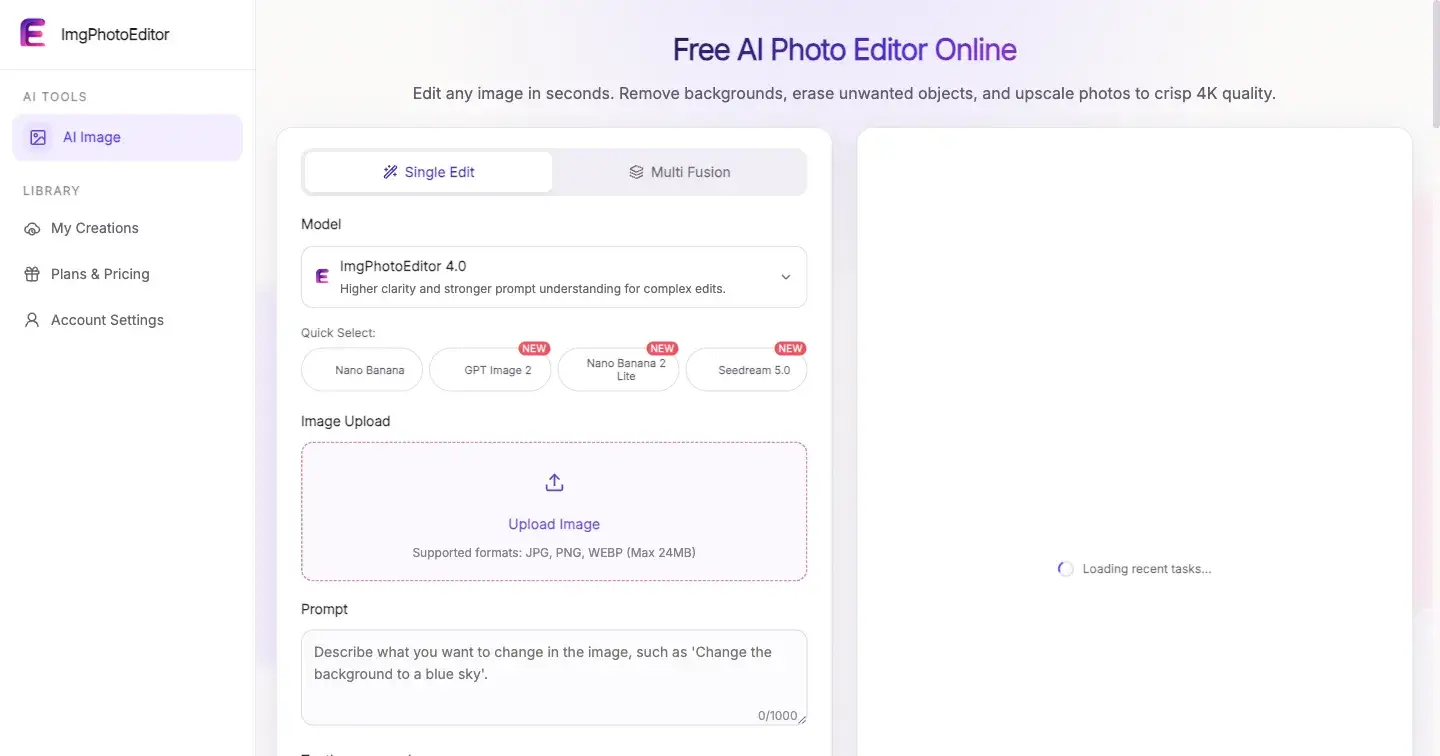
I initially thought the easiest way to make an AI photo editor understandable was to give every task its own tool.
One page for removing a background. Another for cleaning up an object. Another for enhancement, restoration, image extension, and style changes. It is an easy information architecture to explain because every page has one label and one expected outcome.
It is also a poor reflection of how many people actually work.
Someone preparing a product photo may need to remove a distraction, improve clarity, adjust the background, and extend the frame in one sitting. Splitting those intentions into isolated mini-products forces the user to classify the job before they have even described it. The interface looks organized, but the workflow becomes fragmented.
While building ImgPhotoEditor, I started exploring the opposite direction: one prompt-led entry point for several editing jobs. That created a more interesting product question than “how many features should appear on the homepage?” The real question became: how can one interface feel broad without becoming vague?
Start With Intent, Not a Tool Name
Traditional editing software asks users to select operations: mask, clone, crop, fill, sharpen, or transform. Those operations are powerful because they are precise, but they assume the user understands the mechanism.
A prompt-based editor can begin one level higher. The user can say what should change:
remove the cable on the desk but preserve the wood texture;
make this old family photo clearer without changing the faces;
extend the image to a wider composition;
replace the background while keeping the product edges clean.
These instructions describe outcomes, not buttons. That makes one prompt box a plausible starting point across different tasks.
The prompt box cannot be the entire product, though. The editor still needs a clear source-image area, supported options, a visible generation state, a review surface, and a reliable download action. Natural language reduces the cost of expressing intent; it does not remove the rest of the workflow.
Separate a Shared Spine From Task-Specific Branches
The six editing categories are not identical, but they share a stable spine:
Add one or more supported source images.
Describe the desired change.
Choose from the models and options currently available.
Generate an output.
Review it against the source and instruction.
Download it or revise the request.
That shared spine belongs in the main interface. Differences should appear only when they become relevant.
For example, an image-extension request makes aspect ratio and composition especially important. A multi-image composition needs clearer source roles and may allow a different number of uploads. A restoration request needs a warning about faces and fine historical details. Background work makes edge inspection important. These are branches within the workflow, not reasons to make users begin on six disconnected islands.
This distinction gave me a useful design rule: consolidate repeated decisions, but expose meaningful differences at the point where they affect the result.
Make Availability Honest
A broad editor creates a temptation to present every capability as universal. It is cleaner visually to show the same resolution, source-count, and output controls for every request. It is also misleading if models have different limits.
The interface should derive available choices from the selected model and mode. If 4K output is not available for the current combination, it should not be implied. If an operation requires login or credits, that requirement should appear before generation. If a mode accepts multiple source images, the upload area should state the actual minimum and maximum rather than relying on trial and error.
This is not only defensive UX. Honest constraints reduce wasted prompts, failed submissions, and the feeling that the product changed the rules after the user committed time.
Treat Review as a First-Class Step
The most important part of an AI editing workflow may be what happens after “success.”
A generated file can be technically complete and still be wrong. Text may have changed. A face may look subtly different. A product edge may be damaged. A removed object may leave repeated texture. An extended area may be plausible at first glance but inconsistent with the original lighting.
That is why I prefer the sequence “generate, review, download” over presenting download as an automatic conclusion. The review state should keep the original image, prompt, selected options, and result close enough to compare. It should also make revision feel normal rather than like starting over after failure.
This changes product language too. “Completed” should describe the system state, not promise aesthetic quality. The user remains the final reviewer.
Preserve Context When Something Changes
One-interface products have many dependent choices. A user can upload an image, write a careful prompt, select a model, and then switch modes. That switch may invalidate the chosen resolution or source count.
The easy implementation resets the entire form. The better behavior preserves everything still valid, changes only the incompatible fields, and explains the adjustment. The same principle applies when login becomes necessary, credit cost changes, or a generation attempt fails.
Inputs are user effort. Preserve them unless there is a concrete reason not to.
For retries, that means keeping uploaded sources and prompt text while refreshing model availability and cost. For authentication, it means returning to the prepared request after login. For a provider timeout, it means retaining a job reference instead of inviting an immediate duplicate submission.
What I Would Not Combine
One entry point does not mean every editing experience should collapse into the same undifferentiated screen.
Precision masking, layered compositing, pixel-level retouching, batch asset management, and repeatable professional production pipelines have interaction needs that a simple prompt workflow may not satisfy. Pretending otherwise would turn scope discipline into an exaggerated replacement claim.
There are also real operating limits: supported models and options can change; high-resolution output is not universal; some actions may require authentication or credits; accepted formats and file sizes have boundaries; and generated results always need review.
Those limitations help define the product. The goal is not to reproduce every control in a desktop editor. It is to make a common set of intent-driven edits easier to begin and finish online.
The Builder Lesson I Am Keeping
The most useful simplification was not putting six feature names under one logo. It was finding the decisions those jobs genuinely share.
The upload, instruction, supported-option selection, generation, review, and download loop can remain stable. Task-specific guidance can appear when it matters. Constraints can be stated before they surprise someone. User effort can survive mode changes and recoverable failures.
That is the product model behind ImgPhotoEditor, the concrete project that prompted this design work. Even without the link, the lesson applies to other multi-purpose AI products: a unified interface works only when it unifies the workflow, not merely the navigation.

Join Ethan on Peerlist!
Join amazing folks like Ethan and thousands of other builders on Peerlist.
0
0
0