

What Building a Gear Comparison Tool Taught Me About Auditable UI
A builder-first look at identity, provenance, unit compatibility, empty states, and the boundary between arithmetic and product advice.
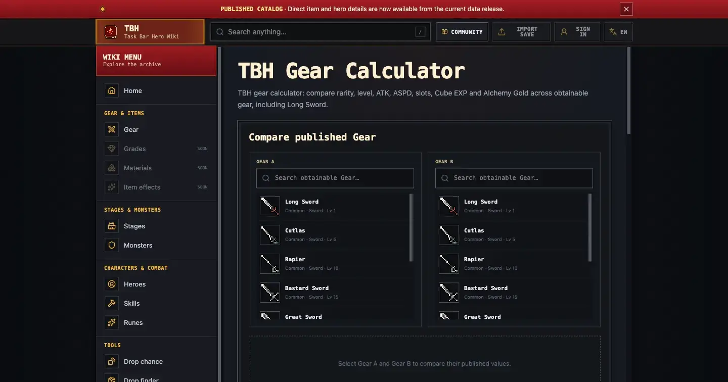
A comparison table is not neutral just because it displays numbers. The moment a product chooses which records to merge, which units to hide, how to represent missing fields, or which delta to color green, it starts making decisions on the user’s behalf.
That became the central product-design constraint while I was building a Gear comparison tool for Task Bar Hero Wiki. The useful result was not a smarter score. It was a more auditable comparison.
Identity Is Part Of The Data Model
The first design trap was treating an item name as a unique identity. Same-name Gear can exist as distinct rarity variants, so a select control that only shows the shared name can produce a technically valid comparison for the wrong records.
The interface therefore needs to preserve record-level context on both sides:
exact name and rarity;
required level;
Gear type;
upgrade-slot count;
Cube EXP;
Alchemy Gold.
These fields do more than decorate the header. They let the player verify that Gear A and Gear B are the intended records before interpreting the combat rows. They also prevent economic catalog fields from being mistaken for market prices or guaranteed profit.
The builder lesson is simple: if two objects can share a label but differ in behavior, display identity cannot be your comparison key.
Provenance Should Survive Rendering
The next challenge was stat provenance. Values can come from base or inherent fields, and that distinction matters to the reader. Flattening both sources into a single unlabeled number would make the UI smaller while erasing part of the catalog evidence.
I treated source and unit as first-class properties of each comparison cell. A useful row is closer to this model:
stat name;
Gear A value, source, and unit;
Gear B value, source, and unit;
compatibility state;
optional arithmetic delta.
This prevents rendering code from quietly deciding that all numbers are interchangeable. Flat, percent, and per-second values may appear in the same table, but they do not belong in the same arithmetic operation.
The broader product principle is that provenance should survive the trip from storage to UI. If the backend knows where a value came from but the interface discards that context, the user still receives an opaque result.
Compatibility Comes Before Subtraction
It is tempting to compute B - A whenever two cells contain numbers. That rule is easy to implement and wrong for mixed units.
The safer sequence is:
confirm both values are present;
confirm both are numeric;
confirm their units are compatible;
only then calculate B - A;
label the result as arithmetic, not a recommendation.
If the units differ, the UI should expose that incompatibility instead of manufacturing a delta. If one value is unavailable, the row should remain unavailable rather than treating missing data as zero.
This creates more states for the component, but each state has a clear meaning. “Zero,” “missing,” and “not comparable” are different product facts. Compressing them into one fallback makes the implementation shorter and the output less trustworthy.
The Delta Is Not The Decision
Even a correct delta answers only a narrow question: how far apart are two compatible published values?
It does not model hero scaling, skills, enemy defenses, buffs, rotations, clear time, or the value of a particular slot to a particular build. Highlighting every positive delta as “better” would turn transparent arithmetic into a hidden Best-in-Slot algorithm without doing the work that such a recommendation requires.
I chose to keep the judgment boundary visible. The calculator compares released catalog records. The player decides how those facts fit a build.
That restraint is useful in many product domains. A comparison tool earns trust by making its inference boundary clear, not by forcing every dataset into a winner.
Designing The Empty State As Evidence
Missing catalog fields are unavoidable when data can be incomplete, delayed, or incorrect. The empty state is therefore part of the comparison model, not an error message to hide.
When a field is unavailable, the table should say so and suppress the delta. It should not borrow a value from a similar item or assume zero. This makes gaps visible to users and maintainers, and it prevents precise-looking conclusions from being built on invented inputs.
An honest empty state also improves future maintenance. When a later catalog release adds the value, the comparison can update cleanly because the earlier UI did not encode a false default.
A Reusable Implementation Checklist
For any side-by-side data tool, I now ask:
Is the displayed label also a stable identity?
Does every value retain its source and unit?
Are compatibility checks performed before arithmetic?
Are zero, missing, and incompatible represented separately?
Does visual emphasis imply a recommendation the system cannot support?
Which user-specific context remains outside the model?
Can a reviewer reconstruct why each result appears?
The Task Bar Hero Gear Calculator is a small example, but the pattern applies to pricing comparisons, benchmark dashboards, inventory tools, and any interface that places unlike records side by side.
I maintain Task Bar Hero Wiki as an independent community resource; it is not official or publisher-operated. The current catalog can be incomplete, delayed, or incorrect, and release-sensitive values should be rechecked.
The live unit-aware comparison is here:

Join Ethan on Peerlist!
Join amazing folks like Ethan and thousands of other builders on Peerlist.
2
0
0