I Completed the Google UX Design Certificate — Here’s What I Actually Learned (and How You Can Use It)
7 courses, months of learning, and one big realization: the real value isn’t the certificate — it’s the process.
🎯 Why I Took the Google UX Design Certificate
Like many designers, I’ve always believed that great design starts with understanding people — not just pixels. But I wanted to formalize my process, fill gaps in my knowledge, and earn a credential that reflects real-world UX rigor.
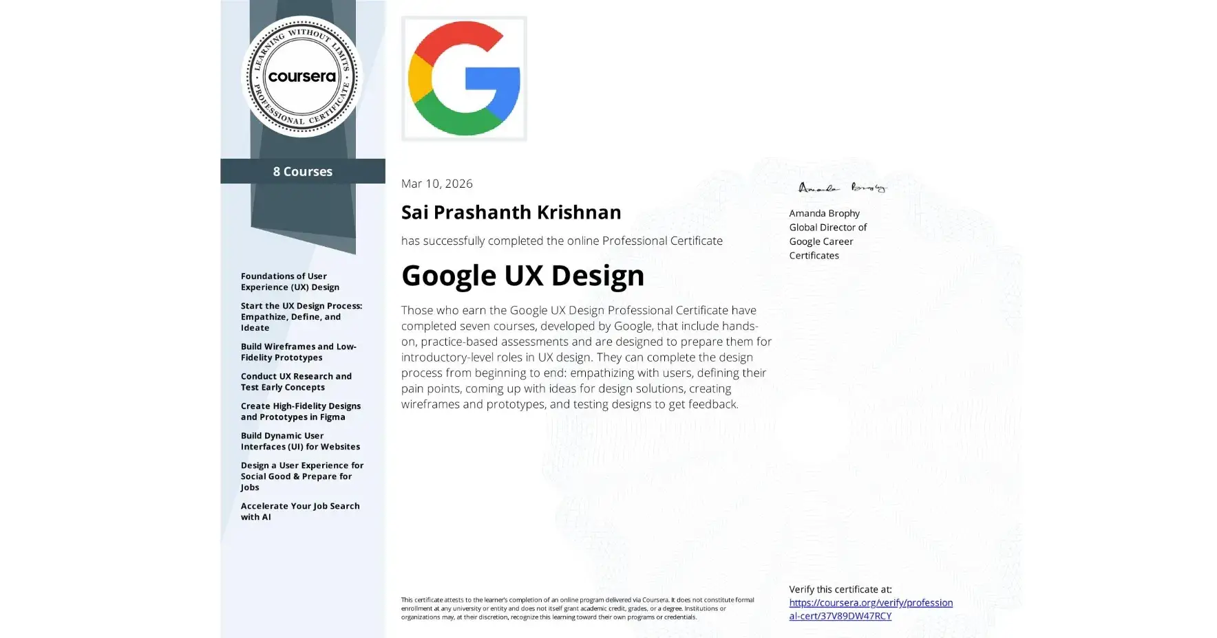
So I enrolled in the Google UX Design Professional Certificate on Coursera.
Seven courses later (and many late nights), I finished. But the certificate itself is just a piece of paper. What really matters is what I can now do differently.
Today, I want to share the most valuable takeaways from the program — and how you can apply them to your own work, whether you’re just starting out or already designing.
🧩 The 5 Big Shifts I Made
1. I Stopped Jumping to Visuals Too Early
Before, I’d often open Figma and start arranging rectangles. The program taught me to stay in the problem space longer.
Now I force myself to complete:
Empathy maps
User personas
Journey maps
Problem statements
…before I even think about screens. It sounds obvious, but doing it consistently makes the difference between a pretty UI and a genuinely useful product.
2. I Treat Research as a Non‑Negotiable
We all know user research is important, but it’s easy to skip when deadlines loom. The program gave me a structured way to plan, conduct, and synthesize research — so it doesn’t feel like extra work.
My go‑to now is a simple 7‑element research plan:
Background
Goals
Questions
KPIs
Methodology
Participants
Script
If I can’t fill that out, I know I’m not ready to test.
3. I Design for Accessibility from the Start
Accessibility used to be an afterthought — something I’d check at the end. Now I run a WCAG checklist at every stage.
Simple habits like:
Using proper heading hierarchy
Ensuring 4.5:1 contrast
Designing for keyboard navigation
…have become second nature. It’s not just ethical — it makes the product better for everyone.
4. I Built a Reusable Design System
Before, I’d style buttons and cards on the fly, leading to inconsistency. Now I start with a sticker sheet: typography scale, color tokens, component states (default, hover, active, disabled).
It saves hours and makes handoff to developers much cleaner.
5. I Learned to Speak About My Work with Clarity
One of the hidden gems of the program is the portfolio and interview prep.
I now structure case studies with a clear narrative:
Problem → Process → Insights → Iterations → Impact
And I use the STAR method (Situation, Task, Action, Result) to explain my decisions concisely.
📘 A Few Templates I Use Every Day
Here are three templates from the program that I’ve adapted and still use:
Problem Statement
> “[User] is a [characteristic] who needs [need] because [insight].”
Keeps me focused on the human problem, not the feature list.
Insight Formula
> Observation + Pattern + Meaning = Insight
Turns raw research notes into actionable design directions.
Priority Framework
P0 – Must fix (blocks core tasks)
P1 – Should fix (important improvement)
P2 – Nice to have (future iteration)
Helps me and stakeholders agree on what matters most.
🔁 How This Helped My Recent Projects
I’ve applied these learnings to a few projects:
Code Difference Checker (https://iamprashanthks.github.io/Code-Difference-Checker/) — a tool for developers to compare code snippets. I started with user stories (“As a developer, I want to paste two code blocks so that I can spot differences instantly”) and used rapid wireframing to validate the flow before writing any code.
My own portfolio redesign — I conducted a small usability study with fellow designers, which revealed that my old navigation was confusing. I iterated based on their feedback, and now it’s much cleaner.
IconWizard (https://iconwizard.vercel.app) — an AI-powered app icon generator that helps designers and developers create iOS-style icons in seconds. I applied user-centered design principles to simplify the three-step flow (describe → customize → generate), ensuring even non-designers can get professional results without confusion.
ParityCalculator (https://paritycalculator.vercel.app) — a Purchasing Power Parity tool that compares real living costs between countries. I focused on clear information architecture and instant feedback, so users can make informed financial decisions without wading through complex economic jargon.
PixelArtGenerator (https://pixellartgenerator.vercel.app) — a tool that turns images and ideas into pixel art masterpieces. I applied iterative wireframing to make the creative process feel intuitive — from uploading an image to exporting retro-style visuals in just a few clicks.
🚀 What’s Next for Me
I’m now applying this process to a responsive web project — designing for mobile first, then scaling up to desktop. I’m also building out my design system in Figma to make future projects faster.
If you’re interested, I’ll be sharing behind‑the‑scenes updates on Peerlist and my other channels.
💡 Why This Matters for You
Whether you’re:
A beginner wondering if the Google UX cert is worth it
A designer looking to tighten your process
A developer who wants to add UX rigor to your builds
…the real value isn’t in the certificate itself — it’s in adopting a repeatable, user‑centered workflow.
You don’t need to take the full program to start using these methods. Pick one template, try it on your next project, and see how it changes your thinking.
🙏 Final Thoughts
Earning the Google UX Design Certificate was a milestone, but it’s what I do with it that counts. I’m excited to keep learning, building, and sharing.
If you have questions about the program, UX process, or just want to chat design — drop a comment or reach out. I’d love to hear about your journey too.
Join Prashanth on Peerlist!
Join amazing folks like Prashanth and thousands of other builders on Peerlist.
0
5
0