What is the Dynamic Clamping Technique in CSS? and How to Use It
Achieving Fluid Design Harmony Without the Overhead of Media Queries
In the traditional era of responsive web design, achieving fluid typography required a complex web of @media queries and "magic numbers" that often led to bloated stylesheets and brittle layouts. Today, senior front-end developers have moved toward a more elegant, mathematical solution: Dynamic Clamping.
By utilizing the native CSS clamp() function, you can define a value that scales dynamically within a strictly controlled range. This isn't just about making text bigger or smaller; it’s about creating a predictable visual hierarchy that adapts to the viewport as naturally as liquid fills a container.
The Anatomy of a Perfect Clamp
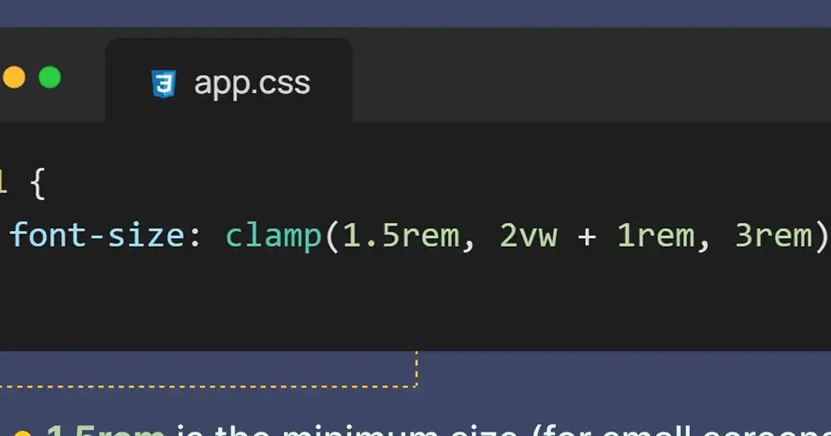
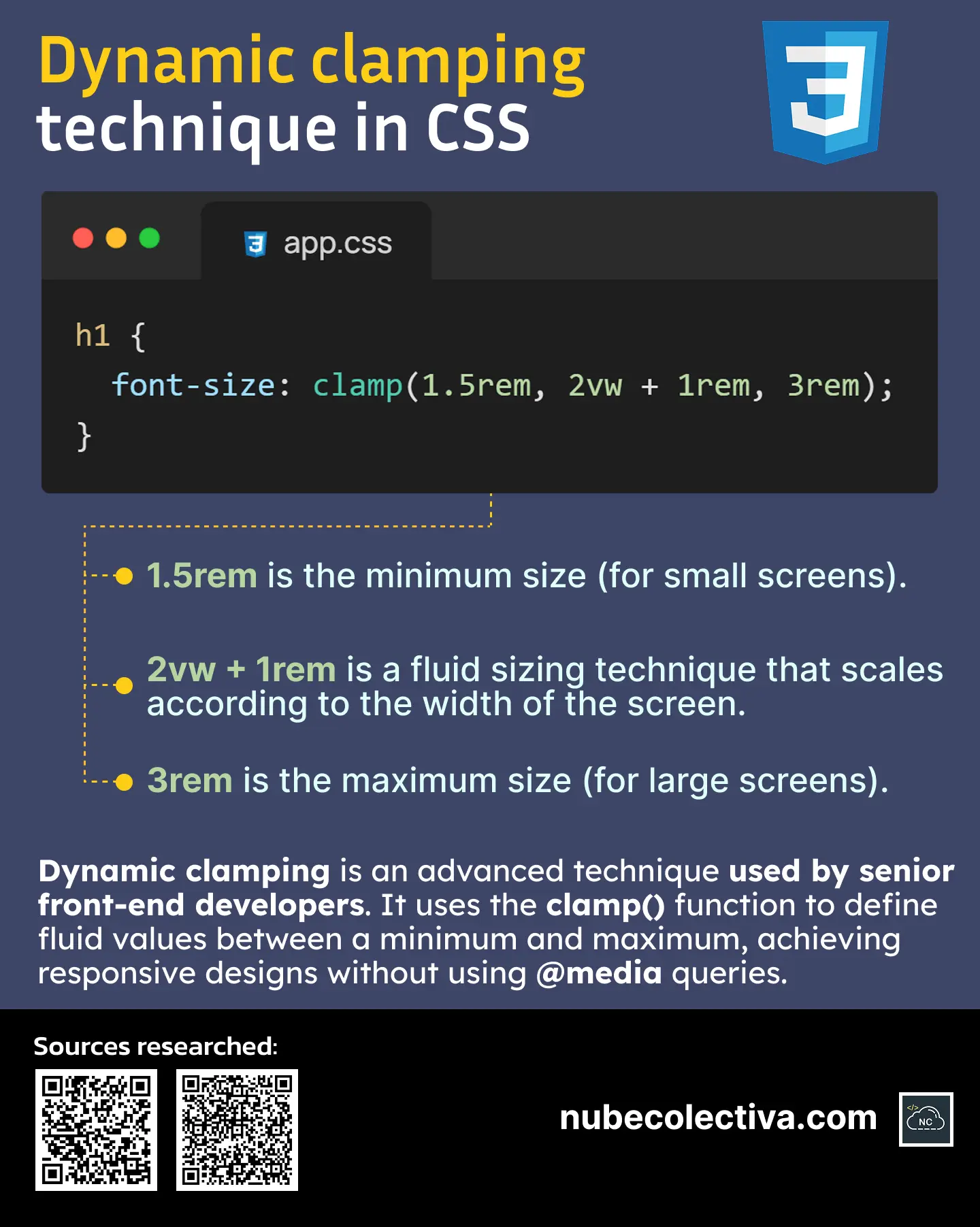
The clamp() function takes three parameters: a minimum value, a preferred value (fluid), and a maximum value.
The Floor (1.5rem): This is the "minimum size" safeguard. Regardless of how small the screen becomes (even on the narrowest mobile devices), your typography will never shrink below this threshold, ensuring constant readability.
The Fluid Engine (2vw + 1rem): This is where the magic happens. By mixing viewport units (
vw) with static units (rem), you create a "fluid sizing technique" that scales proportionally with the screen width. The addition of1remensures that the text retains a base size even if the viewport width technically drops to zero.The Ceiling (3rem): This is the "maximum size" limit. On ultra-wide monitors or large desktop screens, it prevents the typography from becoming comically oversized, maintaining the aesthetic balance of your layout.
Why Senior Developers are Abandoning Media Queries for Sizing
While media queries are still essential for layout shifts (like changing a grid from 1 column to 3), using them for font sizes creates "stair-step" scaling, where the text jumps abruptly at specific breakpoints.
Dynamic Clamping provides a linear transition. It offers a smoother user experience and significantly cleaner code. Instead of writing four blocks of media queries for a single heading, you write one line of CSS. This reduces technical debt and makes your design system significantly easier to maintain as it scales.
Gift
In the following image, you can see visually how this technique works:
Conclusion
The Dynamic Clamping technique represents a shift from "fixed" thinking to "fluid" systems in CSS architecture. By mastering clamp(), you empower your designs to be truly responsive by default, ensuring that your typography is always legible, balanced, and elegant, regardless of the device in the user's hand. It is the hallmark of a modern, efficient, and professional front-end workflow.
Join Juan on Peerlist!
Join amazing folks like Juan and thousands of other builders on Peerlist.
0
3
0