Why are Bento Grids a new trend in UI design?
What is Bento?

Bento is a layout style inspired by “Japanese Bento boxes”, which are placed in neatly arranged compartments with different items.
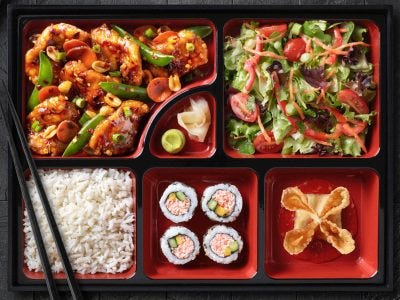
In UI, it means organising different elements in visually distinct blocks or tiles that are kept together in a grid, often with varying shapes and sizes.
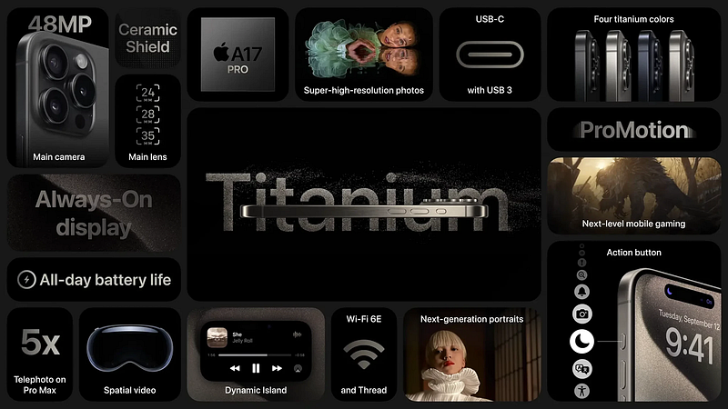
The characteristics and applications of the Apple product shown in the image above are arranged such that we can learn about it visually from a single picture.
Why are Bento grids so trendy right now?
First of all, it works well for displaying several components and features simultaneously without being disorganised and cluttered. for instance, displaying the dashboard, portfolios, and Hero sections.
A bento grid can be used to balance whitespace and neatly align the content with the “Less is more” philosophy, giving it a clean, minimalist, and well-organised feel.
Companies like Microsoft, Apple, and Notion have modified this design to highlight their high-end interactive experience. They have used imaginative layouts and carefully considered tile content to convey the distinctiveness of their brand.
Where can you find Bento Grid?
Digital Portfolios
SaaS Product pages
Creative Apps
Dashboard and Analytics tool
Technical landing pages
Bonus Insight
Bento grids are the greatest option if you are building something that requires you to prioritise information and a variety of content while maintaining simplicity and usability. All you need to do is watch out that it doesn’t get disorganised and confused. Create something similar by using robust grid logic.
Join Kashyap on Peerlist!
Join amazing folks like Kashyap and thousands of other builders on Peerlist.
0
0
0