NEMESIS | Brand identity
NEMESIS: Bold, precise, and unmistakable brand identity.
NEMESIS | Brand identity
NEMESIS was designed as a bold editorial identity system built through precision, reduction, and controlled tension. The visual language combines Swiss structure with brutalist expression to create a brand that feels confident, modern, and unmistakable.
Every element, from typography to spacing, was intentionally crafted to amplify clarity and visual impact across every touchpoint. The result is a scalable identity that commands attention while maintaining consistency across both digital and physical environments.
More than a logo, NEMESIS functions as a complete visual system designed to hold weight, create recognition, and leave a lasting impression.
Logo Ideation
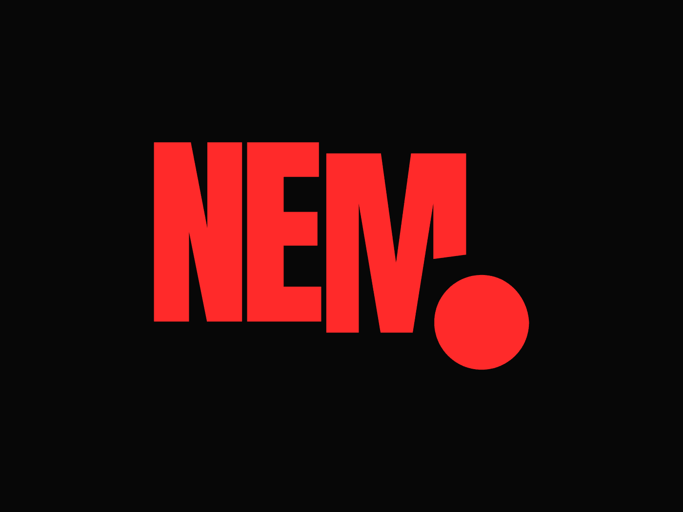
The NEMESIS logo was built through reduction, tension, and precision. The process began with bold condensed typography, chosen for its strong vertical structure and editorial presence. From there, the name was stripped back to its most impactful form: NEM — a sharper, more immediate expression of the brand.
The wordmark was refined through tight spacing and controlled proportions, creating a compact block that feels solid and deliberate. A circular dot was then introduced as a point of disruption — a simple but powerful graphic element that adds contrast, balance, and memorability.
Rather than relying on decoration, every decision was rooted in structure. The result is a logo that feels bold, modern, and unapologetic: a mark designed to hold weight across every application.
Built with