Designing for Simplicity in Complex User Flows.
My First Peerlist article :)

Hello Everyone 👋
As a designer, I was excited to join Peerlist’s 21-day design challenge and able to finish all 21 days (not the end) to push my skills and connect with a passionate design community. I’m open to feedback on my journey, and I invite anyone interested to comment with designs they’d like me to review or redesign from what i think to improve your work. I’m ready for constructive criticism and eager to help elevate other designers’ work.
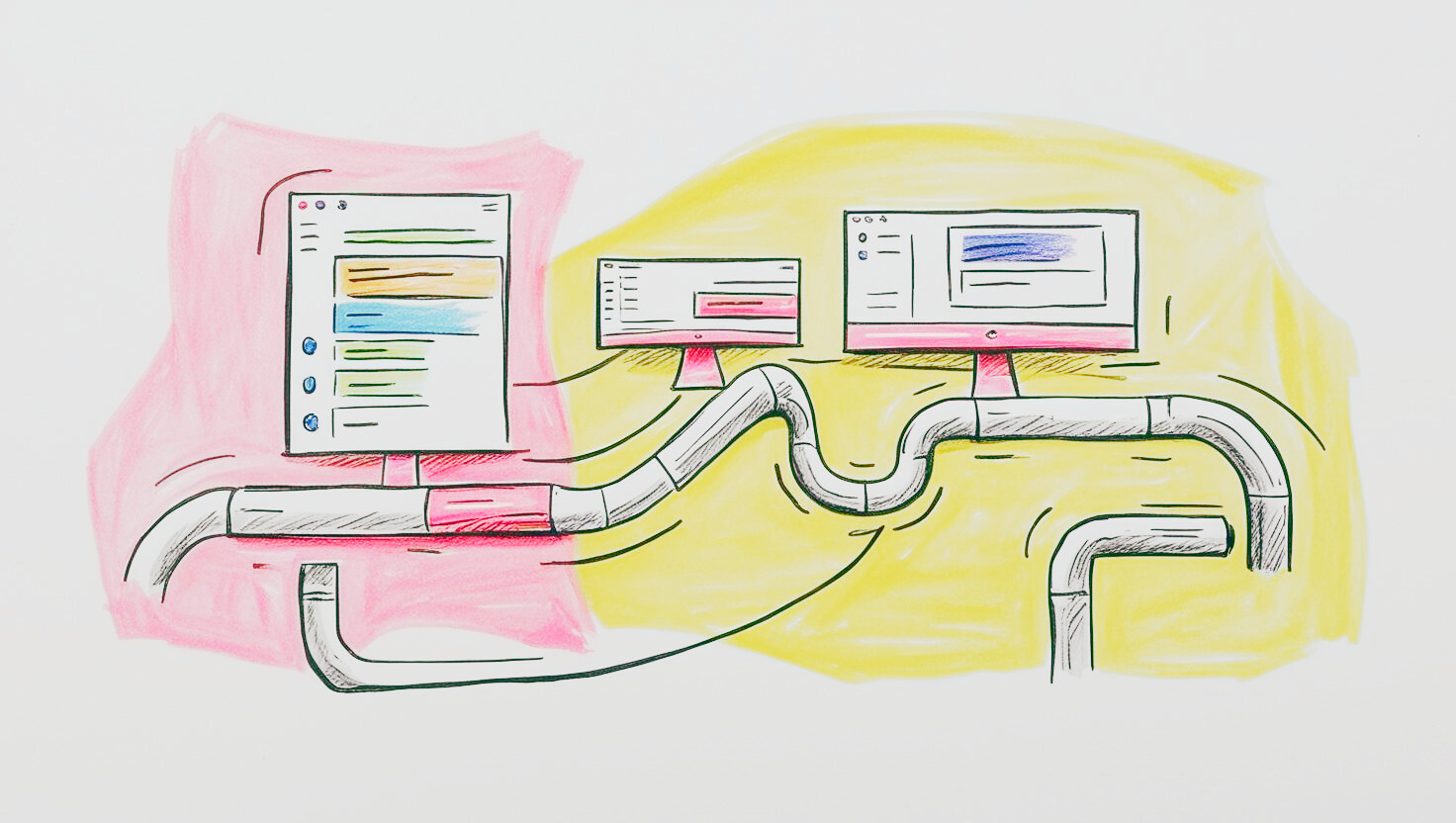
Key Insights for Simplifying Complex User Flows
In today’s digital world, many applications need to handle intricate processes—booking a flight, setting up health & Finance things, or creating some complex logic-based forms. The challenge for designers is to simplify these flows so users can navigate them effortlessly without feeling overwhelmed. Achieving this balance requires thoughtful design, user empathy, and a strategic approach to information hierarchy.
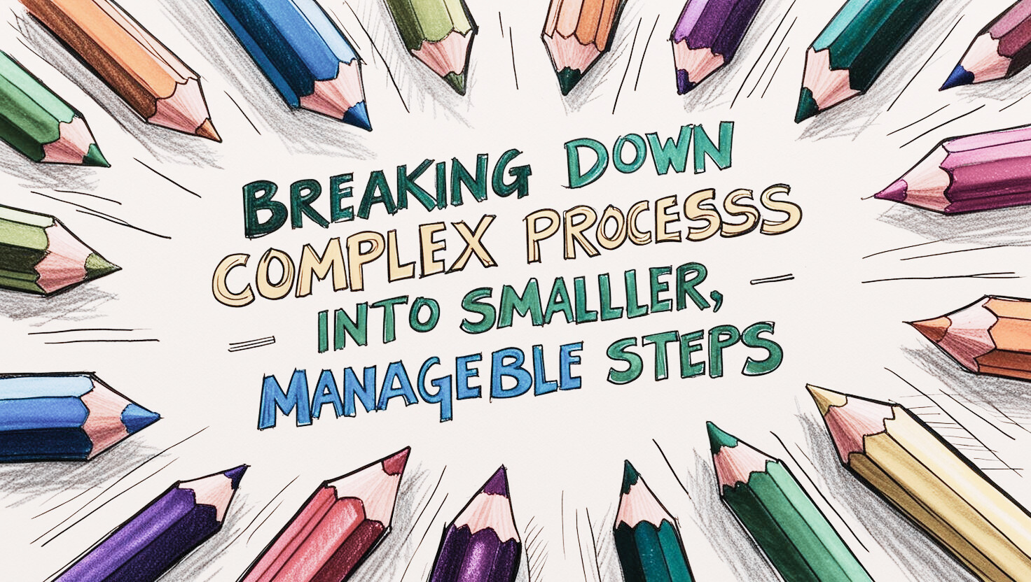
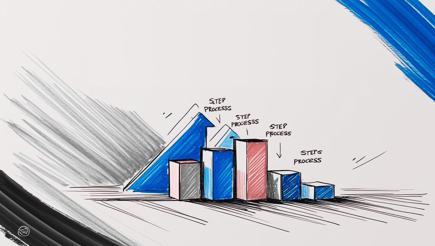
1. Break Down Processes Into Digestible Steps
Users can feel overwhelmed when too much information is presented at once. Instead, break down the journey into clear, bite-sized steps. In a flight booking flow, for example, let users complete one section, like flight details, before moving to baggage or add-ons. This approach, known as progressive disclosure, keeps users focused, reducing cognitive load and mistakes.
2. Prioritize Key Actions
Complex flows often present numerous actions or options. Highlighting the primary action per screen helps users progress smoothly. For instance, in a healthcare app, clearly emphasize key actions like “Select Meal” or “Add Medication” so users don’t get lost in secondary options.
3. Use Visual Cues and Clear Labels
Consistent, clear labeling and visual cues guide users through multi-step flows. Bold headings, progress indicators, and “Next” buttons provide structure and clarity. In multi-stop forms, intuitive icons and markers show where users are in the process, helping to ease navigation. This is even more tricky when there are similar action items which almost looks identical and also has multi purpose meaning to the assets we use for example a refresh or sync or replace and the list goes on... choose icons and other assets wisely and make them clear for user.
4. Minimize Unnecessary Choices
Offer only the essential options relevant to users’ needs. For instance, avoid loading all ancillary flight services at once. Instead, use conditional logic or personalization to display options based on previous selections, creating a custom flow that feels personal and efficient.
5. Regularly Gather User Feedback and Iterate
Simplicity isn’t a one-size-fits-all solution. User feedback provides valuable insights into where users may feel stuck or frustrated. Time to time refine the designs based on real user behavior helps to polish the experience and add improvements that truly enhance usability.
Final Thoughts
Simplicity is an ongoing process. With every iteration, thoughtful design choices create a seamless experience, making even the most complex flows feel intuitive. By designing with empathy and carefully guiding users through each stage, we can create a smoother, more satisfying journey that meets their needs effortlessly.
Thank you for coming this long, I would love to hear your opinions and feedback!
Join ↓KRISHNA on Peerlist!
Join amazing folks like ↓KRISHNA and thousands of other builders on Peerlist.
3
14
0