Adding Keyboard navigation in your apps is easier than you think (step-by-step guide)
Make your web apps more accessible and user-friendly with keyboard navigation support.

Introduction
Good user experience isn’t just about visuals — it’s about accessibility. Many users rely on their keyboard to navigate through interfaces efficiently. As developers we sometimes focus too much on our button hover effects and pay little attention to keyboard support. And I am also guilty as charged in this regard.
At Prophunt.ai we created this nice Search Suggestions element which shows the user top real estate localities in their selected cities
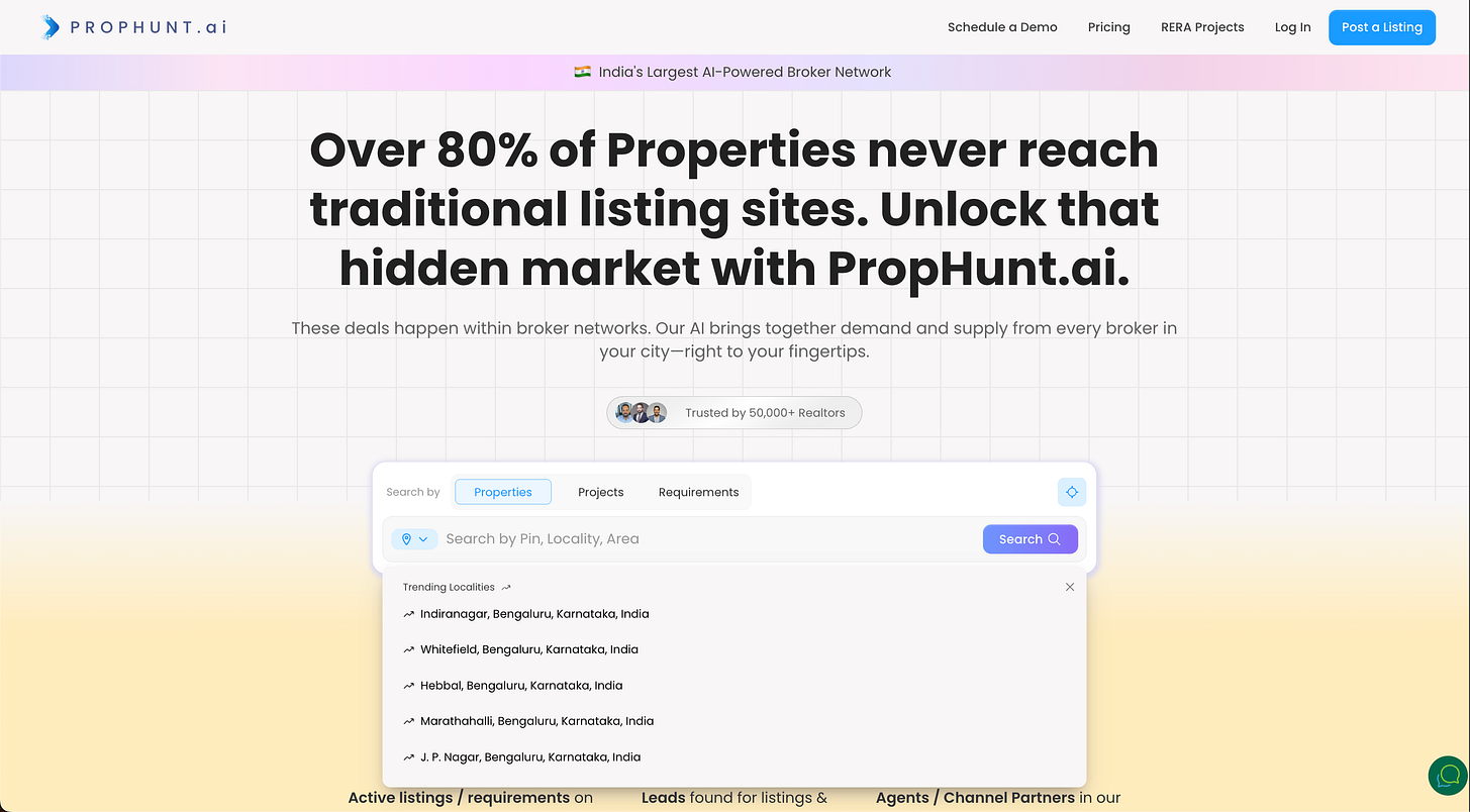
While clicking the suggestions with a mouse works great, we thought of implementing keyboard navigation support to improve our UX. Think of search suggestions, dropdown menus, or autocomplete lists — users expect to:
Use Arrow Down (↓) and Arrow Up (↑) keys to move through items
Press Enter (⏎) to select an option
See a clear visual highlight on the active list item
Here is how we did it in our Angular app:
Note: This example is for Angular app, but the same can be applied to other frameworks like React, Vue, etc with some tweaks
Step 1: Track the Active List Item
First, we’ll store the index of the currently selected suggestion inside our component.
// tracks the state of selected suggestion
selectedIndex = -1;
This index will keep track of which item is currently highlighted when the user presses the arrow keys.
Step 2: Handle Keyboard Events
Next, we’ll listen for keyboard events ArrowUp, ArrowDown and Enter key presses.
// Suggestions items is the Element Reference of the suggestions list items
@ViewChildren('suggestionItem') suggestionItems!: QueryList<ElementRef<HTMLLIElement>>;

onKeyDownInSuggestions(event: KeyboardEvent) {
 const items = this.suggestionItems.toArray();

 if (items.length === 0) return;
 const total = items.length

 switch (event.key) {
 case 'ArrowDown':
 // we increment the selected index & make sure to round it
 this.selectedIndex = (this.selectedIndex + 1) % total;
 // prevents page from scrolling down
 event.preventDefault();
 break;
 case 'ArrowUp':
 this.selectedIndex = (this.selectedIndex - 1 + total) % total;
 event.preventDefault();
 break;
 case 'Enter':
 if (this.selectedIndex >= 0 && this.selectedIndex < total) {
 // we trigger the search with the current selection
 this.selectSuggestion(this.suggestions[this.selectedIndex]);
 }
 break;
 }
 }
Tips:
event.preventDefault() ensures that pressing the arrow keys doesn’t scroll the page.
we round of the selectedIndex by total to ensure that once we reach the end of the list, we again select the first index
Step 3: Update the Template
We’ll now connect our keyboard listener to the container and highlight the active item.
To ensure keyboard support in our element we have to make it focus-able using our keyboard, this can be done by using tabindex global attribute
<div
 class="suggestions-container"
 tabindex="0"
>
...
</div>
Then we have to listen for the keydown event on the focus-able element and implement our logic which we have written in step 2.
<div
 class="suggestions-container"
 tabindex="0"
 (keydown)="onKeyDownInSuggestions($event)"
>
...
</div>
Finally we have to highlight the selected list item to indicate the user that it is selected. This can be done by setting the class.active attribute.
Here is the final code for the template:
<div
 class="suggestions-container"
 tabindex="0"
 (keydown)="onKeyDownInSuggestions($event)"
>
 <ul>
 <li
 #suggestionItem
 *ngFor="let suggestion of suggestions; let i = index"
 [class.active]="i === selectedIndex"
 (click)="selectSuggestion(suggestion)"
 >
 {{ suggestion }}
 </li>
 </ul>
</div>
Key points:
tabindex=”0" makes the container focusable using the keyboard.
(keydown) captures key events while the container is focused.
[class.active] dynamically adds a highlight to the currently selected item.
Step 4: Add Visual Highlighting
A simple CSS class can help users see which item is currently active.
.suggestions-container {
 outline: none;
}

.suggestions-container li.active {
 background-color: #f0f0f0;
 border-radius: 6px;
 cursor: pointer;
}
This setup works great, but there’s one refinement we can add. Because the suggestions appear below a text input, when the user moves up from the first item, we should shift focus back to the input field.
Step 5: Customize Event Handling
For returning focus back to the text input field we simply add this logic in our ArrowUp handler:
onKeyDownInSuggestions(event: KeyboardEvent) {
 ...

 switch (event.key) {
 ...
 case 'ArrowUp':
 if (this.selectedIndex == 0) {
 requestAnimationFrame(() => this.searchInput.nativeElement.focus());
 this.selectedIndex = -1;
 } else {
 this.selectedIndex = (this.selectedIndex - 1 + total) % total;
 }
 event.preventDefault();
 break;
 ...
}
In the above code this.searchInput.nativeElement is an Element Reference to the search Input field.
Here is the final result:

demonstration of keyboard navigation in search suggestions
Final Result
Once implemented, users can:
Use Arrow Up/Down to move through list item
Press Enter to select an item
Clearly see which item is active through visual feedback
Your list items are now fully keyboard-accessible, improving usability for everyone.
Example Use Cases
Search suggestion dropdowns
Location or product autocomplete lists
Command menus or quick actions
Custom dropdown components.
Conclusion
Adding keyboard navigation to list items in your apps takes just a few lines of code but dramatically improves accessibility and user experience.
By implementing this approach, you ensure that your app works seamlessly for keyboard users, power users, and accessibility tools alike — aligning with best practices for modern web development.
Next time you create a list or dropdown, make it keyboard-friendly — your users will thank you!
If you found this guide helpful, consider sharing it or leaving a comment — I love hearing how others are improving accessibility in their Angular projects!
#Angular #Accessibility #KeyboardNavigation #FrontendDevelopment #WebUX #Angular #Tips #WebAccessibility
Join Mayur on Peerlist!
Join amazing folks like Mayur and thousands of other builders on Peerlist.
0
0
0