

Stop asking AI to “make it modern”
Why AI-generated UI still looks generic — and how visual references can become a better prompt
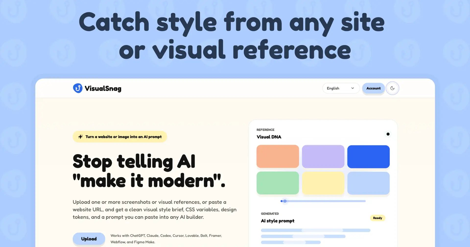
Why AI-generated UI still looks generic — and how visual references can become a better prompt
AI coding tools are getting very good at building interfaces.
You can open Cursor, Lovable, v0, Bolt or any similar tool, write a few lines, and get a working UI in minutes. For solo founders, indie makers and product people, this is a huge shift.
But there is one thing I keep noticing.
The UI is fast — but often not very specific.
It works.
It has cards.
It has buttons.
It has a dashboard layout.
It looks clean enough.
But it also looks like many other AI-generated products.
Same soft blue accents.
Same rounded cards.
Same generic SaaS layout.
Same “modern” feeling that does not really belong to any brand.
The problem is not that AI cannot build UI.
The problem is that we usually give it weak visual direction.
“Make it modern” is not a design system
A lot of prompts for UI generation sound like this:
Build a clean and modern SaaS dashboard.
Or:
Make this landing page look premium and minimal.
Or:
Create a beautiful interface for a productivity app.
These prompts describe a mood, but they do not describe a visual system.
AI still has to guess:
what colors to use
how much contrast the UI needs
how rounded the components should be
whether the typography should feel serious, playful, editorial or technical
how much spacing the layout needs
what kind of surfaces and borders should exist
how dense or calm the interface should feel
So the model falls back to the average.
And the average is usually boring.
A screenshot contains more design information than a long prompt
When we look at a good website or product UI, we understand a lot of things immediately.
We understand the rhythm.
We understand the color logic.
We understand whether the product feels playful or serious.
We understand how the interface breathes.
We understand if the brand is sharp, soft, premium, technical or editorial.
But when we try to explain that to AI, we often compress everything into one vague sentence.
That is strange, because visual references are already full of useful design information.
A good reference can tell AI:
use this kind of background tone
keep surfaces soft and low contrast
use large rounded cards
make typography bold but friendly
keep spacing generous
avoid heavy shadows
make buttons feel tactile
use this kind of hierarchy
This is much more useful than “make it modern”.
The workflow I started using
The workflow is simple:
1. Start with a visual reference
Not to copy it.
This part is important.
The goal is not to steal another website or clone a product. The goal is to understand the visual logic behind a reference.
A reference can be:
a landing page
a dashboard screenshot
a product card
a mobile screen
a design system example
a moodboard image
a screenshot from your own previous work
2. Extract the visual rules
Instead of only looking at the image, turn it into structured rules.
For example:
background color
surface color
primary accent
text color
border style
border radius
spacing mood
typography personality
layout density
component style
overall visual tone
This gives you something closer to a mini design system.
3. Turn those rules into AI-ready instructions
Then use those rules inside your AI coding prompt.
Instead of writing:
Make it clean and modern.
You can write something like:
Use a warm off-white background, dark near-black text, soft rounded cards, low-contrast borders, generous spacing and friendly bold typography. Keep the layout editorial, minimal and calm. Avoid generic blue SaaS styling.
This is already much better.
It gives AI a visual direction, not just a task.
4. Add CSS variables or design tokens
This is where the workflow becomes practical.
If you can turn a visual reference into CSS variables, you can reuse the style across components.
For example:
:root {
 --color-background: #f8f4ec;
 --color-surface: #ffffff;
 --color-text: #1f1f1f;
 --color-muted: #6f6a63;
 --color-primary: #ff6b3d;

 --radius-card: 24px;
 --radius-button: 999px;

 --shadow-soft: 0 16px 40px rgba(0, 0, 0, 0.06);
}
Now the AI has something real to work with.
Not just taste.
Structure.
This is why I built VisualSnag
I built VisualSnag because I kept running into this exact problem while working with AI coding tools.
The tools were fast.
The output was useful.
But the visual direction was too vague.
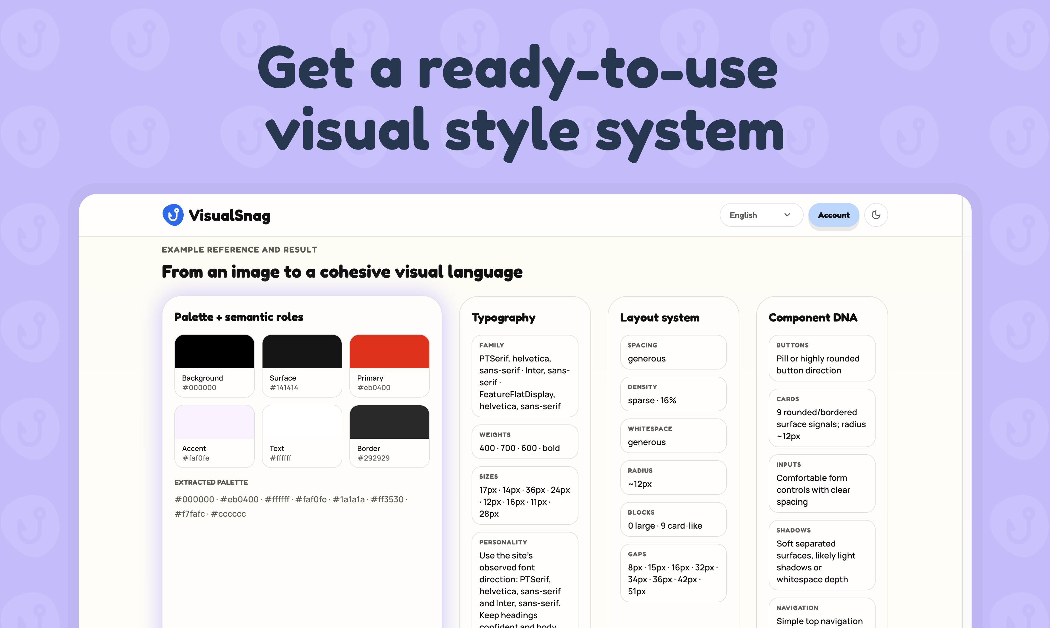
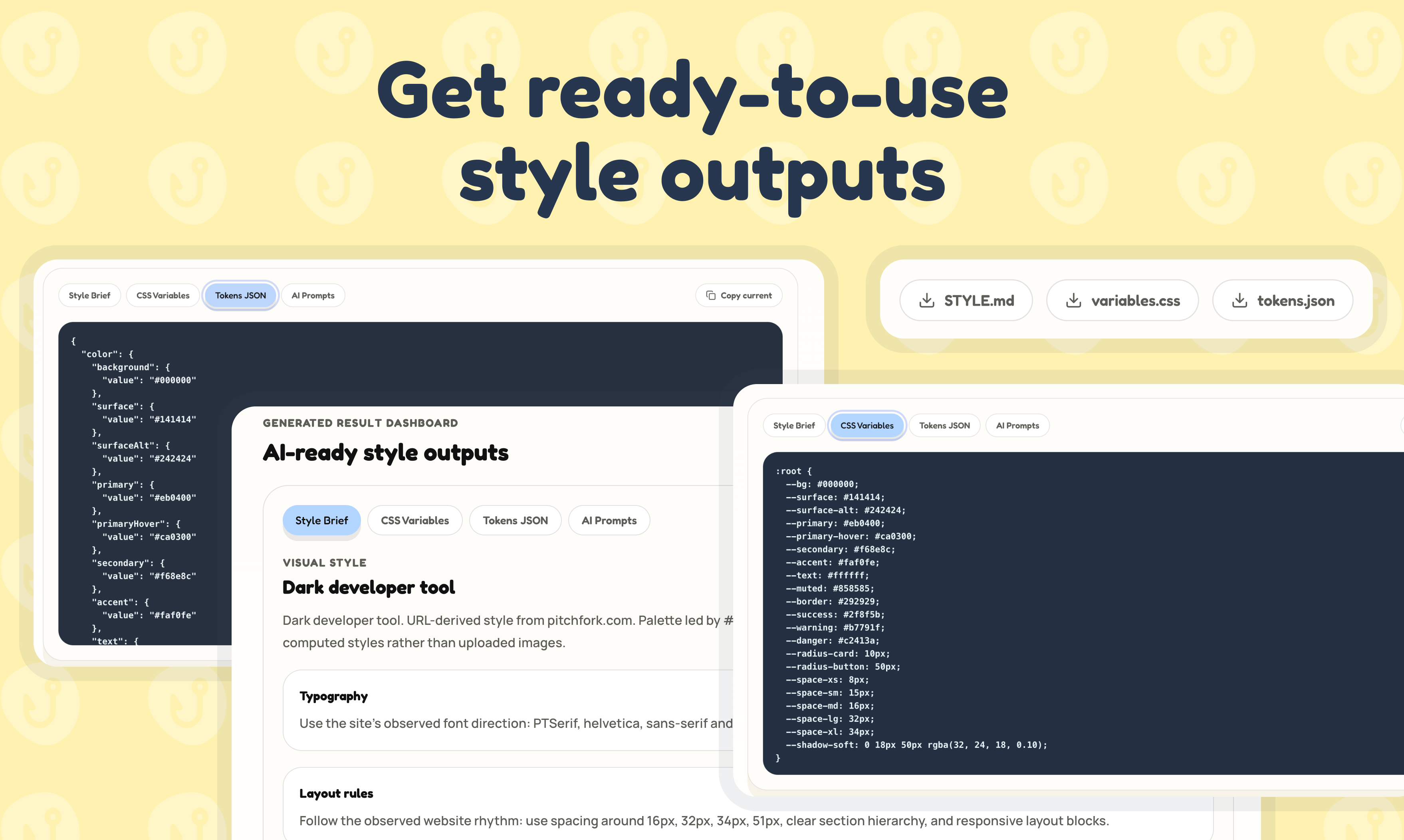
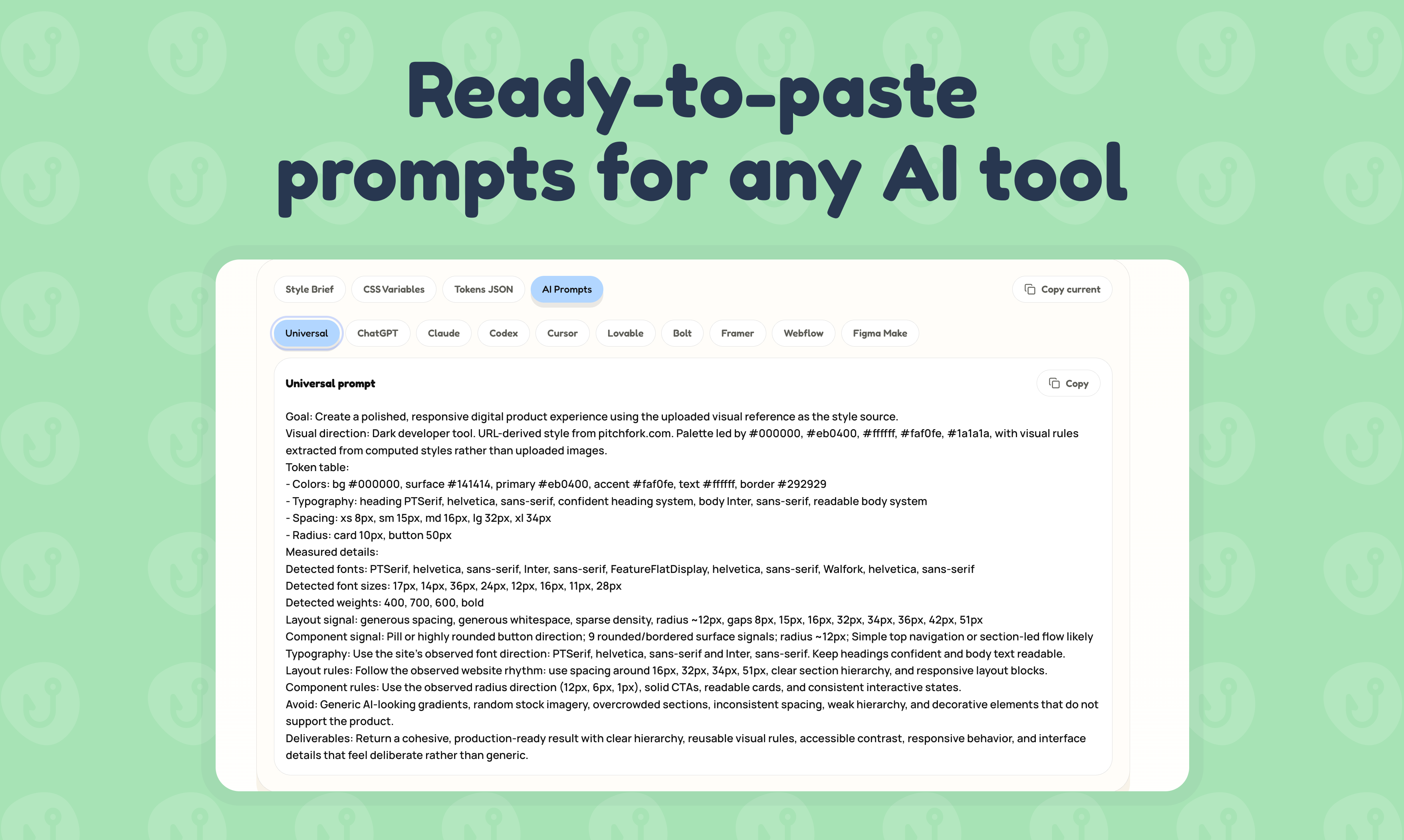
So I started building a small tool that turns a screenshot or URL into:
a visual style brief
CSS variables
design tokens
an AI prompt for tools like Cursor, Lovable or v0
The idea is simple:
Before asking AI to build the UI, give it a visual system.
Not a full enterprise design system.
Not a 40-page brand document.
Just enough visual structure to make the output more consistent and less generic.
The real problem is not speed anymore
A year ago, the hard part was building fast.
Now, AI helps us build fast.
The new problem is taste, direction and consistency.
If every founder can generate a dashboard, the difference will not be who has the most components.
The difference will be who can give AI better context.
Better product thinking.
Better copy.
Better visual direction.
Better taste.
That is why I think visual references will become part of the AI UI workflow.
Not as something to copy — but as something to translate.
A better prompt starts before the prompt
The more I use AI tools, the more I feel that prompting is not only about words.
A good prompt can come from:
a screenshot
a brand mood
a product reference
a layout pattern
a color system
a typography direction
a real interface that already works visually
The job is to turn those things into structured instructions.
That is the gap I am trying to explore with VisualSnag.
If you are building with AI, try this next time:
Do not start with:
Make it modern.
Start with:
Here is the visual system I want you to follow.
The output will usually be much closer to what you actually imagined.

Join Maksym on Peerlist!
Join amazing folks like Maksym and thousands of other builders on Peerlist.
0
0
0