Create a responsive table with Tailwind CSS

Create a responsive table with Tailwind CSS
Hello everyone! Today we are going to create a responsive table using Tailwind CSS. This tutorial will show you how to create a table that that doesn’t break when the screen size changes.
Originally posted on: https://lexingtonthemes.com/tutorials/how-to-create-a-responsive-table-with-tailwind-css/
What is a table?
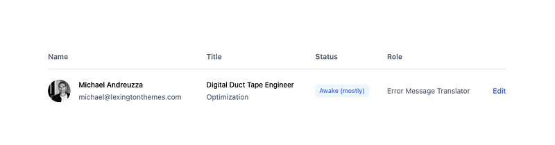
A table is a data structure that organizes data into rows and columns. It is a common way to display data in a structured and organized manner. Tables are used in a wide range of applications, from spreadsheets to databases to data visualization tools. They are an essential part of web design and are widely used in various industries.
Join Michael on Peerlist!
Join amazing folks like Michael and thousands of other builders on Peerlist.
9
12
1