DropdownProPlus - A Powerful & Customizable Dropdown for Flutter
A customizable dropdown for flutter package
When building modern mobile applications with Flutter, creating clean and user-friendly forms is essential. Dropdown components are a common requirement — but the default dropdown often lacks flexibility like search, multi-select, and custom overlays.
That’s where DropdownProPlus comes in.
DropdownProPlus is a highly customizable dropdown package designed to enhance your Flutter app with powerful features like searchable lists, multi-selection, and a clean API — all with seamless integration.
✨ Features
DropdownProPlus provides a modern and flexible dropdown experience with:
✅ Customizable dropdown overlay
🔎 Searchable dropdown
🔘 Multi-select support
🧼 Clean and simple API
⚡ Easy integration into any Flutter app
Whether you’re building forms, filters, product selectors, or category pickers, DropdownProPlus makes implementation smooth and efficient.
🎬 Demo Preview
Here’s how DropdownProPlus looks in action:
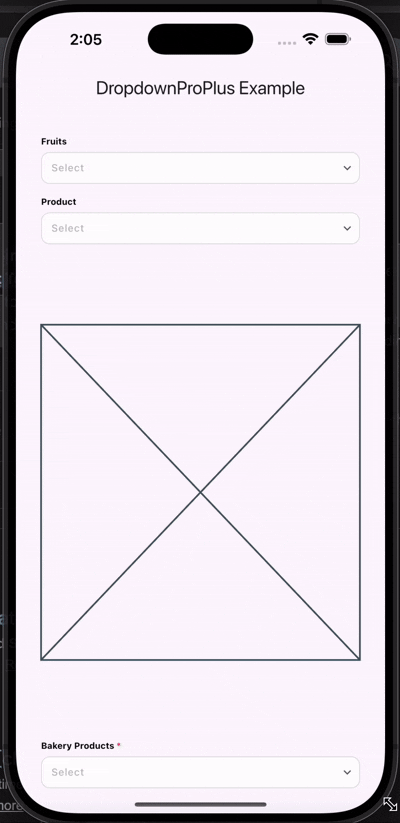
Demo DropdownProPlus
The demo showcases:
Single selection dropdown
Multi-selection with search
Mandatory dropdown validation
🛠 Installation
Add the dependency to your pubspec.yaml file:
dependencies:
 dropdownproplus: ^0.1.2
Then run:
flutter pub getThat’s it! You’re ready to use DropdownProPlus in your Flutter app.
🚀 Usage Example
Import the package:
import 'package:dropdownproplus/dropdownproplus.dart';Below is a complete example demonstrating different dropdown configurations:
1️⃣ Basic Searchable Dropdown
DropdownPlus(
 isEnabled: true,
 enableSearchBar: true,
 dropdownLabel: "Fruits",
 onItemSelected: (value) {},
 dropdownItems: ["Apple", "Banana", "Orange", "Mango"],
 value: '',
 callBackKey: '',
),
✔ Search enabled
✔ Single selection
2️⃣ Multi-Select Dropdown with Snackbar Callback
DropdownPlus(
 isEnabled: true,
 enableSearchBar: true,
 enableMultiSelect: true,
 dropdownLabel: "Product",
 onItemSelected: (value) {
 ScaffoldMessenger.of(context).showSnackBar(
 SnackBar(content: Text("Selected: $value")),
 );
 },
 dropdownItems: [
 "Product1", "Product2", "Product3", "Product4",
 "Product5", "Product6", "Product7", "Product8", "Product9"
 ],
 value: '',
 callBackKey: '',
),
✔ Multi-selection enabled
✔ Real-time callback
✔ Ideal for filters & product lists
3️⃣ Mandatory Dropdown Field
DropdownPlus(
 isEnabled: true,
 enableSearchBar: true,
 isMandatory: true,
 dropdownLabel: "Bakery Products",
 onItemSelected: (value) {
 ScaffoldMessenger.of(context).showSnackBar(
 SnackBar(content: Text("Selected: $value")),
 );
 },
 dropdownItems: [
 "Bread", "Butter", "Toast", "Khari",
 "Milk", "Cheese", "Curd", "Butter Milk", "Cookies"
 ],
 value: '',
 callBackKey: '',
),
✔ Required field indicator
✔ Validation-ready
✔ Clean UI integration
📘 Parameters Explained
ParameterDescriptiondropdownLabelLabel displayed for the dropdowndropdownItemsList of dropdown itemsonItemSelectedCallback triggered when an item is selectedisEnabledEnable or disable the dropdownenableSearchBarEnable search bar inside dropdownenableMultiSelectEnable multi-selectionisMandatoryMarks field as requiredvalueSelected value (supports custom objects / JSON / POJO)callBackKeyAccess tapped item details
💡 Why Choose DropdownProPlus?
While Flutter provides basic dropdown functionality, modern apps often require:
Search capability for long lists
Multiple item selection
Custom overlays
Validation support
Better UX for enterprise apps
DropdownProPlus solves these limitations with a clean and scalable approach.
🎯 Perfect For
E-commerce product filters
Registration & profile forms
Survey apps
Admin dashboards
Inventory management systems
🔗 Links
Pub Package: DropdownProPlus
GitHub : DropdownProPlus
🏁 Final Thoughts
DropdownProPlus simplifies dropdown implementation in Flutter while providing powerful customization options. Whether you’re building a small app or an enterprise-level solution, this package enhances both development speed and user experience.
If you’re looking to upgrade your Flutter dropdown experience, DropdownProPlus is definitely worth integrating.
“Contributions are highly welcome — if you’re interested in improving the package or have ideas to enhance it, feel free to contribute and share your valuable feedback.”
Happy Coding! 🚀
Join Pravin on Peerlist!
Join amazing folks like Pravin and thousands of other builders on Peerlist.
0
12
0