Google’s New Material 3 Update for Contacts & Calling Screen: A UI/UX Designer’s Perspective
Introduction
Google continues its journey of unifying the Android experience under the Material 3 design language (also known as Material You). The latest update to the Contacts and Calling screen brings a softer, more adaptive look with fresh color schemes, rounded elements, and an overall minimalistic approach.
But beyond aesthetics, how does this redesign impact real-life usability? As a UI/UX designer, I’ll break down the pros and cons, explore user scenarios, and share insights on what we can learn from this shift.
Reference Link: Google’s official Material 3 design guidelines
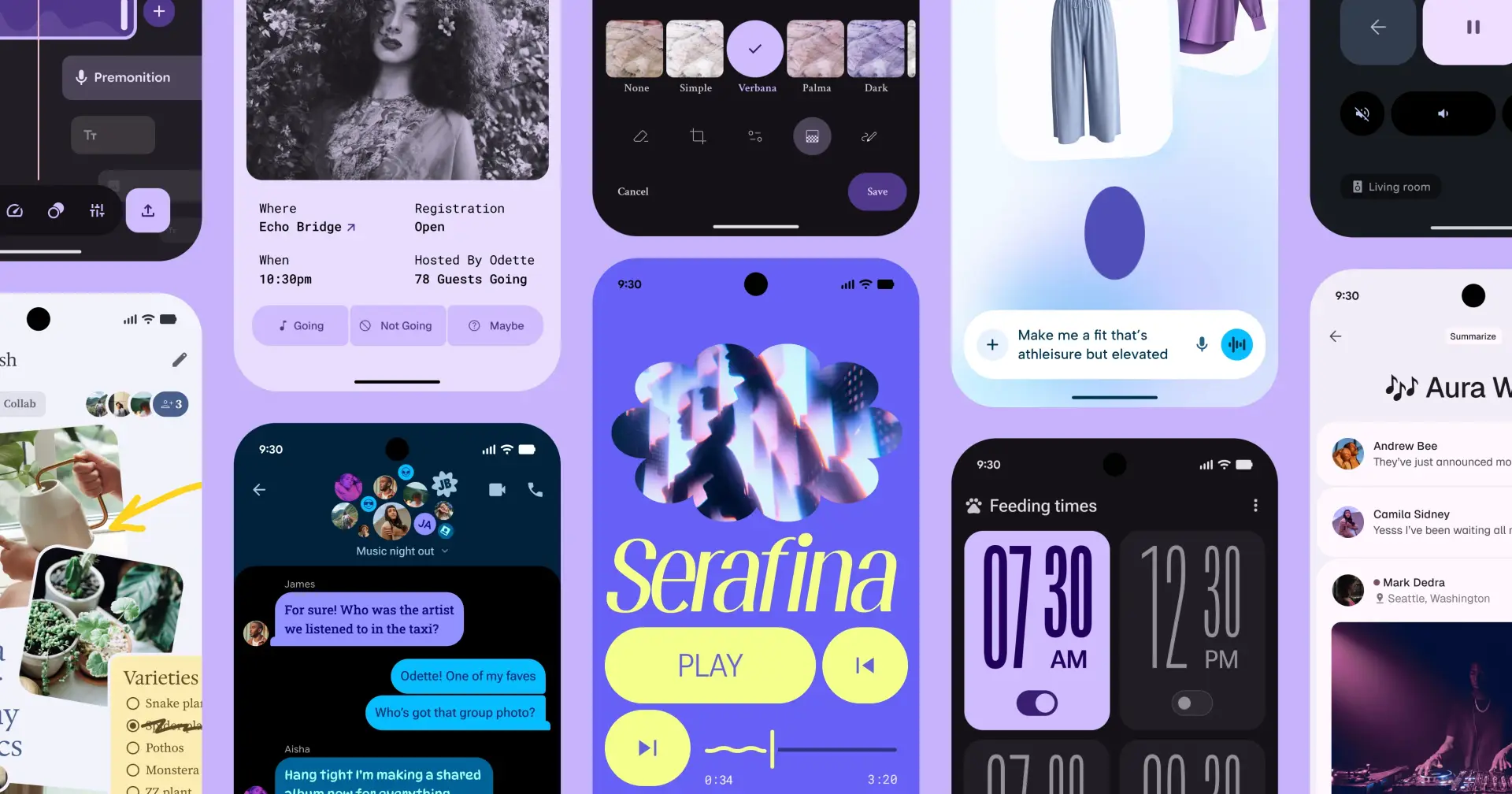
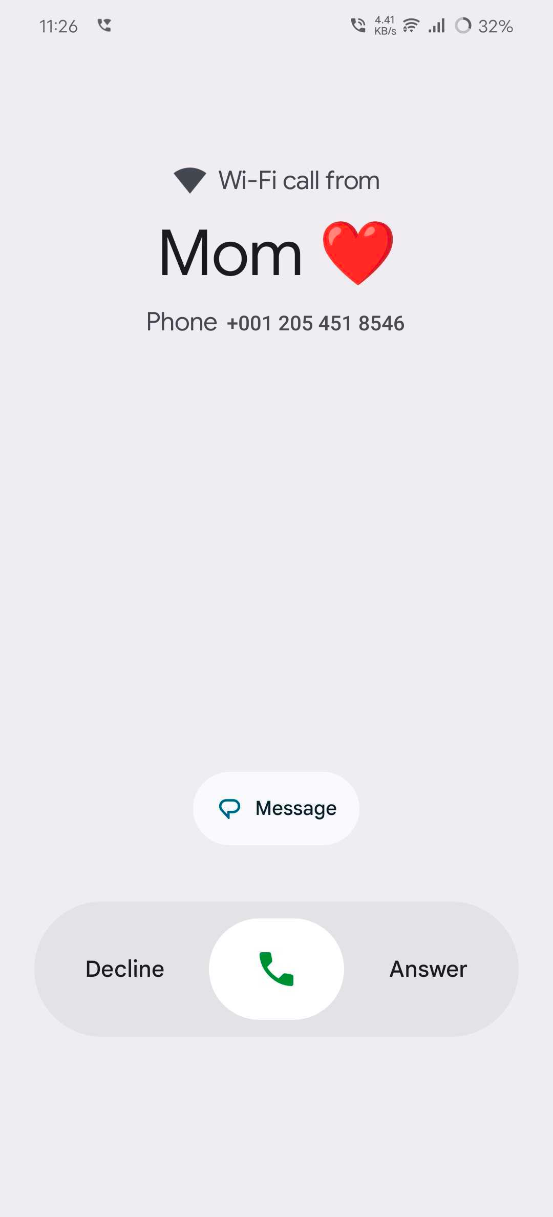
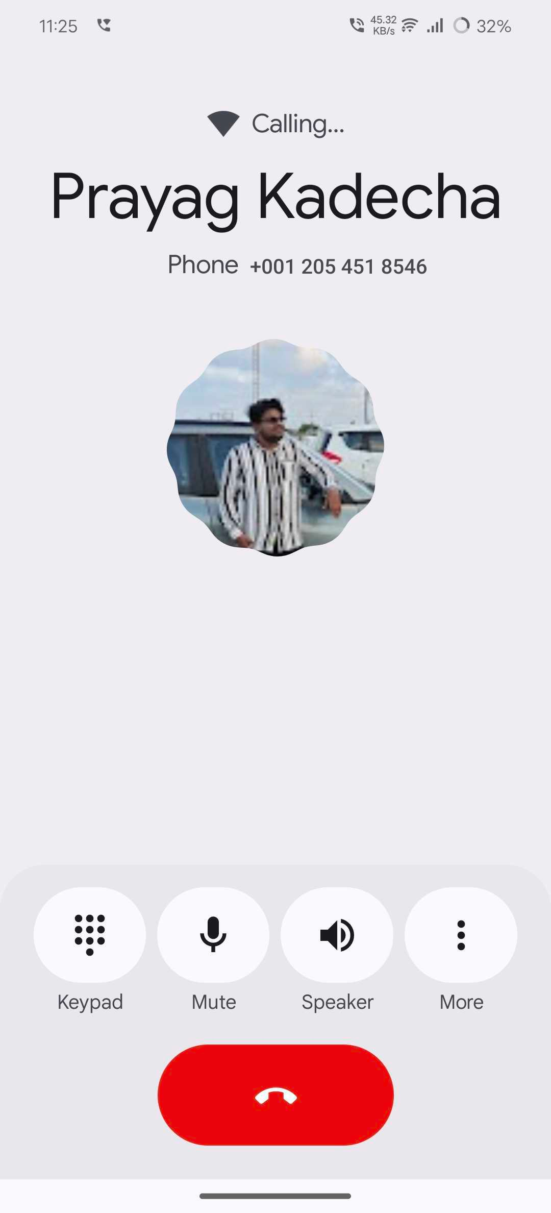
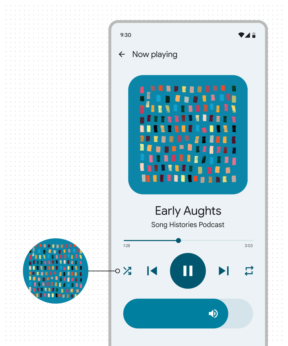
What’s New in the Update
Here’s a quick overview of the changes that rolled out with the update:
Material 3 Visual Language: Rounded corners, pastel backgrounds, and subtle elevation effects.
Dynamic Theming: The UI now adapts to your wallpaper colors, thanks to Material You.
Refreshed Call UI: Core actions (mute, hold, speaker, add call, keypad) redesigned with larger buttons and more spacing.
Contacts List Improvements: Consistent typography, circular avatars, and more whitespace.
Accessibility Focus: Larger touch targets, better spacing, and simplified layouts.
Pros: Where Google Got It Right ✅
Modern Aesthetic & Consistency
The update aligns with Material 3, making Google’s apps look cohesive. The visual language now feels consistent across Gmail, Messages, Calendar, and other core apps.Improved Accessibility
Bigger buttons and improved contrast benefit people with motor challenges or low vision. For one-handed use, this is a big plus.Dynamic Personalization
With Material You, users feel more connected to their devices as the UI inherits colors from wallpapers, creating a personalized theme.Reduced Cognitive Load
Cleaner iconography and simplified layouts reduce decision fatigue. Users can quickly identify core actions during calls without clutter.Future-Proofing Android Design
This update isn’t just a cosmetic change; it’s part of Google’s effort to future-proof the Android ecosystem’s design identity.
Cons: Real-World Frictions ❌
Too Much Whitespace
While minimalism looks good, it decreases information density. Contact lists show fewer entries per screen, meaning more scrolling for heavy users.Icon Familiarity Issues
Some redesigned icons may confuse users who are used to the old placements and visuals.Dynamic Colors & Legibility
Material You theming doesn’t always guarantee accessibility. Certain wallpaper-derived colors may reduce contrast, impacting readability.Learning Curve for Seniors
Frequent UI changes, even minor ones, frustrate older or less tech-savvy users who rely on familiarity.Productivity Trade-Offs
Power users (e.g., professionals who manage hundreds of contacts daily) may feel slowed down because of increased spacing and reduced density.
Real-Life UX Impact
For Everyday Users: The update feels fresh and personalized but doesn’t significantly improve task completion speed.
For Accessibility Users: Larger buttons and improved spacing are helpful, though dynamic theming could introduce contrast issues.
For Power Users: Minimalism may feel like a downgrade when efficiency and quick access matter more than aesthetics.
Link: Android Accessibility Guidelines
Lessons for Designers 🎨
This update highlights a critical design tension:
👉 Aesthetic minimalism vs. Information density
As designers, we often lean toward visual cleanliness, but in contexts like calling and contacts, speed and clarity are just as important as beauty. The update is a reminder that:
Consistency matters across an ecosystem.
Accessibility isn’t optional — it must be tested in multiple real-world contexts.
Personalization works best when balanced with legibility and usability.
Link: Material 3 Design Kit Figma
Conclusion
Material 3 Expressive isn’t just a design system update — it’s a new way of thinking about digital experiences. With M3 and its Expressive extension, the goal goes beyond consistency. We’re now designing for emotion, accessibility, and personal connection.
The beauty of Material 3 is that you don’t need to adopt everything at once. Start small: experiment with dynamic color, explore the new shape system, or test the updated Figma components. Build a custom theme, break a few patterns, and discover what feels right for your product.
Material 3 Expressive encourages flexibility and exploration — and that’s where true creativity happens.
From a UI/UX designer’s perspective, the key takeaway is this: design updates should always be validated in real-world workflows, not just in Figma mockups. A design that looks stunning in theory may not always translate into the best everyday user experience.
What do you think about Google’s new update?
Would you prefer the clean look with more whitespace, or the older denser UI that shows more contacts at once?
Join PRINCE on Peerlist!
Join amazing folks like PRINCE and thousands of other builders on Peerlist.
0
8
0