Shimmer Effect 102
Adding Shine to Your CTAs
Hey folks!
If you’ve been exploring modern UI, you’ve probably noticed shiny animations on buttons, cards, or hero sections. Today, we’re going to dissect how to create that shimmer/shine effect from start to finish yes, from -100% to 100%.
How the Shimmer Works
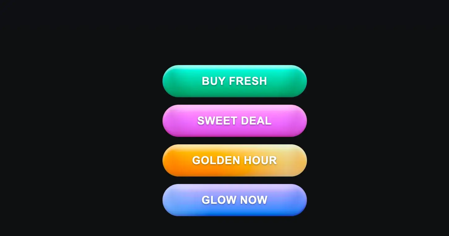
It’s just a DOM element, Usually a
<div>or<span>that sits inside your parent element (e.g., a button). In our case, we have:<button class="buyButton aquaGlow"> <span class="label">Buy Fresh</span> <span class="shimmer"></span> </button>Position & size
The shimmer spans the full size of its parent, using absolute positioning andinset: 0Translate for movement
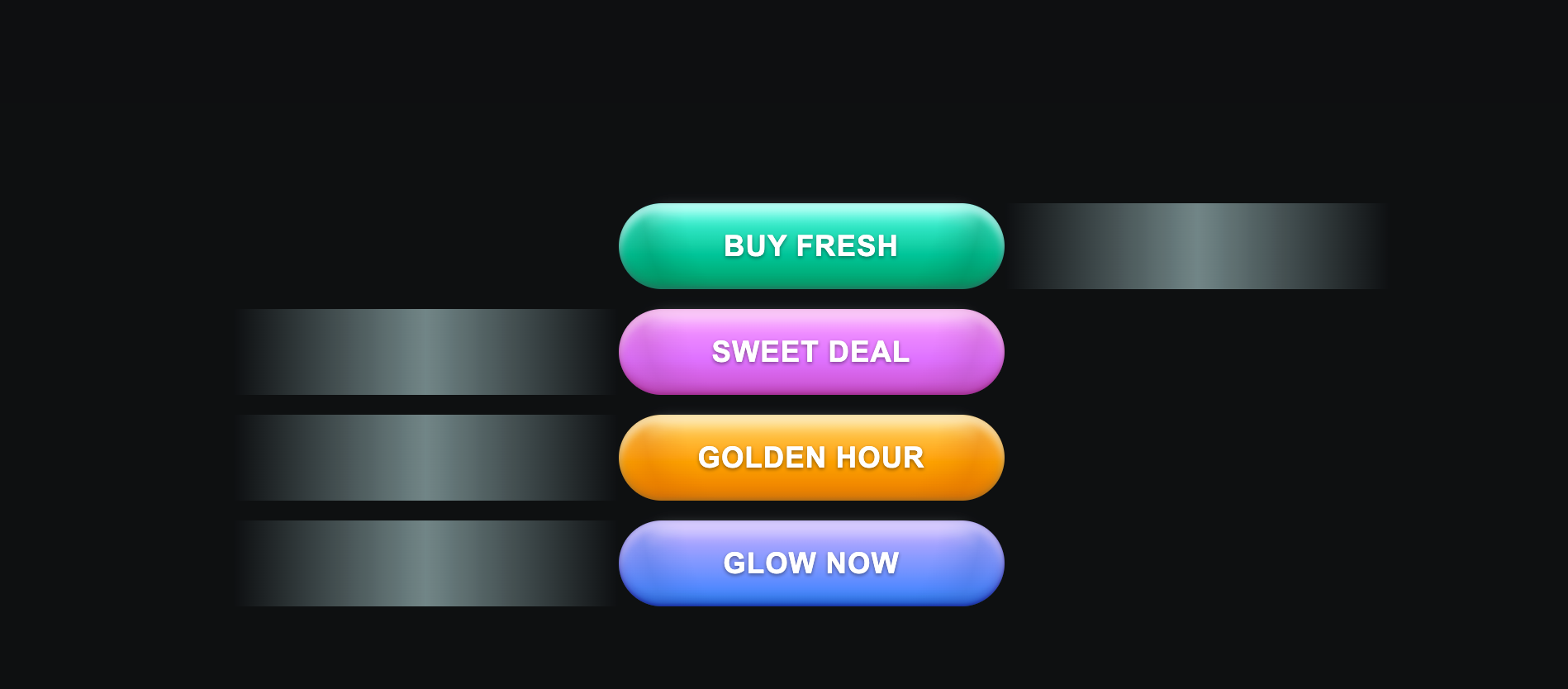
By usingtransform: translateX(-100%), we position it off-screen to the left initially.On hover, we translate it to
translateX(100%)so it glides across the button.
Why transform?
Transform moves the element relative to itself, not the parent.
It’s GPU-accelerated, meaning smoother animations than animating
leftormargin.
Timing with transition
A simple transition: transform 1000ms makes it glide beautifully.
Also make sure to hide it by overflow hidden on parent element (button)
When we combine all this , the effect would look like this
https://codepen.io/purohitdheeraj/pen/zxrKMMY
How cool it is na ? with some css we can move things around
do try this with pure css, tailwind or any other framework you are using
Thank You!
Join Dheeraj on Peerlist!
Join amazing folks like Dheeraj and thousands of other builders on Peerlist.
4
20
0