Design with Brains in Mind: Psychology Hacks for UI/UX
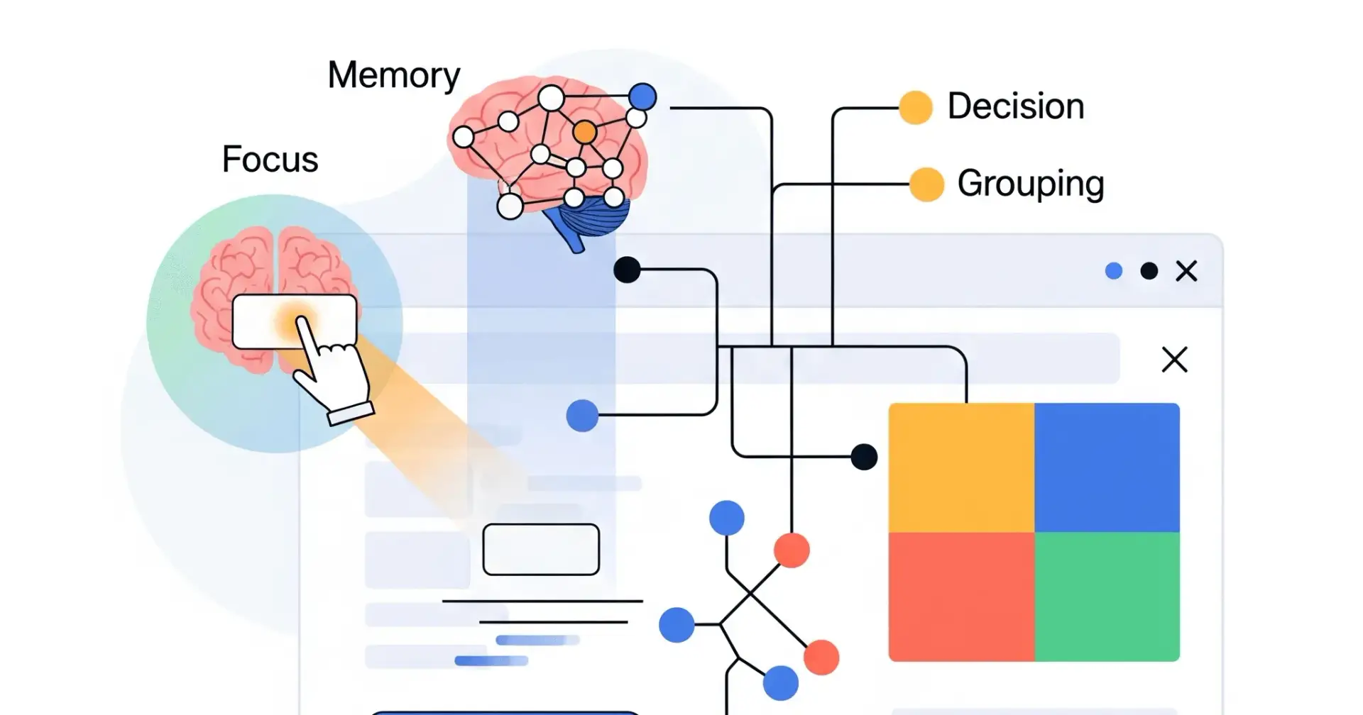
Ever wonder why some apps just feel right to use, while others make you want to throw your phone across the room? It's not magic – it's often good design, rooted in how our brains work! As UI/UX designers, understanding a bit of psychology can turn good designs into great ones. It helps us predict how people will react, think, and interact with what we build.
Let's dive into some key brain rules that can make your designs shine:
1. The "Pop Out" Principle (Von Restorff Effect)
What it is: When you see a bunch of similar things, the one that's different really stands out and is easier to remember.
Think of it like this: If you're scanning a list of black text, and suddenly one word is bright red and bolded, your eyes snap right to it.
In your designs:
Highlight key actions: Make your main "Sign Up" or "Buy Now" button a contrasting colour.
Emphasize important info: Use a distinct font, size, or colour for crucial alerts or unique features.
Show unique value: If one plan is "Most Popular," give it a special badge or background.
2. The Memory Trick (Serial Position Effect)
What it is: Humans tend to remember the very first items and the very last items in a list better than those in the middle.
Think of it like this: When you shop for groceries, you often remember the first few things you added to your cart and the last few, but the stuff in the middle might blur together.
In your designs:
Navigation: Place your most critical menu items (like "Home" or "Contact") at the beginning or end of your navigation bar.
Onboarding: Make the first and last steps of an onboarding flow the most impactful or memorable.
Checklists/Forms: Put essential fields at the top and the final "Submit" button clearly at the bottom.
3. The Brain Strain Test (Cognitive Load)
What it is: This is the total mental effort your brain needs to do something. Too much, and users get overwhelmed and give up.
Think of it like this: Trying to follow a recipe with 20 ingredients and 15 complex steps (high load) versus a simple 3-ingredient, 4-step recipe (low load).
In your designs:
Simplify! Remove unnecessary elements, text, or steps.
Chunk information: Break large blocks of text or many options into smaller, digestible groups.
Provide clear instructions: Don't make users guess what to do next.
Minimize distractions: Keep interfaces clean and focused on the task at hand.
4. Too Many Choices! (Hick's Law)
What it is: The more choices you give people, the longer it takes them to make a decision. Too many choices can even lead to no decision at all.
Think of it like this: Standing in front of a vending machine with 100 drink options versus one with just 5. You'll pick much faster from the latter.
In your designs:
Limit options: Reduce the number of choices users have, especially for critical decisions.
Categorize: If you must offer many options, group them logically (e.g., in a dropdown or expandable section).
Default options: Provide smart default selections to guide users.
Progressive disclosure: Show only essential information initially, revealing more as needed.
5. Grouping by Closeness (Law of Proximity)
What it is: Our brains naturally see objects that are close to each other as belonging together or being related.
Think of it like this: In a crowded room, you assume people standing close together are a group or talking to each other.
In your designs:
Forms: Group related form fields (e.g., all address fields) together with appropriate spacing.
Content Layout: Place headlines close to their corresponding paragraphs, and images near their captions.
Navigation: Group similar menu items or filter options together visually.
Visual Hierarchy: Use spacing to show relationships and breaks between different sections.
By keeping these psychological principles in mind, you're not just designing pretty screens; you're designing for how people naturally perceive, process, and interact with the world around them. This leads to more intuitive, less frustrating, and ultimately more successful products!
Join Vijay on Peerlist!
Join amazing folks like Vijay and thousands of other builders on Peerlist.
2
17
0