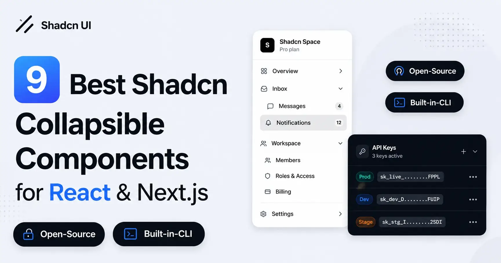
9 New Shadcn Collapsible Components for Your Web Projects
Looking for Shadcn collapsible components for your React & Next.js projects? Explore 9 practical UI patterns to build cleaner and more organized interfaces.
If you build dashboards or tools with React, you’ve probably faced this problem:
Too much content → messy UI
Too little content → missing context
That’s where collapsible components from shadcn/ui come in.
They help you hide secondary content without removing it — and without breaking the user’s flow.
Quick Thought: Collapsible vs Accordion
This still confuses a lot of people.
Collapsible → toggle a single section
Accordion → manage multiple grouped sections
If your goal is simple show/hide, collapsible is usually enough.
Why I Use Collapsible So Often
In most real projects, not everything needs to be visible all the time.
Collapsible helps to:
Reduce visual clutter
Keep important content upfront
Let users explore details when they want
Avoid modals for small interactions
It’s a small component, but it solves a big UX problem.
Shadcn Collapsible Components That Actually Work with React & Next.js Projects
These are patterns I’ve used or seen working well in real apps.
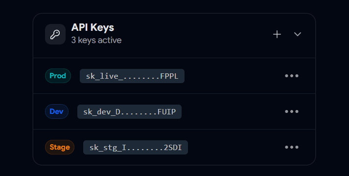
Secret Keys / Sensitive Data Collapsible
Perfect for things like:
API keys
tokens
secrets
Users can reveal only when needed.
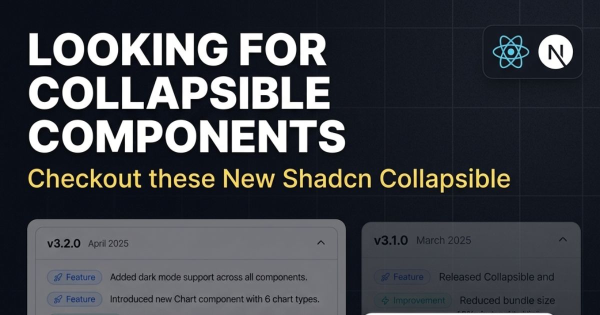
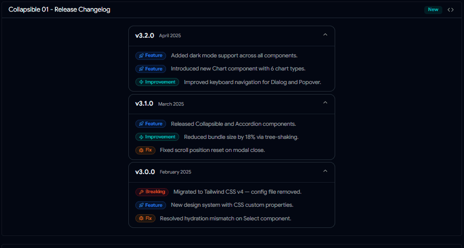
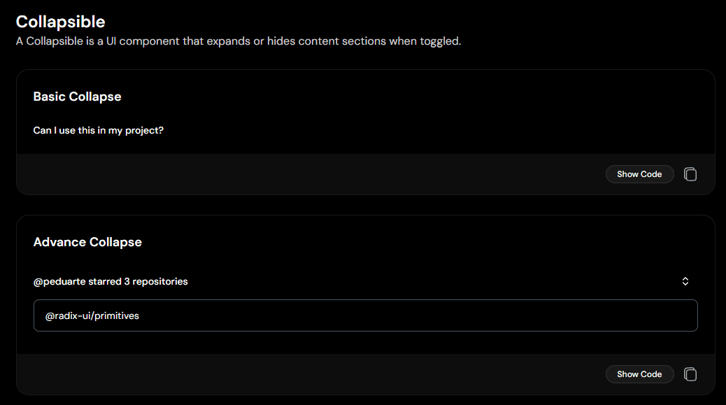
Changelog / Updates Collapsible
Instead of showing all updates at once, let users expand specific versions.
Cleaner and easier to scan.
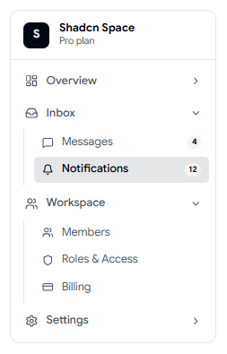
Collapsible Menu
Very common in dashboards.
You keep the sidebar compact, but still support deeper navigation levels.
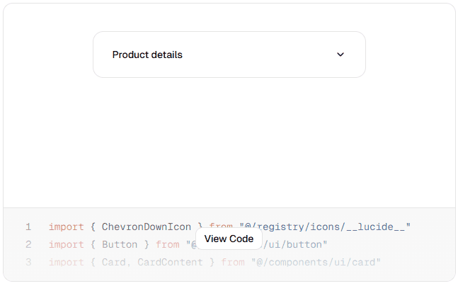
Collapsible Card
This collapsible component that lets users expand or collapse content with a click. Use the header icon to toggle visibility and keep your UI clean and organized.

Basic Show / Hide Collapsible
The simplest use case.
Works well for:
FAQs
short descriptions
extra notes
Nested Collapsible (Grouped Content)
When you have structured data like:
categories
grouped settings
multi-level items
This pattern scales nicely.
Dropdown Styled Collapsible
A button that reveals extra actions or options.
Useful for:
filters
quick actions
compact controls
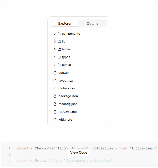
Folder Tree Collapsible
You can build simple explorer-like interfaces using nested collapsibles.
Great for:
CMS
admin tools
documentation viewers
Settings with Advanced Options Collapsible
Instead of overwhelming users with too many inputs, hide advanced settings.
Clean UI + better usability.
Where This Helps the Most
You’ll see this pattern in almost every serious product:
dashboards
internal tools
settings pages
developer panels
content-heavy screens
Small Things That Make It Better
A few tweaks can improve the experience a lot:
Use clear labels like “Show more”
Add icons for state (open/close)
Keep animations quick
Don’t hide critical information
Avoid too many nested layers
Final Note on Shadcn Collapsibles
Collapsible isn’t a fancy component; but it’s one of the most useful ones.
It helps you design interfaces that feel lighter without removing information.
If you’re building with shadcn/ui, this is something you’ll end up using again and again.
Want More Collapsible Components ?
If you’re building with shadcn/ui, try experimenting with different layouts and combinations.
You can reuse the same collapsible logic across many use cases.
Check out more modern Shadcn Collapsible components to use in your projects.
Built Collapsible components ?
If you’ve built any interesting collapsible patterns, I’d love to see how you’re using them in your projects.
Share it with me on:
I’d love to review it and feature it here.
Searching Shadcn Blocks, Components
& Templates for Your Web Projects
Here are some useful resources from the Shadcn ecosystem:
Join SANJAY on Peerlist!
Join amazing folks like SANJAY and thousands of other builders on Peerlist.
0
0
0