8+ Useful Shadcn Combobox Components & Examples
Today I’m sharing some of the most useful and clean Shadcn Combobox components you can use in your web projects.
Working on a React or Next.js project?
Today I’m sharing some of the most useful and clean Shadcn Combobox components you can use in your apps.
Whether you’re building admin panels, forms, dashboards, or SaaS products, a good combobox can improve search and selection experience instantly.
What is Shadcn Combobox?
A combobox is a smart input component that lets users type and select options from a dropdown list.
It combines:
An input field
A searchable dropdown list
Instead of forcing users to scroll through long dropdowns, combobox lets them search instantly.
For example, if your dropdown has 200 cities, users can simply type “New” and quickly find New York.
Why Developers Use Shadcn Combobox
Regular dropdowns work fine for small lists.
But when the list gets large, dropdowns become frustrating to use.
That’s where combobox helps.
Benefits of Using Combobox
Makes large datasets searchable
Improves form usability
Supports single and multi-select
Works well with async/server data
Keeps UI lightweight and clean
If you’re building shadcn dashboards or internal tools, searchable selection can greatly improve user experience.
Shadcn Combobox with Icons
A clean combobox with icons for each option.
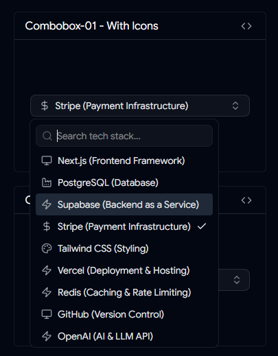
Useful when you want to show tech stacks, categories, or branded selections visually.
Features
Icon support inside options
Better visual scanning
Great for tech/tool selection
Combobox with Custom Country Check Icon
A country selection combobox with custom check styling.
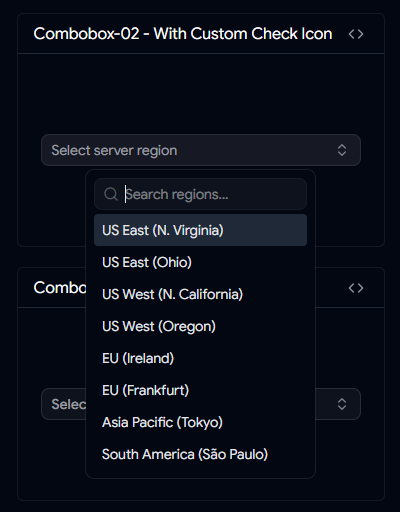
Useful for country pickers and location forms.
Features
Country selection support
Custom selected state icon
Clean visual feedback
Combobox with Add Button
A combobox with built-in add/select action.
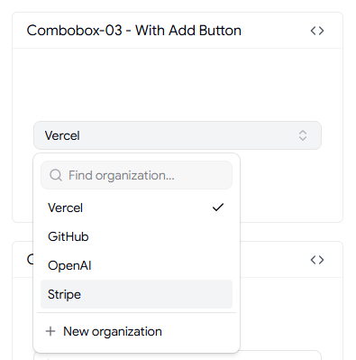
Lets users quickly confirm or add selected items.
Features
Add button included
Auto tick on selection
Good for dynamic inputs
Shadcn Timezone Combobox
Built for selecting timezones easily.
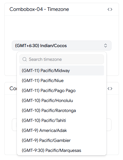
Useful for global SaaS products and scheduling apps.
Features
Timezone selection
Multi-country support
Searchable timezone list
User Selection Combobox
A combobox for selecting users.
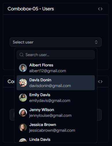
Works well in admin panels and team/project management tools.
Features
User avatar/name support
Selected state indicator
Great for member assignment
Country Combobox with Flags
A country picker combobox with flag support.
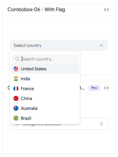
Helps users quickly identify countries visually.
Features
Country flags
Searchable country list
Great for signup/profile forms
👀 Live Preview • ⬇️ Download
Virtualized Shadcn Combobox
One of the most useful combobox implementations for large datasets.
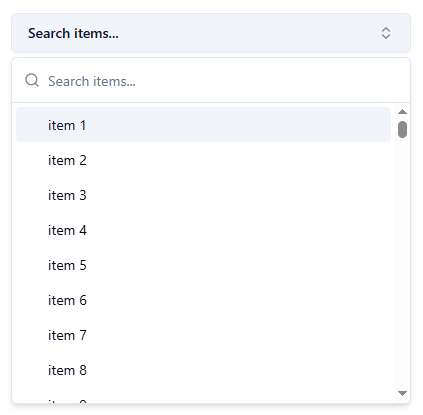
Uses virtualization for better performance when rendering many options.
Features
Virtualized list rendering
Handles large datasets efficiently
Smooth performance
👀 Live Preview • ⬇️ Download
Downshift Selection Combobox
A more advanced combobox for checkbox-style multi-select use cases.
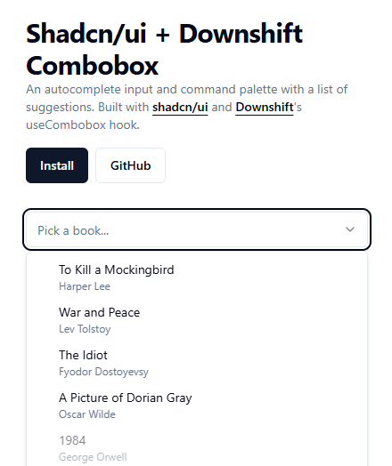
Useful when users need to select multiple items.
Features
Checkbox multi-select
Downshift powered
Great for filters/settings
👀 Live Preview • ⬇️ Download
Shadcn Linear Combobox
A combobox inspired by Linear’s task priority selector.
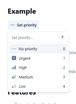
Minimal and polished UI for modern applications.
Features
Linear-inspired design
Great for priority/task selection
Modern clean UX
👀 Live Preview • ⬇️ Download
Important Notes for Using Shadcn Combobox
Small implementation details make a big difference in production.
Best Practices
Add debounce for remote search (150–300ms)
Keep option IDs stable
Show empty states like “No results found”
Validate max selections for multi-select
Increase touch targets on mobile
Support reduced motion for accessibility
FAQs
Can I Use Combobox with Large Datasets?
Yes. For smaller lists, local filtering works fine. For larger datasets, use server-side search or virtualization.
Does It Support Multi-Select?
Yes. You can implement multi-select mode where selected values appear as tags or badges.
Final Thoughts
Combobox is one of those components users appreciate when done right.
It makes large selections easier, improves usability, and gives your forms a more polished experience.
If you’re building modern React or Next.js apps, these Shadcn Combobox components can save you time and improve UX instantly.
👉 Looking for more Shadcn Combobox Components?
Browse more reusable shadcn combobox for your next project.
Built a Shadcn Combobox Component?
Share it with me on
Peerlist
LinkedIn,
Twitter,
Facebook,
Instagram.
I’d love to review it and feature it here.
Join SANJAY on Peerlist!
Join amazing folks like SANJAY and thousands of other builders on Peerlist.
0
3
0