How India’s Largest Payment App Fixed a Problem with Just a Plus Button
You’re buying a few things from a local vendor. They tell you the final amount after adding everything on their side. Nothing wrong with that, but you still want to double-check before paying. Just a quick addition to be sure.
So you do what most people do. You open your payment app, switch to the calculator, add the numbers yourself, switch back, and re-enter the total. It’s not hard. It’s just a small break in focus that happens before you make an online payment.
It’s such a normal routine that we don’t even question it anymore.
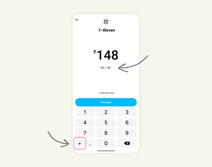
But Paytm (a popular payment app in India) questioned it. And their answer was surprisingly small: a tiny plus button on the amount entry screen.
One small action placed exactly where people need it.
Press enter or click to view image in full size
Why this tiny detail matters
Here’s the thing. Most people don’t calculate amounts before opening a payment app. The real math happens in the moment. Groceries, Fuel, Quicksplits with friends, all of it happens right there, right before tapping Pay.
The problem is that the flow gets interrupted every time users leave the app to do basic math. That switch takes them out of the task. It adds extra steps. It increases the chance of mistakes.
Paytm solved all of that without adding “features.” Just by staying aligned with human behavior.
Everything stays on one screen. The math is visible. The context stays intact. The flow stays smooth.
This is real UX gold: finding a micro-friction users have silently dealt with for years and removing it with the smallest possible change.
Exploring how far this idea could go
Once you see a simple plus button fix so much, the next question becomes obvious: what if the keypad supported a few more lightweight operations without turning into a calculator?
So I explored two directions.
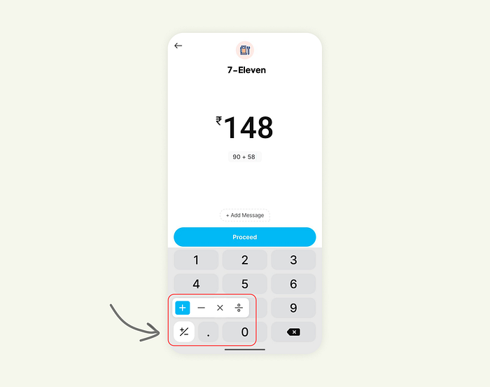
Version 1: Simple operators baked into the keypad
Add, subtract, multiply, and divide. Just enough for everyday cases like:
• quantity-based totals
• quick discounts
• partial splits
• adjusting amounts after rounding
The interface still feels familiar. It doesn’t overwhelm. It simply helps more people finish their tasks without leaving the screen.
Press enter or click to view image in full size

Version 2: Operators appear only when needed
In this version, the keypad stays minimal until the moment the user shows intent. It keeps the design clean for most users while giving power users the shortcuts they want.
It’s flexible, calm, and still focused on one thing: helping people finish the flow without breaking it.
Press enter or click to view image in full size
The bigger lesson for UX and product designers
Great UX rarely announces itself. Most of the time, it hides in tiny details that remove friction at exactly the right moment.
You don’t always need a new feature to improve a flow. Sometimes all you need is to notice where users pause, hesitate, or switch apps.
Watch those moments carefully. Map them. Fix one at a time.
The whole experience suddenly feels more thoughtful, more intuitive, and more “built for real people.”
Paytm’s little plus button is a perfect example of that.
Join Shikhil on Peerlist!
Join amazing folks like Shikhil and thousands of other builders on Peerlist.
0
7
2