The Missing “Watch Later” Button: How Small UX Gaps Create Big Friction
Why respecting user context is the ultimate growth hack — and how easily we can fix it in code.
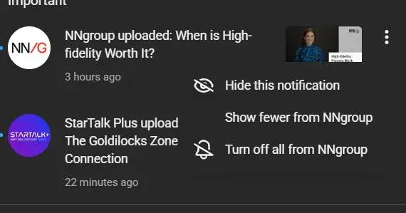
We live in an economy of interruption. Your phone buzzes. It’s a notification from YouTube. You glance down and see a video that looks incredible — maybe it’s an NN/g tutorial on high-fidelity prototyping or a StarTalk episode about the Goldilocks Zone.
But here is the catch: You are currently walking into a meeting, driving a car, or sitting at dinner. You cannot watch it now.
Naturally, you tap the three-dot menu on the notification, expecting a quick “Save to Watch Later” option. Instead, you are greeted with a list of negatives: “Hide this notification,” “Show fewer,” or “Turn off all.”
This creates a frustrating User Experience (UX) gap. The platform is asking for your attention but refusing to accept your schedule.
Let’s break down why this small UI omission is a major Human-Centered Design (HCD) failure, how it impacts product strategy, and how simple it would be to fix using a framework like Flutter.
The High Cost of Interaction
In the world of Human-Computer Interaction (HCI), we talk a lot about Interaction Cost. This is the sum of mental and physical usage effort required to reach a goal.
Right now, if you want to save that video from the notification tray, the flow looks like this:
Tap the notification (opening the app and interrupting your current context).
Wait for the video to load (spending data and time).
Locate the “Save” button below the video player.
Tap “Watch Later.”
Close the app and try to remember what you were doing before.
That is five steps and a complete context switch just to bookmark content.
If the three-dot menu included a “Save to Watch Later” option, the Interaction Cost would drop to two taps, with zero context switching. By failing to provide this affordance, the design creates friction. Friction leads to abandonment. When users feel that saving a video is too much work, they dismiss the notification — and the platform loses a view.
HCD: Respecting the User’s Context
Human-Centered Design is built on empathy. It requires us to understand not just who the user is, but where they are and what they are doing.
The current menu options (Hide, Turn Off) suggest a defensive product strategy. The algorithm assumes: “If they aren’t clicking to watch immediately, they must hate this content.”
This is a flaw in heuristics. A user ignoring a notification isn’t always a signal of disinterest; often, it’s just a signal of being busy. By offering options to suppress content but no option to defer it, the interface fails to accommodate the “Not now, but later” mental model.
A true HCD approach acknowledges that users are multitasking humans, not just metric-generating bots. Giving them a tool to curate their future consumption respects their time and actually increases the likelihood of retention.
Product Strategy: Immediate Views vs. Long-Term Value
Why hasn’t a tech giant implemented this? It likely comes down to product metrics.
In Product Development, there is often a tension between “Engagement Metrics” (time on site right now) and “Utility.” Product Managers might argue that forcing the user to open the app increases the chance they will fall down a rabbit hole and watch three videos instead of one.
However, this is short-term thinking.
The Risk: If I dismiss the notification because I can’t save it, you get 0 minutes of watch time.
The Opportunity: If I save it for later, you get a guaranteed view when I am actually in the mood to consume content.
Adding this feature isn’t just a UX fix; it is a strategic move to capture intent. It turns a fleeting notification into a planned session.
Conclusion: The Power of Micro-Interactions
Do not design for the ideal user; design for the busy one.
When we force users to jump through hoops to perform simple tasks, we erode trust. The difference between a good product and a great one often lies in these micro-interactions.
By simply adding a “Save to Watch Later” option, we can:
Reduce Interaction Cost (HCI).
Respect the user’s immediate context (HCD).
Capture deferred value that is currently being lost (Product Strategy).
It’s a small tweak, but as we know in software development, the smallest bugs cause the biggest crashes — and the smallest design fixes can lead to the biggest gains in usability.
What about you?
Have you ever rage-quit a workflow because a simple option was missing? Let me know in the comments what “simple UX fix” you wish your favorite platforms would implement today.
Join Shahzaib on Peerlist!
Join amazing folks like Shahzaib and thousands of other builders on Peerlist.
0
1
0