Do micro interactions improve UX or just distract users?
Micro interactions can improve UX when they help users understand what is happening on the screen.
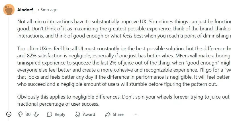
Micro interactions can improve UX when they help users understand what is happening on the screen. They distract users when they add motion without purpose. The value depends on how and why teams use them.
What micro interactions are meant to solve
Micro interactions give small visual or motion feedback for a single action. A button changes color after a click. A menu icon turns into a close icon. A form field shows a tick after valid input.
These actions answer user questions instantly. Did my click work? Is my input correct? Is the system loading or stuck?
When users get these answers fast, they feel more confident. They do not guess or repeat actions. This improves task speed and reduces errors.
How micro interactions improve usability
Good micro interactions guide users without text. They show cause and effect. When a user taps, the system responds right away. This reduces confusion.
They also reduce cognitive load. Users do not read messages or alerts. They simply see what changed. This works well for common actions like saving, loading, or toggling states.
In many real cases shared by designers, small motion made interfaces feel smoother and more human. Users understood the flow faster and felt less friction while moving through tasks.
When micro interactions turn into distractions
Micro interactions fail when they draw attention to themselves instead of the task. Too much motion pulls the eye away from what matters.
Hover animations can distract users on content heavy pages. Large or bouncy effects slow users who want to act fast. Repeated animations can feel annoying during frequent actions.
Some designers also point out that hover based effects do not work well on mobile. If most users are on touch devices, these effects add little value.
When motion delays an action or blocks content, users lose trust. At that point, the interaction hurts UX instead of helping it.
Here is a reddit expert stating that not every micro interaction needs to improve UX and that good enough design often works better than over optimizing.
Performance and load issues matter
Micro interactions rely on animation tools and code. Poor setup can cause lag, slow load time, or dropped frames.
Users notice delays more than polish. If an animation stutters, it breaks the experience. Smooth but simple feedback works better than complex motion that hurts performance.
Many teams test micro interactions only in prototypes. In real products, performance limits change the result. This makes testing on real devices critical.
Micro interactions should support the task
The key question is simple. Does this interaction help the user finish a task faster or with fewer errors? This mindset aligns closely with SaaS UX design principles, where every interaction must support clarity, speed, and task completion.
If the answer is yes, keep it. If the answer is no, remove it.
Good examples include form validation feedback, loading states, progress indicators, and clear state changes. These interactions solve real problems.
Bad examples include decorative motion with no clear meaning or animations added only to look modern.
Context decides success or failure
Micro interactions work best in focused flows. Login screens, checkout steps, settings panels, and onboarding screens benefit the most.
They matter less in reading or browsing heavy experiences. In those cases, motion can interrupt attention.
User intent also matters. A first time user may enjoy guidance. A power user wants speed and control. The same interaction can help one group and annoy another.
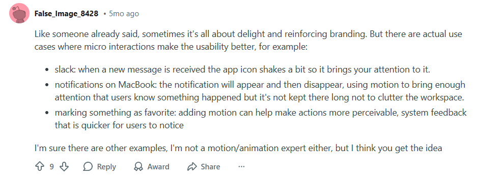
A reddit designer shared micro interactions can improve usability by guiding attention and giving clear feedback.
Testing shows the real impact
Designers often debate micro interactions based on taste. Users decide based on behavior.
Heatmaps, session recordings, and task completion data show if users hesitate, repeat actions, or abandon flows. These signals reveal if interactions help or hurt.
If users click twice, pause often, or skip features, something may distract them. If users move smoothly with fewer errors, the interaction works.
The real answer in short
Micro interactions improve UX when they explain, guide, or confirm actions. They distract users when they exist only for style.
They should feel invisible, not impressive. Users should notice the result, not the animation.
The best micro interactions do their job quietly and get out of the way.
Join Shantanu on Peerlist!
Join amazing folks like Shantanu and thousands of other builders on Peerlist.
0
0
0