SaaS Homepage Design Examples and UI Inspiration
Looking for ideas to design a high-converting SaaS homepage. This guide shares some of the best SaaS homepage design examples from top software brands. These examples show how clear messaging, smart layout, and strong CTAs help users understand the product fast and take action.
We have curated 30-plus SaaS homepage designs that focus on usability, trust, and conversions. Each example highlights a different design approach based on the product audience, industry, and goal.
This article is inspired by design insights and SaaS homepage examples originally curated by Tenet, a leading UI UX Design Agency with an externally rated 4.9 on GoodFirms and has verified client reviews on Clutch and Google (4.7 Rating).
What Makes a SaaS Homepage Important
A SaaS homepage plays a key role in your sales funnel. It is often the first page users see. It should clearly answer three questions.
• What does the product do
• Who is it for
• Why should the user care
A strong homepage builds trust, explains value fast, and guides users to sign up or book a demo. If the page feels confusing or crowded, users leave without exploring more.
Good SaaS homepages balance design and content. They use a clear headline, simple copy, and focused CTAs. Social proof, product visuals, and clean navigation help users decide quickly.
Key Elements of an Effective SaaS Homepage
Based on real SaaS design experience, these elements matter the most.
• Clear value proposition that explains the product in one line
• Strong CTAs like Start Free Trial or Book a Demo
• Feature and benefit sections that solve user problems
• Social proof such as logos, reviews, or case studies
• Product screenshots or demo videos
• Simple and clear navigation
• Fast load speed and mobile-friendly design
• SEO friendly and easy-to-scan content
These elements create a solid base for any SaaS homepage.
Best SaaS Homepage Design Examples
Figma Homepage
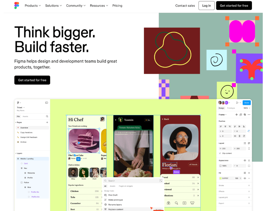
The Figma homepage focuses on real-time collaboration between designers and developers. It clearly shows how teams can create, collaborate, and move faster without switching tools or sharing files.
The layout stays clean and focused. Bold headlines like “Think bigger. Build faster.” set the tone. The hero section shows live collaboration in action, so users understand the product right away. Bright colours and product visuals add energy, while simple CTAs like Get started for free keep the flow smooth. The page feels as easy and confident as the product itself.
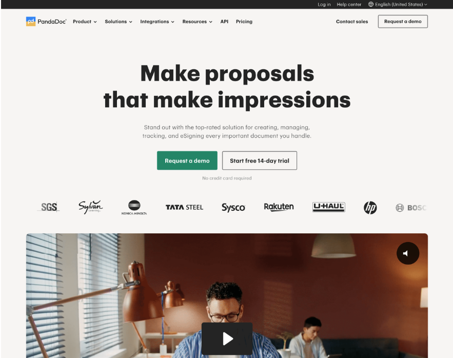
PandaDoc Homepage
The PandaDoc homepage uses a clean and professional SaaS design. It focuses on clear messaging and fast conversions. The layout feels open, with good white space and bold text that highlights the main value. It clearly tells users how PandaDoc helps them create proposals that leave a strong impression.
The hero section shows two clear CTAs, Request a demo and Start free 14 day trial. Customer logos appear right away to build trust. Below this, a short product video shows real use cases. The page then explains key benefits like document creation, eSigning, tracking, and payment management in simple sections that are easy to scan.
Loom Homepage
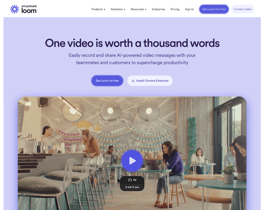
Loom’s homepage is built for instant clarity. It opens with a strong value statement, “One video is worth a thousand words,” which clearly explains what the product does. The design is clean and friendly, making it easy for new users to understand the tool.
Logos from well-known brands like Tesla, Disney, and Walmart act as strong social proof. Product previews and the Loom AI section highlight the technology behind the platform. The homepage balances trust, feature clarity, and smooth visuals, which helps drive signups and demos.
Some more examples:
Front
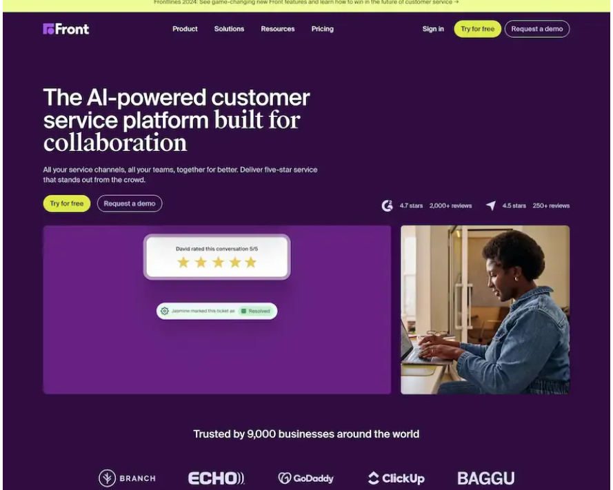
Front uses bold colours, large text, and clear CTAs like Try for free and Request a demo. The homepage explains value quickly and uses real-time stats, customer logos, and reviews to build trust. The layout is easy to scan and action-focused.
OneTrust
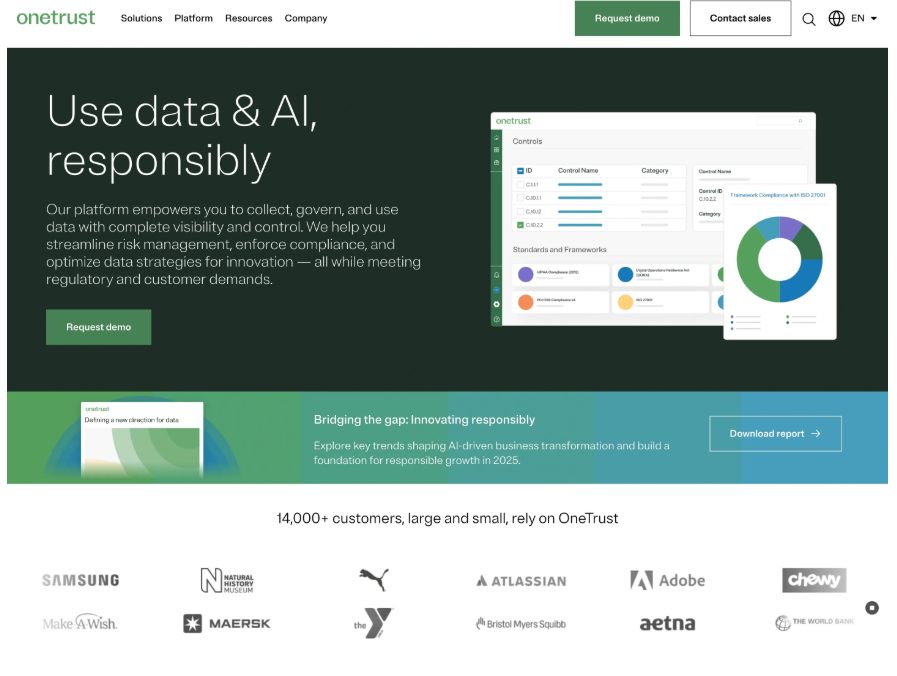
OneTrust shows how to handle complex topics like compliance and data privacy with simple visuals and clean sections. The homepage highlights real use cases and guides users with strong CTAs like Request demo and Download report.
Squarespace
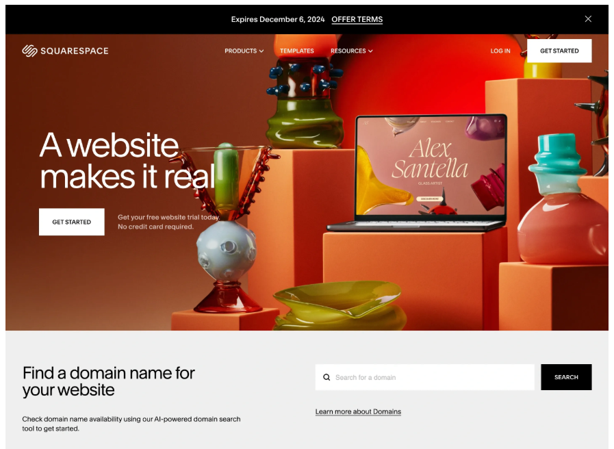
Squarespace uses bold visuals and a clear structure. The homepage opens with a strong headline and a single main action. Each section focuses on one task, like domains, templates, or online stores. The layout feels clean and conversion-driven.
Vercel
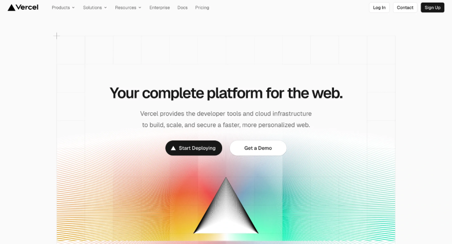
Vercel’s homepage is built for developers. It uses clean grids, sharp text, and direct CTAs like Start Deploying. Success stories from known brands add trust. The design feels fast, focused, and technical.
StackBlitz
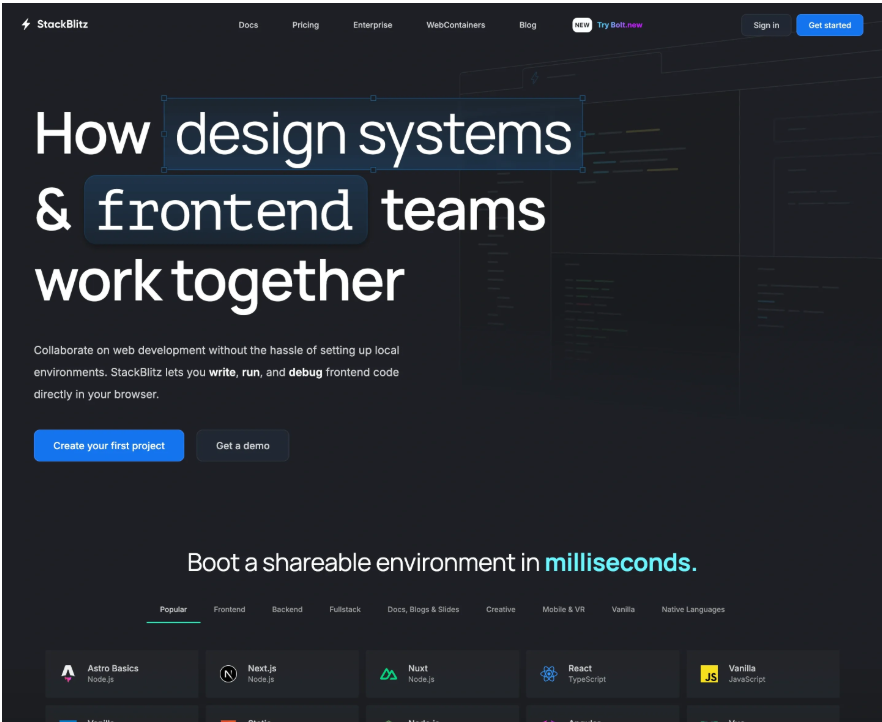
StackBlitz explains its value clearly. The homepage shows how developers can write and run code in the browser without setup. It highlights supported frameworks and one-click environments. The design supports speed and collaboration.
Bento
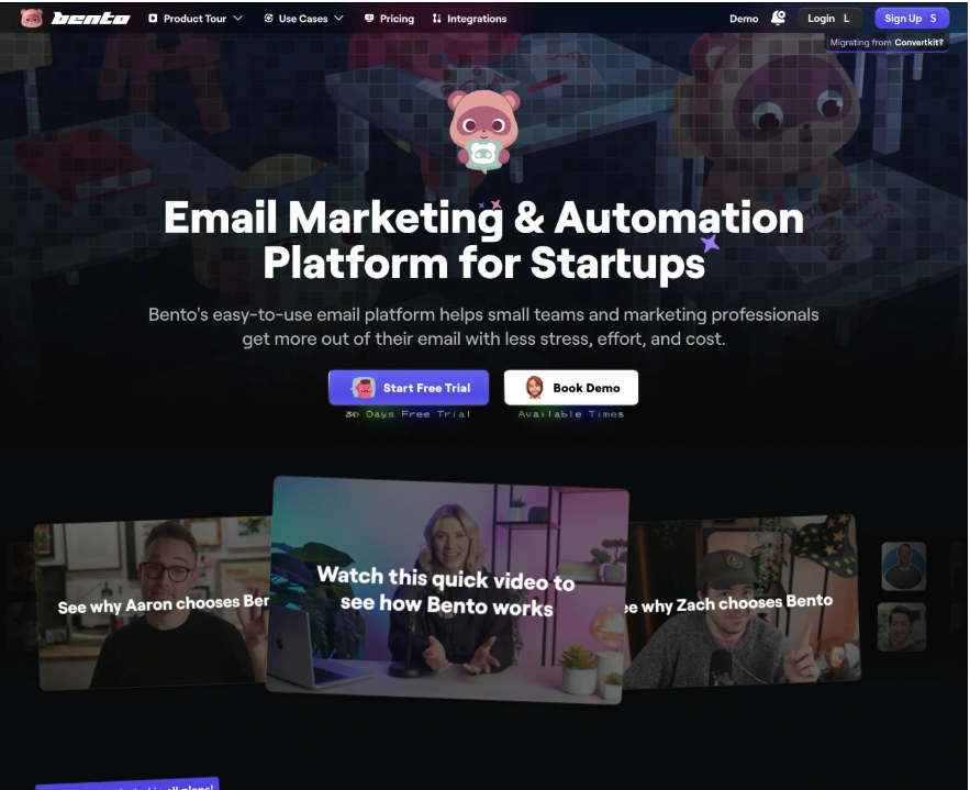
Bento uses a light dark theme with playful colours. The homepage clearly targets small teams. CTAs like Start Free Trial appear early. Features and pricing transparency help users trust the product fast.
Slite
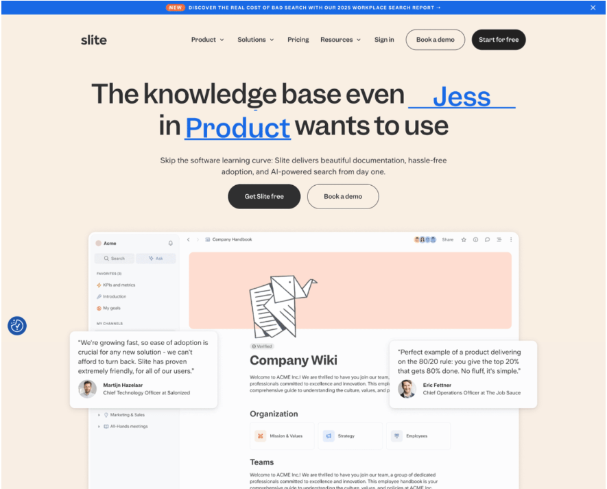
Slite focuses on calm and clarity. The homepage explains async work and team collaboration in simple words. The layout feels open and distraction-free, which matches the product promise.
MongoDB
MongoDB uses a unique visual approach. The homepage feels like a live product preview. It educates users about databases without heavy text. The design reinforces its developer-first and AI-ready positioning.
Intercom
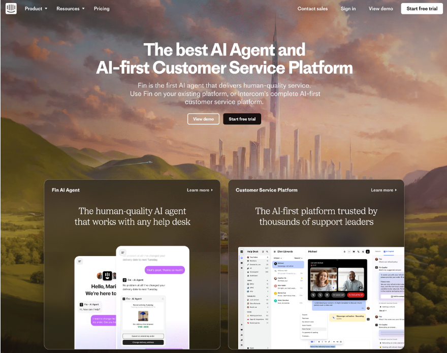
Intercom’s homepage feels bold and modern. It focuses on AI-powered support with strong visuals. The CEO's letter builds credibility. Product sections clearly explain AI Agent, Copilot, and AI Analyst.
What Designers Can Learn From These SaaS Homepage Inspirations
These SaaS homepage examples share clear design patterns that work across products and industries. Designers can use these lessons to build pages that explain value fast and drive action.
1. Lead With One Clear Message
Each homepage starts with a strong headline. It explains what the product does in one simple line. Designers should avoid trying to say everything at once. One clear message works better than many weak ones.
2. Show the Product Early
Most examples show the product in the hero section. This includes screenshots, short videos, or live UI previews. Designers should help users see the product in action within seconds.
3. Use CTAs With Clear Intent
Strong CTAs like Start free trial, Get started, or Request a demo appear early and often. Designers should make CTAs easy to spot and use action based words.
4. Build Trust Above the Fold
Logos, stats, and short testimonials appear near the top. These elements reduce doubt and help users feel safe to continue. Designers should place trust signals before asking for signups.
5. Keep Layouts Simple and Scannable
These homepages use clean sections, white space, and clear headings. Designers should break content into short blocks so users can scan without effort.
6. Match Visual Style With the Product
Developer tools use darker themes and technical visuals. Creative tools use bright colors and playful UI. Designers should align the visual tone with the target audience.
7. Guide Users Step by Step
Good SaaS homepages guide users from problem to solution to action. Designers should structure pages in a clear flow that leads users forward.
8. Focus on Benefits, Not Just Features
These pages explain how the product helps users save time, work faster, or collaborate better. Designers should support feature sections with clear benefits.
Final Words
A strong SaaS homepage plays a big role in product growth. It helps users understand the product fast and guides them to take action. The best examples focus on clear messaging, simple layouts, and strong CTAs.
These designs show that good visuals alone are not enough. Clear value, trust signals, and easy navigation matter more. When design and content work together, users feel confident to sign up or book a demo.
Designers should study these inspirations and apply the same principles to their own work. A clear and focused homepage always performs better than a complex one.
Join Shantanu on Peerlist!
Join amazing folks like Shantanu and thousands of other builders on Peerlist.
0
0
0