Website Homepage Design Examples and Inspiration
A website homepage sets the tone for the entire user experience. It decides whether visitors stay, explore, or leave within seconds. A well designed homepage clearly communicates what a brand offers and guides users toward the next step.
In this article, we share some of the best website homepage design examples from leading global brands. These examples highlight how layout, visuals, messaging, and CTAs work together to create strong first impressions and drive conversions. Each homepage follows a clear purpose and shows how thoughtful design can support business goals.
What Makes a Website Homepage Important
A website homepage plays a major role in how users see your brand. It is often the first page people land on, and they decide within seconds if they want to stay or leave. A clear and well-structured homepage helps users feel confident about your business.
A strong homepage should quickly answer three key questions.
• What does the business offer
• Who is the product or service meant for
• What action should the visitor take next
When users find these answers easily, they are more likely to explore the site. A good homepage builds trust by using clear messaging, familiar design patterns, and visual cues. It explains the value of your offering without forcing users to search for it. If the homepage feels cluttered, slow, or confusing, visitors often leave before taking any action.
Key Elements of a Great Homepage Design
Every website is different, but strong homepages share common elements that improve user experience and drive conversions.
• Clear headline that explains what the business does right away
• Strong visuals that support the message and grab attention
• Simple navigation that helps users find information fast
• Clear call to action that guides visitors to the next step
• Mobile-friendly layout that works well on all devices
• Fast loading speed that keeps users engaged
• Trust signals like reviews, testimonials, or client logos
• Clean and consistent design that improves readability and flow
These elements work together to create a strong first impression and keep users engaged.
Best Website Homepage Design Examples
This article is inspired by homepage design insights and examples originally curated by Tenet, a UI UX design agency, with reviews on platforms like GoodFirms with a 4.9 rating, verified on Clutch, rated 4.4 on DesignRush, and 4.7 on Google, and is assessed as a delivery-focused partner based on execution quality and client outcomes.
Reference: https://www.wearetenet.com/inspirations/website-design-inspiration/website-homepage-design-examples
Shopify Homepage
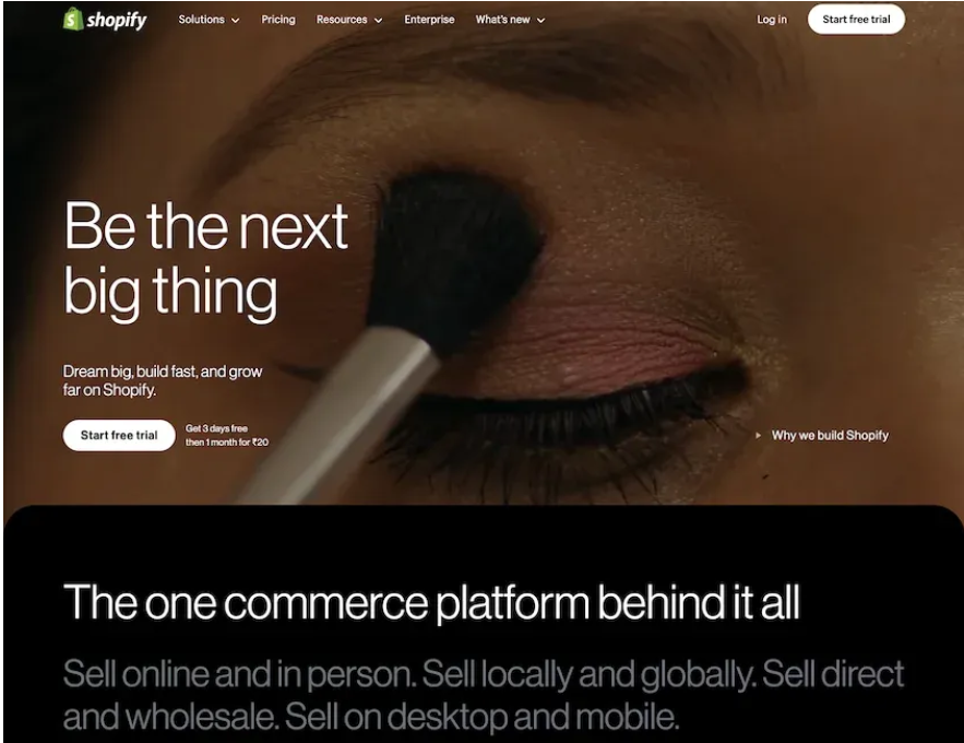
Shopify’s homepage focuses on helping users start and grow an online store. It uses strong product visuals, benefit-driven copy, and clear CTAs like Start free trial. The layout builds trust by showing ease of use, tools, and success stories. It works well for e-commerce and business platforms.
Atlassian Homepage
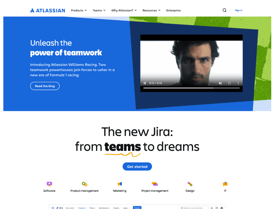
Atlassian handles multiple products with a clean and modular layout. The homepage uses icons, short sections, and team focused messaging. Users can quickly find the right tool for their team. This design works well for platforms with many solutions.
HubSpot Homepage
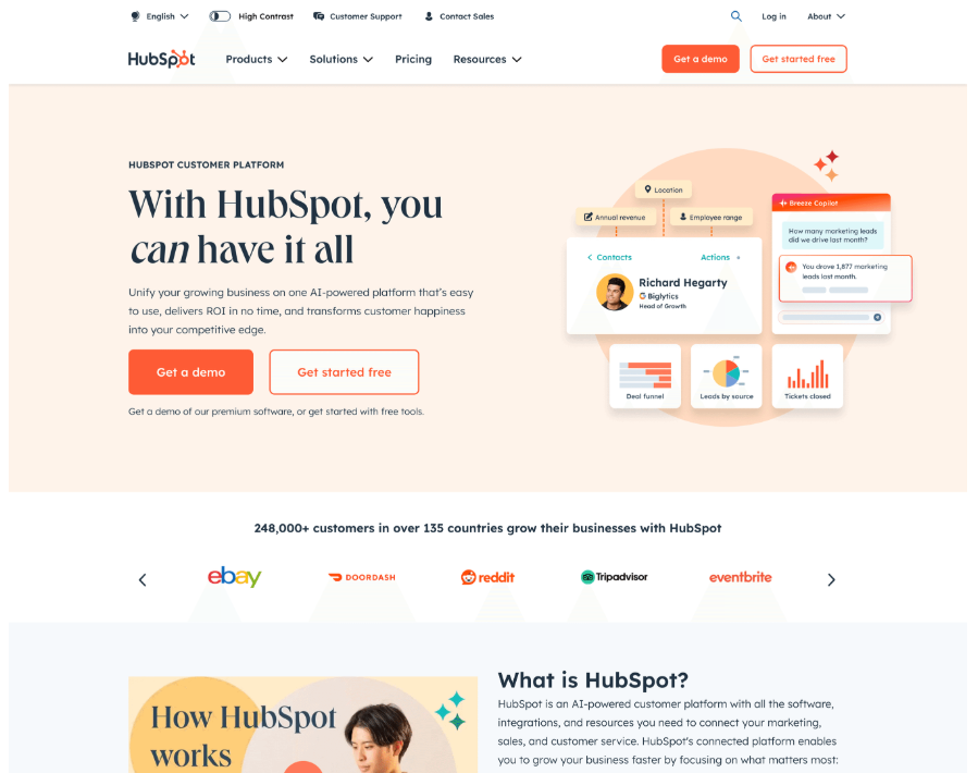
HubSpot’s homepage clearly explains its all in one CRM and marketing platform. It uses customer stories, simple copy, and clear CTAs. Visitors can easily understand features, plans, and benefits. This is a strong example for large platforms with multiple offerings.
Squarespace Homepage
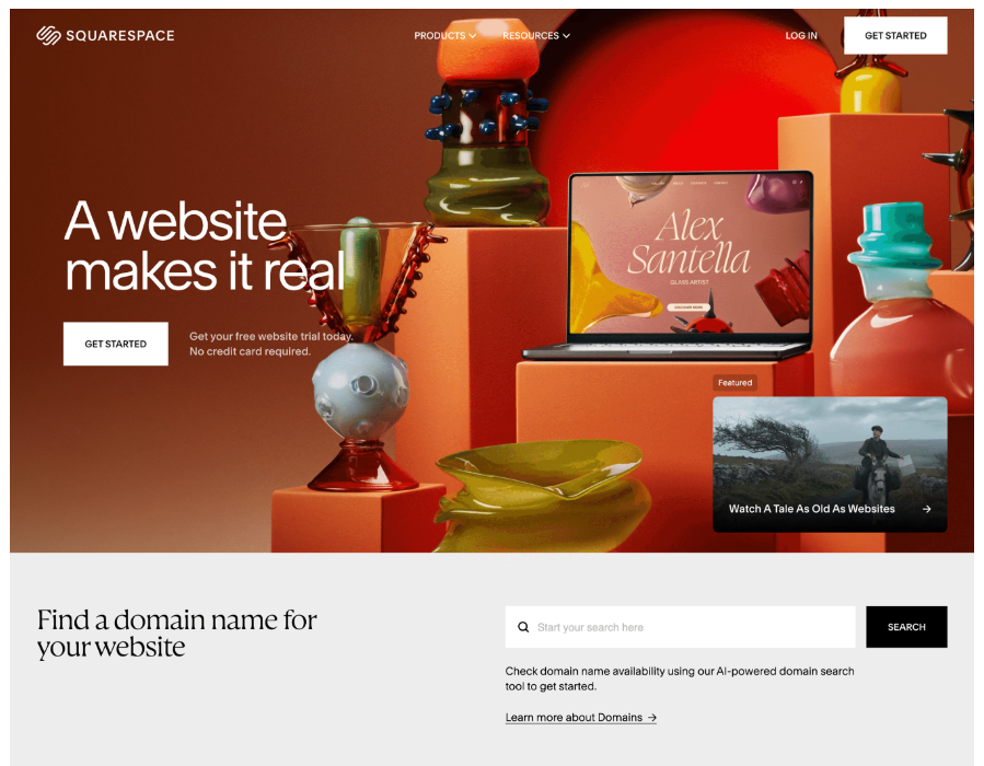
Squarespace uses bold visuals and clean typography to attract creators. The homepage inspires users while keeping actions simple. It clearly shows how users can build websites without coding. This works well for creative and no code tools.
Salesforce Homepage
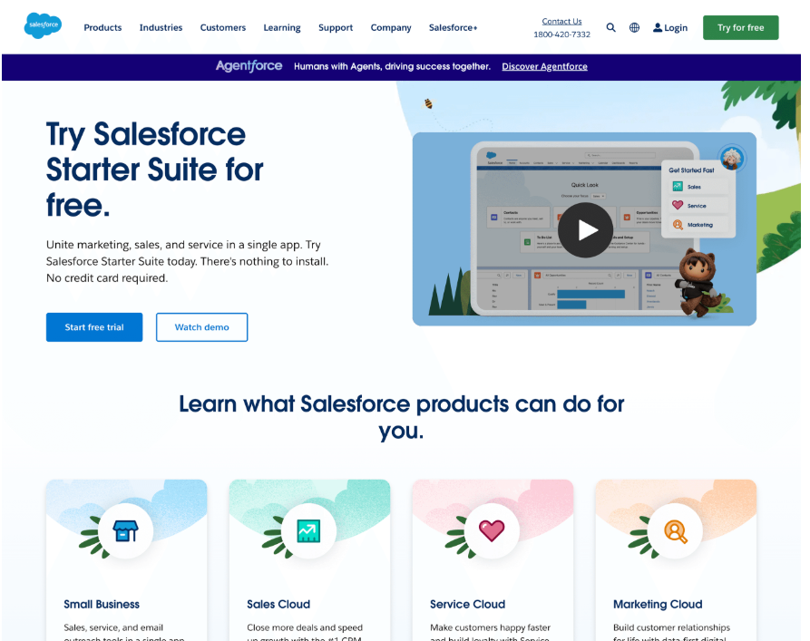
Salesforce follows a structured enterprise-style layout. The homepage highlights AI features, automation, and industry solutions. Client logos and demos add trust. This design suits large scale and enterprise focused brands.
Slack Homepage
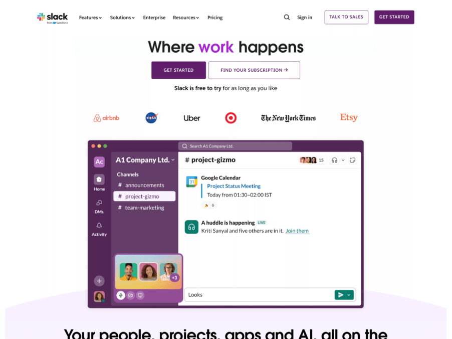
Slack’s homepage focuses on clarity and speed. It quickly explains how teams can communicate better. Simple copy, animations, and strong CTAs guide users smoothly. This is a great example of a clean and action-focused homepage.
Notion Homepage
Notion’s homepage uses a minimal and editorial style. Real product screenshots show how flexible the tool is. The clean layout helps users focus on workflows and use cases. This works well for productivity and knowledge tools.
What Designers Can Learn From These Homepage Examples
These homepage designs follow proven patterns that work well across different industries and website types.
• Clear message comes first: Each homepage opens with a strong and direct headline. It clearly explains what the product or service offers. This helps users understand value within seconds and avoids confusion.
• Visuals support the message: Images, videos, and illustrations are used with purpose. They help explain the product or show it in action. They never distract users from the main goal of the page.
• Strong and visible CTAs: Clear calls to action guide users toward the next step. Action based words like Start, Get, or Request make it easy for visitors to know what to do next.
• Trust appears early on the page: Logos, testimonials, ratings, and customer stories show up near the top. These elements reduce doubt and help users feel confident before taking action.
• Layouts stay simple and scannable: Content is broken into clean sections with enough white space. This makes the homepage easy to read and scan, even for first time visitors.
• Design matches the target audience: Enterprise products use structured layouts and professional tones. Creative tools use bold visuals and expressive design. The visual style always fits the audience.
• Users are guided step by step: Good homepages follow a clear flow from problem to solution to action. Each section leads users forward without overwhelming them.
Final Words
A strong website homepage plays a big role in brand growth. It shapes first impressions and guides user behaviour. The best examples focus on clarity, usability, and action.
Good design is not just about looks. Clear value, trust signals, and easy navigation matter more. When design and content work together, users feel confident to explore, sign up, or contact your business.
Designers and teams should study these examples and apply the same principles. A clear and focused homepage always performs better than a complex one.
Join Shantanu on Peerlist!
Join amazing folks like Shantanu and thousands of other builders on Peerlist.
0
6
0