What Is My Viewport and Why Does It Matter for Web Design
Websites do not appear the same way on every screen. The way content fits, flows, and responds depends on the visible space available in the browser. This visible space plays a major role in layout decisions, content placement, and user experience.
Understanding viewport size helps designers, developers, and marketers see websites the way real users do. Instead of guessing how a page looks on different screens, viewport data provides clarity. This article explains how viewport size works, why it matters, and how a simple tool can help you design and test websites more effectively.
What Is a Viewport
A viewport refers to the part of a website that is currently visible inside your browser window. It is not the same as screen size. Screen size is the full display of a device, while the viewport is only the area where web content appears.
For example, when you open a website on a laptop and then resize the browser window, the viewport becomes smaller or larger. The website layout reacts to this change by adjusting text, images, and sections. On mobile devices, the viewport is narrower, which is why websites stack content vertically instead of showing wide layouts.
Understanding the viewport helps teams design layouts that adapt smoothly to different viewing conditions.
Check your viewport at: https://www.wearetenet.com/tools/what-is-my-viewport
Why Viewport Size Is Important
Viewport size directly affects how users experience a website. It determines how much content appears above the fold and how easily users can interact with buttons, menus, and forms.
Knowing the viewport size helps with:
• Designing responsive layouts that adapt across devices
• Making sure key content appears without scrolling
• Testing how websites behave on small and large screens
• Improving readability by adjusting spacing and font sizes
• Preventing layout breaks on uncommon screen sizes
When viewport behaviour is ignored, websites may feel cramped on mobile or overly spaced on large screens, which can hurt usability and engagement.
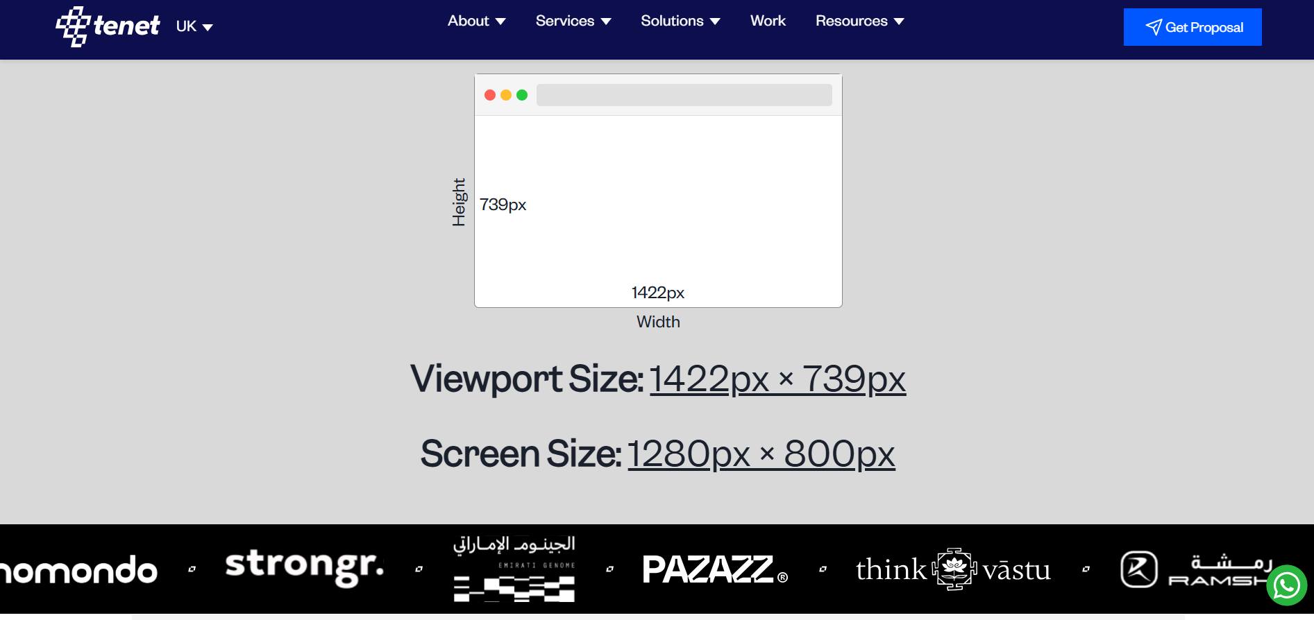
How the “What Is My Viewport” Tool Works
The What Is My Viewport tool gives instant feedback about your current viewport size. It removes guesswork and allows you to see real values instead of relying on assumptions.
Once you open the tool, it automatically detects your browser window and displays the viewport width and height. As soon as you resize the browser, the numbers update in real time. This makes it easy to test how a layout responds without switching devices or using complex tools.
The tool works directly in the browser and requires no setup or technical knowledge.
What Information Does the Tool Show
The tool displays two key measurements that matter for responsive design.
• Viewport width
This value shows how many pixels are visible from left to right inside the browser window. Designers often use this number to define layout breakpoints.
• Viewport height
This value shows how many pixels are visible from top to bottom without scrolling. It helps teams decide how much content should appear above the fold.
Together, these values give a clear picture of how much space a website has to work with at any moment.
Who Should Use a Viewport Tool
A viewport checking tool is useful for anyone involved in building, managing, or optimizing websites.
• UI and UX designers testing layouts and spacing
• Frontend developers working with responsive code
• Marketers checking headline and CTA visibility
• SEO teams reviewing mobile friendliness
• Business owners validating real user experiences
Even non-technical users can use the tool to better understand how their website appears on different screens.
How This Tool Fits Into Better Website Design
Viewport awareness is a basic requirement for modern web design. When teams understand viewport behavior, they can make better decisions about layout structure, content priority, and interaction design.
Using a viewport tool helps teams test real scenarios instead of relying on fixed screen assumptions. This leads to websites that feel consistent, usable, and comfortable across all devices.
About Tenet
Tenet provides UI UX design, website development, and growth services for global brands. The agency works on responsive design systems built for real user environments across devices. Tenet is reviewed on platforms like GoodFirms, Clutch, DesignRush, and Google, with feedback that consistently highlights execution quality, usability, and delivery reliability.
Conclusion
Understanding viewport size is essential for building websites that work well everywhere. The “What Is My Viewport” tool makes it easy to see how much space your website actually has and how layouts respond in real time.
By designing with viewport behaviour in mind, teams can create clearer, more user-friendly websites that adapt smoothly to every screen.
Join Shantanu on Peerlist!
Join amazing folks like Shantanu and thousands of other builders on Peerlist.
0
0
0