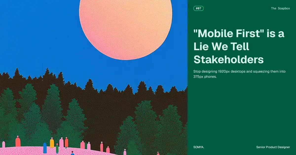
"Mobile First" is a Lie We Tell Stakeholders
Stop designing 1920px desktops and squeezing them into 375px phones.
We need to have an intervention about Mobile First.
In every kickoff meeting, we nod solemnly when the client says it. We chant it like a mantra. We put it in the brief.
Then we run back to our desks, open a glorious 1920px Figma frame, and spend two weeks designing a complex, multi-column dashboard with hover effects and delicate spacing.
Then, at 4:55 PM on Friday, panic sets it. We duplicate the art-board, shrink it to 375px, and spend twenty minutes brutally crushing our beautiful design into a single, scrolling column of sadness.
That isn't Responsive Design. That is just file compression.
We aren't designing for mobile; we are just apologising for it. Here is why your shrunken desktop approach is failing the physics of the real world.
1. The Meat Stick problem
Designers have a fixation for small, elegant icons. We love a 16px Close button with no border because it looks clean and airy on a 27-inch 4K monitor.
But a mouse cursor is a scalpel; a human thumb is a blunt instrument.
When you shrink that elegant desktop design down to mobile, you create a usability trap. If your user has to squint and peck like a bird to hit a button, you haven't designed an interface; you've designed a dexterity test.
The Reality : Apple and Google didn't pick 44pt as a standard because they like big buttons. They did the math on human biology. If your touch target is smaller than a McNugget, you are torturing your users.
2. The Pinky Gymnastics
We keep putting the Back button in the top-left corner because "that's where it goes on the websites."
On a laptop, that works. On a 6.7-inch iPhone Pro Max, the top-left corner is the Orthopaedic Danger Zone.
To reach it one-handed, I have to perform a dangerous acrobatic manoeuver where I balance a $1,200 slab of glass in my pinky finger and stretch my thumb across the screen. One slip, and my phone hits the concrete.
Stop designing for the eye and start designing for the hand. The top of the screen is for looking; the bottom is for touching.
3. Ghost UI
Clean design relies heavily on hover states. We love hiding Edit and Delete buttons until the user mouses over a row to reduce clutter.
But ghosts don't use iPhones.
There is no cursor on mobile. There is no hover. When you squeeze a desktop concept onto a phone, one of the two things happens:
The Mystery Meat : The user has to tap random whitespaces to find hidden buttons.
The Dead End : The buttons simply never appear.
If an action is important, it needs to be visible. Do not hide utility behind an interaction that doesn't exist.
4. The Tetris Fallacy
The biggest lie of responsive design is assuming that mobile users want the exact same content as desktop users, just stacked vertically.
They don't.
A desktop user is likely sitting down, analyzing data, and multitasking. A mobile user is standing in line for coffee, has 4% battery, and is distracted.
When you take a 4-column table and force it into a 1-column list, you aren't making it responsive. You are making it long. You are forcing the user to scroll through three meters of pixels to find the one data point they actually need.
Mobile first is painful because it forces you to kill your darlings. You can't have the parallax background. You can't have the 12-column grid. You barely have room for the logo.
But real design isn't about how much you can fit on the screen; it's about how much you can leave off. Stop squeezing. Start pruning.
Join Somya on Peerlist!
Join amazing folks like Somya and thousands of other builders on Peerlist.
0
3
0