10 Best Fonts Every UX Designer Should Know
Because great design starts with great typography.
Typography is more than just choosing a font — it’s about shaping the user’s experience. In UX/UI design, fonts carry the weight of readability, emotion, and hierarchy. A well-chosen typeface helps users navigate interfaces effortlessly. A poor one? It can make even the best product feel clunky or confusing.
After years of designing interfaces for mobile apps, SaaS products, and websites, I’ve narrowed down the 10 best fonts that every UX designer should keep in their toolkit. These fonts combine clarity, performance, and visual harmony — all essential for building intuitive digital experiences.
1. Inter — The UX Workhorse
Why it’s great:
Designed specifically for screens, Inter shines at both small and large sizes. It features generous line height, clear distinction between similar characters (like I and l), and supports a wide range of weights.
Perfect for: Dashboards, apps, clean minimal UI.
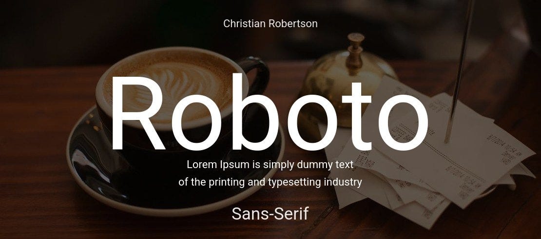
2. Roboto — Google’s UI Standard
Why it’s great:
As Android’s default typeface, Roboto is built for legibility and scale. It feels mechanical yet approachable, and it renders beautifully across devices.
Perfect for: Android apps, material design, cross-platform apps.
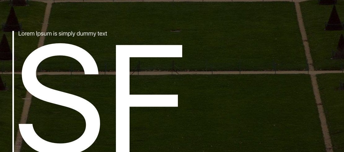
3. SF Pro — Apple’s Typography Darling
Why it’s great:
Designed by Apple, SF Pro is clean, modern, and optimally spaced for iOS/macOS. It adapts its weight and tracking dynamically to improve legibility.
Perfect for: iOS/macOS apps, Apple ecosystem designs.
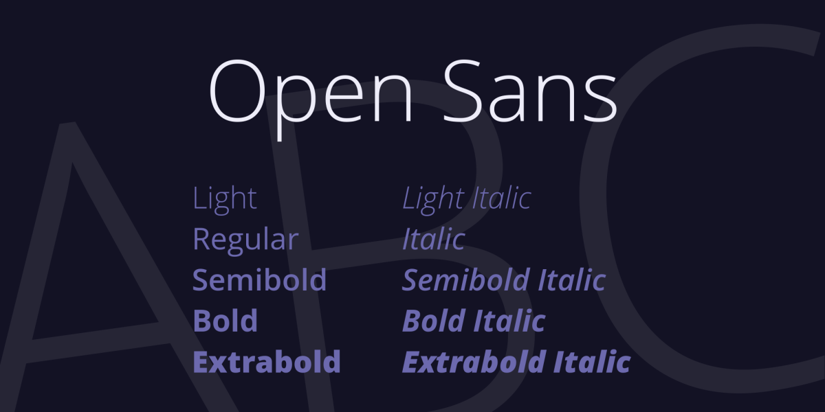
4. Open Sans — Friendly and Versatile
Why it’s great:
Open Sans strikes a balance between professional and warm. Its wide letterforms and open counters make it extremely readable on screens.
Perfect for: Web apps, forms, onboarding screens.
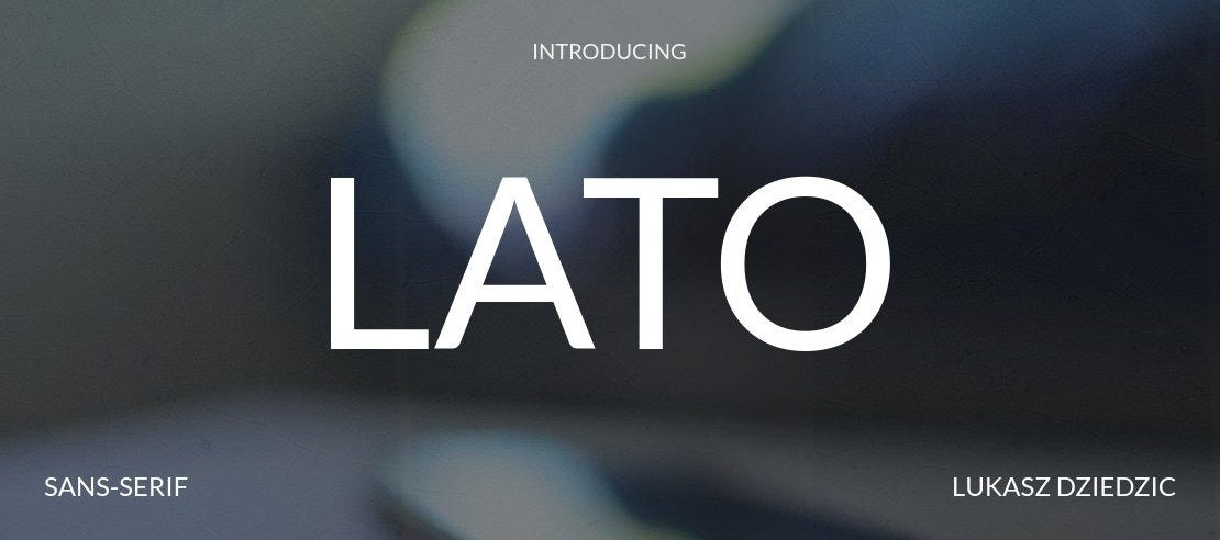
5. Lato — Clean with Character
Why it’s great:
Lato is modern but not sterile. Its semi-rounded details give it a friendly feel without losing clarity. Works great across weights.
Perfect for: Headings and body copy in apps or websites.
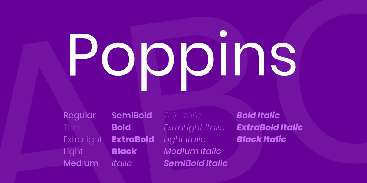
6. Poppins — Geometric and Bold
Why it’s great:
Poppins has a geometric structure that gives your design a sharp, contemporary look. It’s popular among startups and creative apps.
Perfect for: Modern landing pages, product UIs with a bold visual style.
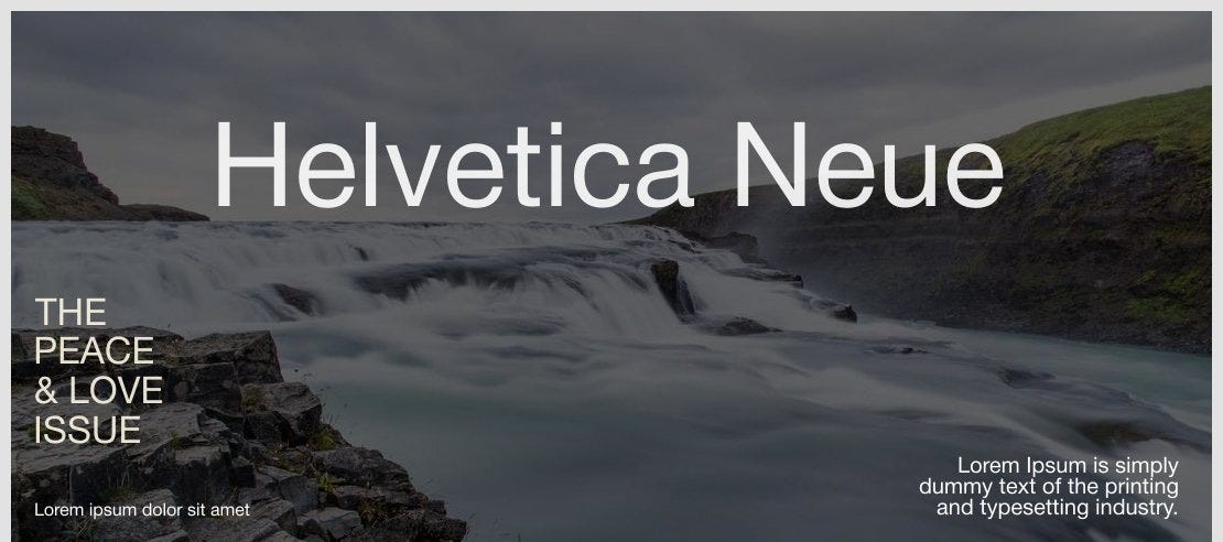
7. Helvetica Neue — The Classic Choice
Why it’s great:
Despite its age, Helvetica Neue remains a go-to for designers seeking timeless elegance. Just be mindful of licensing restrictions.
Perfect for: Minimalist UIs, brand-heavy experiences.
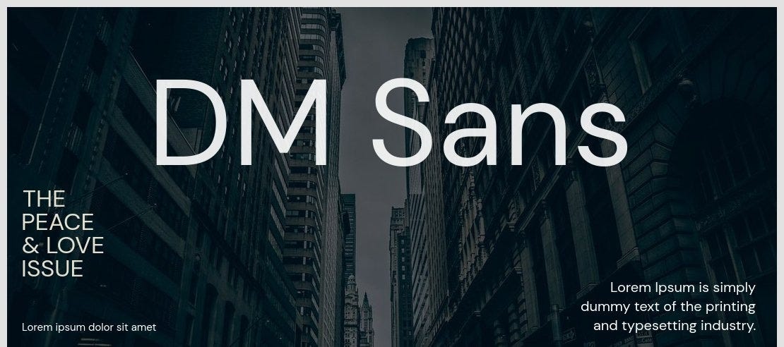
8. DM Sans — Simplicity at Its Best
Why it’s great:
A relatively newer font that’s growing fast in popularity. It’s soft, neutral, and performs well in digital interfaces.
Perfect for: Mobile-first UIs, fintech, and modern SaaS.
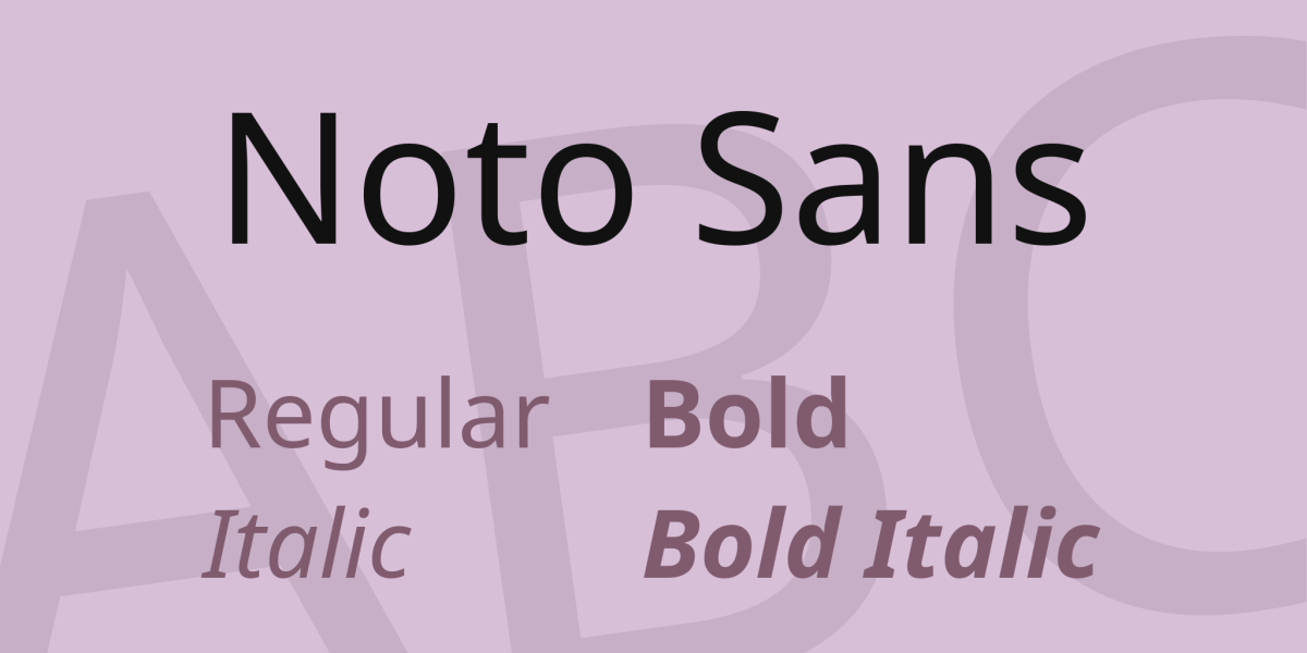
9. Noto Sans — Multilingual Hero
Why it’s great:
Noto Sans supports over 1,000 languages. If you’re designing for global users, this font helps ensure consistent rendering across all scripts.
Perfect for: International apps, accessibility-focused designs.
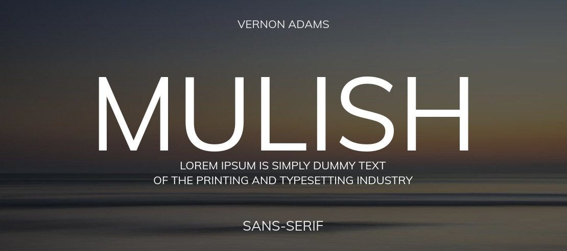
10. Mulish — Lightweight and Elegant
Why it’s great:
Mulish is a smooth, minimal typeface that works beautifully for clean, breathable layouts. Great for startups and modern UI.
Perfect for: SaaS dashboards, minimalist mobile apps.
Choosing the Right Font: Quick Tips
Prioritize legibility over style — especially for body text.
Use font pairings to create hierarchy (e.g., Poppins for headers, Inter for body).
Consider performance — some fonts are more optimized for web loading than others.
Think about language support if you’re designing for a global audience.
Bonus UX Font Tips:
For body text: Inter, Roboto, or Open Sans offer the best legibility at small sizes.
For headings: Poppins, Lato, or SF Pro add just enough personality while keeping things clean.
For multi-language products: Noto Sans or IBM Plex Sans ensure wide character support.
Avoid decorative or overly stylized fonts in core UI unless it’s for branding elements only.
Final Thoughts
Typography in UX isn’t about flash — it’s about function and feeling. Choosing the right font can drastically improve how users interact with your product. The fonts listed here are not just beautiful — they’re battle-tested in real-world digital products.
Whether you’re wireframing a new app or polishing a landing page, let your typography do more than just look good — let it solve problems.
Join Sumon on Peerlist!
Join amazing folks like Sumon and thousands of other builders on Peerlist.
0
17
1