Behind the Screens: A Story of Website Design & Development
A Story of Iteration, Misalignment, and Patience
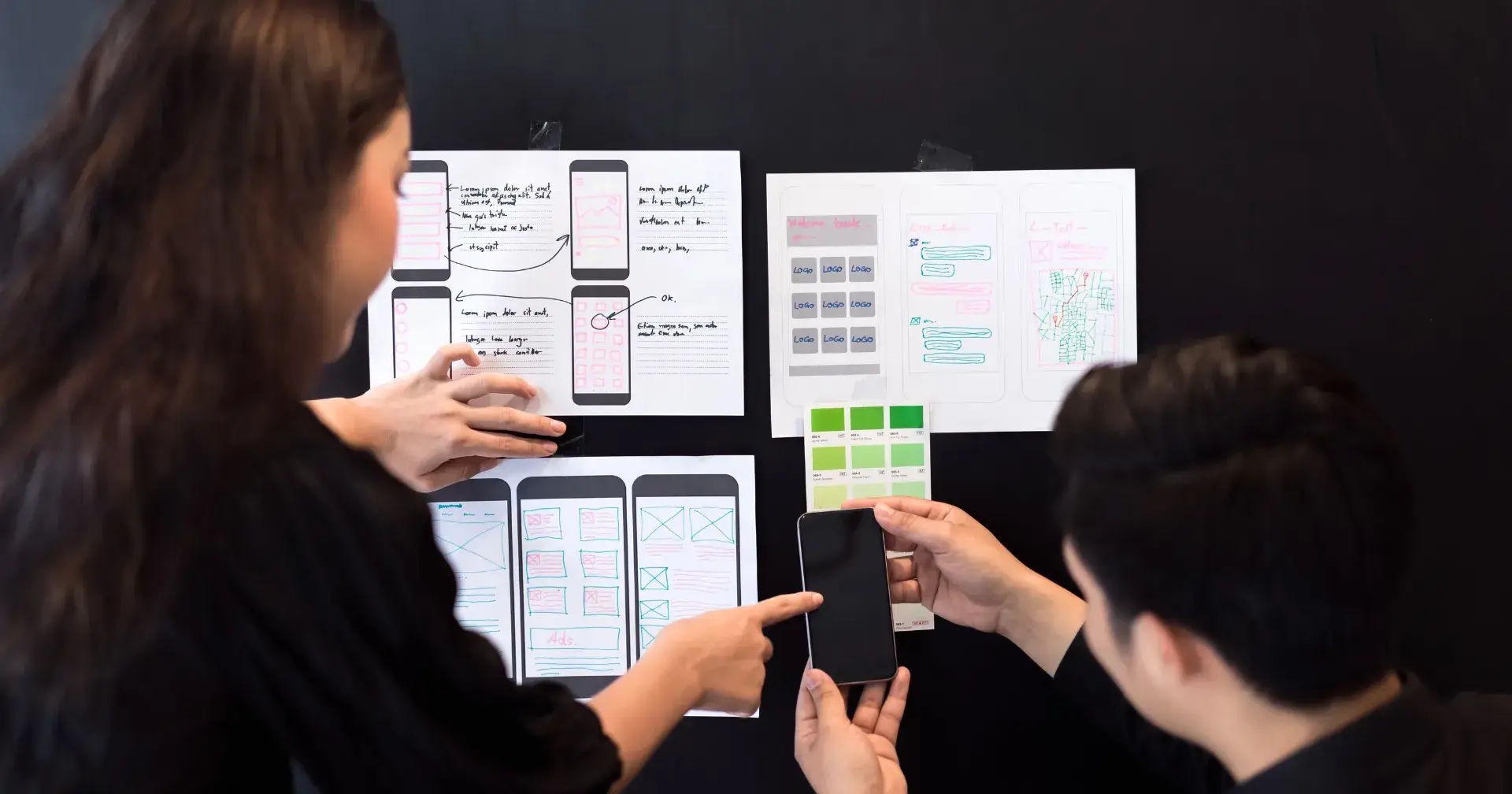
I still remember this project vividly. It started with a simple ask: “We need a website.”
The client wasn’t fully sure what they wanted, but after our first few conversations, it felt like an e-commerce requirement. So, my team and I got to work. We designed a clean, elegant layout — focused on usability, visual appeal, and conversion.
It looked promising. The kind of first iteration you feel quietly proud of.
But here’s the catch with design projects: sometimes the ground beneath your feet shifts. And in this project, it shifted a lot.
When the Goalpost Moves
Not long after presenting the first version, the client came back with a realization:
Their real priority wasn’t selling products. It was educating users.
That single shift changed everything.
The tone had to move from “shop now” to “learn with us.”
The layout had to highlight content, not products.
The visual identity needed a softer, academic voice.
And just when we thought we had adapted, another twist appeared:
The client requested a monochromatic theme.
If you’ve ever worked on balancing educational clarity with minimalist monotones, you know it’s like walking a tightrope. Every iteration felt like trying to satisfy two opposing personalities in one brand.
The Stakeholder Rollercoaster
At first, the client told us they were the sole decision-maker. Great, I thought — one voice, one direction.
But then, more voices entered the room.
Stakeholder 1 wanted dark tones, bold animations, and “punchy” transitions. The exact opposite of the client’s request for soft, pastel aesthetics.
After weeks of back-and-forth, Stakeholder 1 walked away. Enters Stakeholder 2, who loved our very first iteration. Ironically, they pushed us back to nearly the same designs we started with.
Then Stakeholder 2 left as well — after suggesting major navigation changes.
It felt like running a marathon, only to be told the finish line had been moved… three times.
When Design vs. Usability Collides
Some of the requested design changes directly clashed with usability best practices.
We flagged issues:
Navigation confusion
Visual clutter
CTAs misplaced in ways that broke the flow
We explained, advised, and cautioned. But at times, the client insisted on moving ahead with their vision.
And just as we predicted, those very issues surfaced post-development. Users got lost, CTAs were overlooked, and the overall experience suffered.
That was a turning point. The client realized first-hand why UX concerns aren’t optional — they’re essential.
What We Delivered (Despite It All)
Despite the chaos, we did manage to create a platform that:
Balanced education + commerce in one functional experience
Built a scalable navigation system to support future content
Established our role not just as executors, but as trusted UX advisors
It wasn’t a straight road, but the destination was worth it.
Lessons That Will Stay With Me
Every messy project leaves behind clarity for the next one. Here are mine:
Alignment is Everything
Stakeholder alignment before execution is non-negotiable. Otherwise, work will keep looping back.Early UX Feedback Saves Time
Many usability issues could have been avoided had feedback been addressed before development.UX is a Voice, Not a Checkbox
When usability advice is ignored, the product suffers. This project proved — painfully — that UX warnings should never be optional.
Where We Go From Here
The story isn’t over yet. We’re currently helping the client:
Fix critical usability pain points
Re-align visual consistency across the site
Build a flexible design system so future pivots don’t mean starting over
It has been a journey of patience, persistence, and persuasion. But that’s what design really is — not just making things beautiful, but guiding people through uncertainty toward clarity.
And if there’s one takeaway I’d leave fellow designers with, it’s this:
The hardest part of UX isn’t the design tools. It’s aligning humans.
Join Tamanna on Peerlist!
Join amazing folks like Tamanna and thousands of other builders on Peerlist.
0
10
0