

11+ Shadcn Badge Components Examples and Best Practices
A curated collection of Shadcn UI components, examples, and patterns for building scalable React applications in 2026.
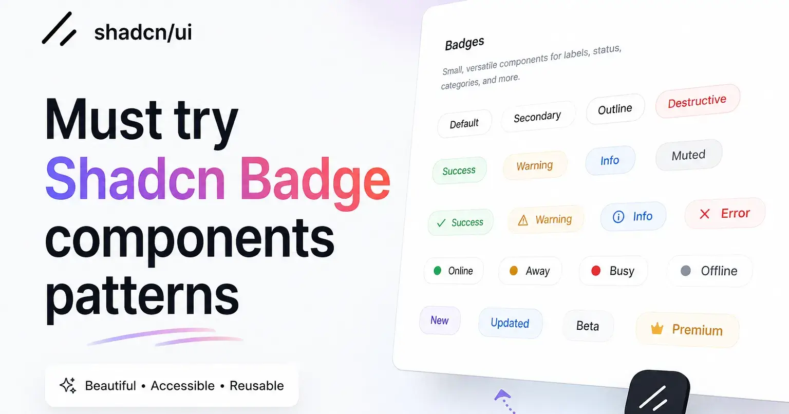
Badges look like a five-minute job until you ship them into a real product. You drop a small label next to an avatar, add a count on a notification icon, and call it done. Then the edge cases show up.
The count breaks past 99 and stretches the circle into an oval. The status color goes muddy in dark mode. The icon spacing collapses inside a flex row, and the screen reader announces nothing useful.
I have rebuilt the same badge logic across dashboards, admin panels, and SaaS apps more times than I want to admit. Each time it started as one tiny element and turned into a pile of conditional classes. So I started treating badges as a small system instead of a throwaway tag, and the maintenance time dropped fast.
Why You Can Trust This List
Most badge roundups paste a snippet and move on. They skip the parts that break once real data hits the screen. This list works differently because each variant was checked against the conditions that actually matter in production.
Here is what I evaluated each badge against:
Real UI usage. How it holds up inside tables, cards, tabs, and notification icons, not just an isolated demo.
Dark mode behavior. Whether the contrast stays readable when the background flips.
Accessibility. Keyboard reachability and screen reader output for status meaning.
Icon alignment. Whether the icon and label share a baseline without manual margin patches.
React and Next.js compatibility. Clean rendering without hydration warnings.
That is the filter. If a variant failed those checks, it did not make the list.
What is a Shadcn Badge?
A Shadcn badge component is a small inline element that carries one piece of context: a status, a count, a label, or a tag. It sits next to buttons, tabs, cards, avatars, and table rows. The job is to communicate state at a glance without adding a full sentence to your interface.
The difference here is ownership. The component code lives inside your project, not behind a locked package. You import a variant, then change color, radius, padding, or behavior using the same Tailwind classes you already write.
That ownership matters once your app grows past a demo. These badges are built on semantic HTML and accessible patterns. A status badge that reads “Failed” should announce its meaning to assistive tech, not just paint a red pill on the screen.
How Shadcn Badge Can Help Developers
Most badge snippets look clean in isolation and fall apart in a real layout. They ignore dark mode, skip focus states, or assume the text never changes length. You end up patching the same problems on every screen.
Here is what you actually get with this approach:
Full code ownership. The variant lives in your repo, so you extend it without forking a library.
Tailwind-native styling. Color, spacing, and radius use utility classes you already know.
Accessible by default. Built on semantic markup with keyboard and screen reader support in mind.
Framework-ready. Renders directly inside React and Next.js without hydration warnings.
Composable. Drops into buttons, tabs, cards, tables, and avatars without spacing hacks.
Animation support. Pairs with Framer Motion for state transitions like pending to success.
That last point is where most copied snippets quit. A badge that animates from “Pending” to “Success” needs controlled state and a clean transition, not a hard color swap that flickers on re-render.
Installation
Every variant follows a direct copy-paste approach through the Shadcn CLI. You run one command, the component lands in your project, and you own it from there.
Here is the pnpm command for a single variant:
pnpm dlx shadcn@latest add @shadcn-space/badge-01You can run the same install with the other package managers using their own CLI syntax:
npx shadcn@latest add @shadcn-space/badge-01
yarn dlx shadcn@latest add @shadcn-space/badge-01
bunx --bun shadcn@latest add @shadcn-space/badge-01
Every variant is free, supports both Radix UI and Base UI, and is built on React, Next.js, Tailwind CSS, and Framer Motion. Pick the variant you need, install it, and customize the rest in your editor.
Best Shadcn Badge Components and Examples
Each badge below comes with its real use case and the exact situation it fits. They are meant to drop in without rebuilding the spacing or color logic yourself.
Default
The Default badge is your baseline label for neutral information that needs visual weight without color signaling. It uses solid background fill with balanced padding, so the text stays readable at small sizes and inside dense rows. You reach for this when the content is informational rather than a status alert, like a plan tier or a category name. Getting its padding and radius right early saves rework, since this is the variant you reuse most.
Tagging a content type like “Article” or “Guide”
Marking a user role such as “Admin” or “Editor”
Showing a plan tier next to a pricing card
Labeling a feature group inside settings
Adding a quiet identifier next to a list item
Best for: Neutral labels that need presence without a status color.
Count
The Count badge shows a number tied to an element, like unread messages or pending items in a queue. The hard part is not the styling, it is handling overflow when the value passes 99 and keeping the circle from stretching into an oval. This variant keeps the shape stable and the number centered, so a “9” and a “99+” both stay clean. You attach it to icons, tabs, or menu items where the number itself is the message.
Unread notification count on a bell icon
Cart item total in an e-commerce header
Pending approvals inside an admin tab
New message count in a chat sidebar
Open ticket count on a support dashboard
Best for: Numeric indicators on icons, tabs, and menu items.
Outline
The Outline badge swaps the solid fill for a bordered style, which lowers visual weight when you have several badges in one view. Solid badges fight for attention once you stack three or four in a table row. This variant keeps the label readable while staying quiet, so it works for secondary tags that support the main content. You use it when the badge adds context but should not pull the eye first.
Secondary tags on a blog post card
Optional filters in a search interface
Metadata like “Draft” next to a primary status
Low-priority labels inside a data table
Grouping markers that should stay subtle
Best for: Secondary tags that should stay quiet in busy layouts.
With Icon
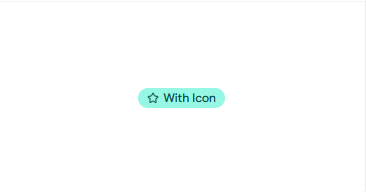
The With Icon badge strong text pairs a small icon with text, using inline alignment so the icon and label share a baseline without manual margin fixes. Icon spacing inside a pill is where most custom badges break, leaving the icon too high or crowded against the text. This variant handles inline-start and inline-end placement cleanly, so the icon reads as part of the label. You use it when an icon makes the meaning faster to scan than text alone.
A verified checkmark next to a username
A lock icon on a restricted feature label
A star marking a featured or pinned item
A shield icon on a security or account setting
A bookmark on a saved content marker
Best for: Labels where an icon speeds up recognition.
Link
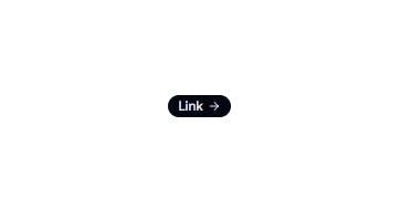
The Link badge renders as an anchor while keeping the badge shape, so a tag can navigate without looking like a button. The common mistake is wrapping a badge in an <a> and losing the focus ring or hover state. This variant keeps the link accessible, with proper focus styling and hover feedback, so keyboard users can reach it. You use it when a tag should route somewhere, like a category that filters a page or a documentation reference.
A category tag that links to its archive
A documentation reference in a developer portal
A topic tag that opens a filtered list
A “View details” marker inside a card
An external resource link in a knowledge base
Best for: Tags that need to navigate while staying badge-shaped.
Error
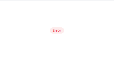
The Error badge signals a failed or blocked state using a destructive color that holds enough contrast in both light and dark mode. A red badge that looks fine on white often turns muddy on a dark background, which weakens the warning. This variant keeps the contrast consistent across themes, so the alert reads clearly either way. You use it for states the user should not miss, like a rejected payment or a validation failure.
A failed payment status in a billing table
A rejected submission label in a queue
A blocked account marker in user management
A validation error tag on a form field
An expired status on a credential or token
Best for: Destructive states that must stay visible in any theme.
Success
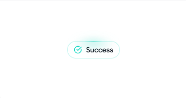
The Success badge marks a completed or healthy state with a green tone that stays legible without shouting. Status colors only work if they are readable, and a pale green on white often fails that test. This variant balances the fill and text contrast, so “Active” or “Completed” reads at a glance inside dense lists. You use it to confirm positive states across dashboards and tables.
An “Active” status in a subscription list
A “Paid” label in an invoice table
A “Completed” marker on a task row
A “Verified” tag on an account
A “Healthy” indicator on a service status page
Best for: Confirming positive or completed states clearly.
Icon Badge

The Icon Badge combines an icon with a label to provide faster visual recognition and context. The icon helps users identify meaning at a glance while the text reinforces clarity. This variant is especially useful when representing categories, priorities, features, or system states where visual cues improve scanning and comprehension.
A verified badge with a checkmark icon on a user profile
A security badge with a shield icon in account settings
A premium badge with a star icon on subscription plans
A warning badge with an alert icon in a monitoring dashboard
A feature badge with a lightning icon highlighting new functionality
Best for: Labeling UI elements where icons improve visual scanning.
Pending
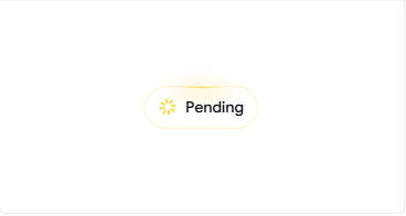
The Pending badge represents an in-progress state, often paired with a subtle motion cue so the user knows something is still working. A static “Pending” label can read as stuck rather than active. This variant supports a spinner or animated dot through Framer Motion, so the in-progress state feels live without distracting the user. You use it for states that resolve over time, like a processing job or an awaiting-review item.
A “Processing” tag during a payment flow
An “Awaiting review” status in moderation
A “Syncing” label on a data integration
A “Queued” marker on a background job
An “In progress” tag on a multi-step task
Best for: In-progress states that need a live, working feel.
Failed
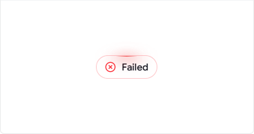
The Failed badge marks an action that did not complete, distinct from Error so you can separate a hard block from a retryable failure. Using one red badge for everything hides useful detail from the user. This variant gives failed operations their own clear state, which pairs well with a retry action nearby. You use it for operations that ran and did not finish, like a failed upload or a dropped job.
A failed file upload in a media manager
A dropped background job in a worker queue
A failed webhook delivery in an integrations panel
A failed build status in a deploy log
A failed sync attempt on a connected account
Best for: Retryable operation failures that need their own state.
Link Badge

The Link badge marks content that navigates users to another page, resource, or external destination. It provides a compact way to indicate that an item is clickable while keeping the interface clean and scannable. Unlike buttons that trigger actions, Link badges focus on navigation and discovery. They work well inside tables, cards, lists, and status panels where users may need quick access to related information.
A documentation link in a developer portal
A customer profile link in a CRM table
A project details link in a dashboard card
A release notes link in a product update panel
An external resource link in a knowledge base
Best for: Navigating to other pages or external sites.
FAQs
1. How do I add a notification count badge on an icon in a Next.js app without breaking hydration?
Render the Shadcn badge as a client-aware element and keep the count value stable between server and client. Hydration warnings usually come from a count that differs on first paint, so pass the initial value as a prop and update it after mount. The Count variant keeps the shape fixed when the number changes, so a value moving from “9” to “99+” will not shift your icon layout.
2. Which Shadcn badge variant should I use for a status column in a data table with light and dark mode?
Match the variant to the meaning, not just the color. Use Success for healthy states, Pending for in-progress rows, Error for blocked states, and Failed for actions that ran and did not finish. Each one keeps its contrast across light and dark mode, so your status column stays readable without per-theme overrides.
3. Can I animate a Shadcn badge from a pending state to a success state without a flicker on re-render?
Yes, and the trick is controlled state plus a real transition. Drive the badge with a status value in state, then let Framer Motion handle the color and content change instead of swapping classes directly. The Pending and Success variants transition between states cleanly, so the change reads as a smooth update rather than a hard repaint.
Conclusion
Badges are small, but they carry a lot of the state your interface communicates. The reason they cause repeat work is simple: most snippets only solve the demo case. They skip count overflow, dark mode contrast, icon alignment, focus states, and live status transitions.
The variants here map to the states you actually ship. Neutral labels, counts, secondary tags, icon labels, navigation tags, and four distinct status types. Because the code lives in your project, you extend each one with the Tailwind classes you already use, and you pair Pending and Success with Framer Motion when a state needs to feel live.
Pick the variant that matches your use case, install it with your package manager of choice, and adjust the styling in your editor. Treat badges as a small system instead of a one-off. You stop rebuilding the same logic on every new screen, and that is time you get back on the next feature.

Join Vaibhav on Peerlist!
Join amazing folks like Vaibhav and thousands of other builders on Peerlist.
0
1
0