

22+ Shadcn Card Components You'll Want to Copy
Discover beautiful Shadcn card components with copy-ready code. Perfect for dashboards, SaaS, pricing, profiles, stats, and eCommerce UIs.
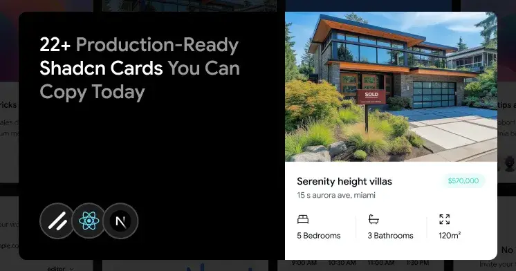
Cards look easy until you build the tenth one by hand. You start with a clean title and a body, then a product manager asks for a metric delta, a hover reveal, a footer action, and an empty state, all on the same screen. Soon, you are rewriting the same layout logic across dashboards, product grids, and onboarding flows.
I built this list to skip that loop. Every Shadcn Card below maps to a real product problem, not a design demo. You copy the one that matches the job, drop it into your React or Next.js project, and move on.
What is a Shadcn Card?
A Shadcn Card is a grouped content container built from composable parts. It groups related data into a single block: title, description, media, action, and footer, so the interface stays scannable and easy to maintain.
The structure is what makes it useful. Instead of a single rigid component with fixed props, you get small pieces you can arrange yourself. That means a product tile, a KPI widget, and a booking form can share the same base without forcing three custom layouts.
These cards fit modern React stacks. They work in Next.js projects with Tailwind styling and support both Radix UI and Base UI primitives, which matters once keyboard behavior and accessibility become part of the build.
Why Card Components Are Useful
Raw content without structure turns dashboards into noise. Forms blur into product lists, and metrics get lost in long blocks of text. A card draws a clear boundary around a single idea, so your users can scan rather than read.
Here is what you actually get when cards are composable:
Clear sections: CardHeader, CardTitle, CardDescription, CardContent, CardAction, and CardFooter keep the layout predictable.
Free composition: drop in buttons, badges, avatars, charts, or menus without fighting fixed styles.
Accessible markup: semantic headings and sections that map to ARIA roles.
Grid-friendly layouts: stack on mobile, split into columns on desktop, no rewrite needed.
Low overhead: lightweight markup that holds up when a dashboard renders 30 cards at once.
That is the reason cards keep showing up in SaaS, admin panels, and content-heavy apps. They solved the structural problem once.
Developer checklist before you use these cards
Most card problems show up in production, not in the demo. Run this checklist before you ship any of the variants below.
Confirm Tailwind CSS is installed and configured in your project.
Match the card variant to the user task, not just the visual style.
Keep one primary action per card when you can.
Reuse the same spacing, typography, and state tokens across the full grid.
Test keyboard focus, hover states, and empty states before launch.
Load real data early so the layout breaks the surface before production.
Check dark mode if your app supports it, since contrast often fails there first.
Card Composition
Use the following composition to build a Card:
Card
├── CardHeader
│   ├── CardTitle
│   ├── CardDescription
│   └── CardAction
├── CardContent
└── CardFooter
Stick to this tree, and your cards stay consistent. The header carries identity and quick actions; the content holds the body, and the footer holds primary actions like save, submit, or purchase.
How to Install
The setup follows a copy-paste approach through the Shadcn CLI. Instead of pulling an opaque package, the CLI copies readable code straight into your codebase, so you own and edit every line.
pnpm
pnpm dlx shadcn@latest add @shadcn-space/card-01npm
npx shadcn@latest add @shadcn-space/card-01yarn
yarn dlx shadcn@latest add @shadcn-space/card-01bun
bunx shadcn@latest add @shadcn-space/card-01Several cards also ship with copy-prompt support. You copy the prompt and paste it into V0, Lovable, or Bolt to generate the card inside your AI workflow. If you build with agents, the Shadcn MCP server connects tools like Cursor, Claude Code, and VS Code to real component data, so the generated UI uses actual props and variants instead of guesses.
Every card is built on React, Next.js, and Tailwind CSS. Some use Framer Motion for animation and Radix/Base UI for primitives.
Best Shadcn Card Components
Each Shadcn card component below solves a specific UI problem. They are built to be dropped into production apps.
Ecommerce Product Variant Card
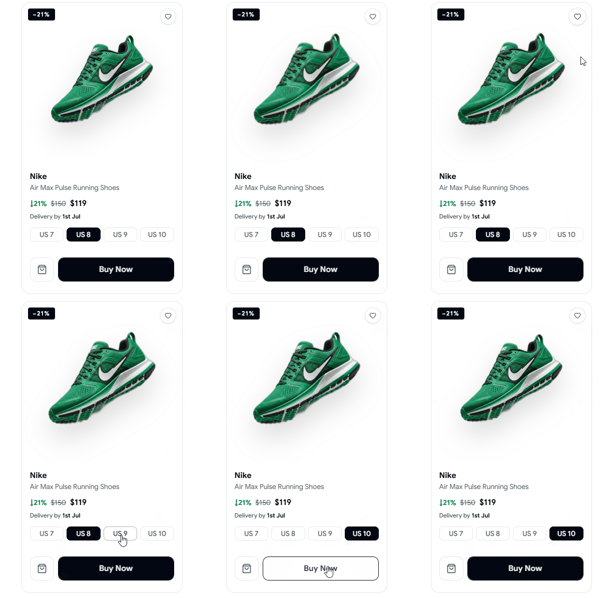
Variant selection breaks when sizes and discounts live in separate spots. This card shows a discount badge, product name, price drop, delivery estimate, and selectable size options in one block. It keeps the buying decision contained. You use it on product pages where variant choice happens inline.
Use cases
Product detail pages
Size and option selection
Discount-driven tiles
Fast checkout previews
Variant comparison blocks
Best for: Product variant selection.
Explore Ecommerce Product Variant Card
Article Preview Card
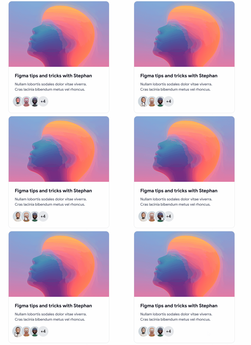
Editorial grids fall apart when every post needs a custom layout. This card fixes that with a fixed skim path: title, excerpt, media preview, and compact action icons in one block. It reads fast in a grid, which is exactly what content discovery needs. You drop it into a feed, and the hierarchy stays the same across every post.
Use cases
Blog index pages
Editorial and news feeds
Author content grids
Related posts sections
Content discovery layouts
Best for: Blog feeds and editorial content grids.
Form Card
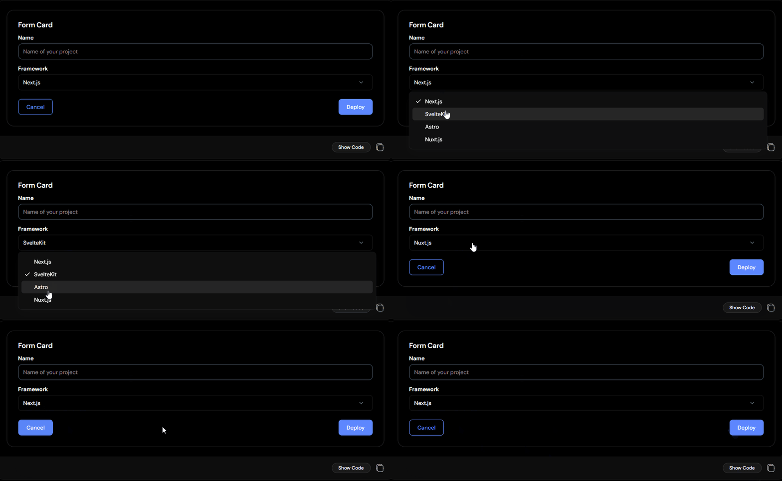
Forms scattered across a page feel unfinished. This card groups inputs, labels, and a framework selected inside CardContent, then puts Cancel and Deploy in the footer. The structure keeps related fields together and gives the user a clear submit path. You get a settings panel or a project setup screen without having to build wrapper logic.
Use cases
Project creation flows
Account settings panels
Deployment configuration
Single-step input groups
Inline edit forms
Best for: Settings panels and project setup screens.
Preview Card
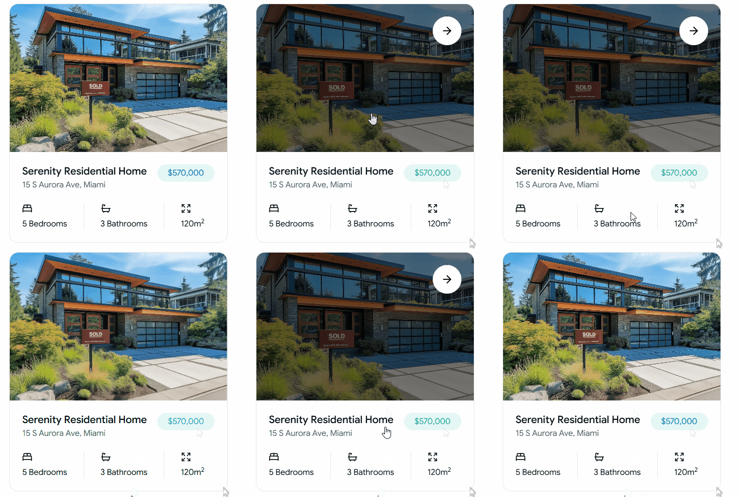
Listing screens need fast comparison, not long descriptions. This card leads with a hero image, then stacks location, price, and feature counts in a tight block. The layout works when a user scans ten items in a row and needs the key facts up front. You reuse it across catalogs without redesigning each tile.
Use cases
Real estate listings
Catalog item tiles
Property comparison grids
Marketplace previews
Search result cards
Best for: Catalog and listing previews.
Read the full article here

Join Vaibhav on Peerlist!
Join amazing folks like Vaibhav and thousands of other builders on Peerlist.
0
1
0