30+ Top Shadcn Components for React/Next.js Developers
Enhance your web design with ShadCN components. Customizable and responsive UI solutions for developers. Get started today!

When building a React application, developers often repeat the same UI work. Buttons, forms, cards, dashboards, charts, and loaders – most of these components already follow common patterns.
The real challenge is not building them. The challenge is to build them fast, keep them customizable, and avoid heavy UI dependencies. This is where the Shadcn component libraries and ecosystem became popular among developers.
Instead of installing a UI library that controls your styling and architecture, these components follow a copy-paste architecture. Developers add the component directly to their project and modify the source code as needed.
This approach works well for teams that want:
full control over the component code
predictable accessibility behavior
Tailwind-first styling
flexible design systems
What are Shadcn Components?
Shadcn components are a set of reusable React UI components that developers add directly into their project code rather than installing them as a traditional UI library dependency. This copy‑paste model gives you full ownership of the component’s source code, allowing you to freely customize its structure, styles, and logic.
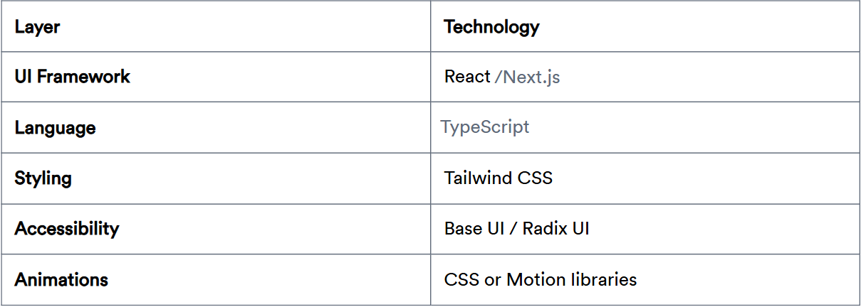
They are built with React and styled using Tailwind CSS, often using Radix UI or Base UI primitives for accessible interactions.
This means no heavy external UI frameworks controlling the design or architecture.
Key advantages:
Full ownership of component source code
Tailwind‑first styling
Predictable accessibility
Easy customization without waiting for library updates
Developer Implementation Checklist
Before integrating these components into a project:
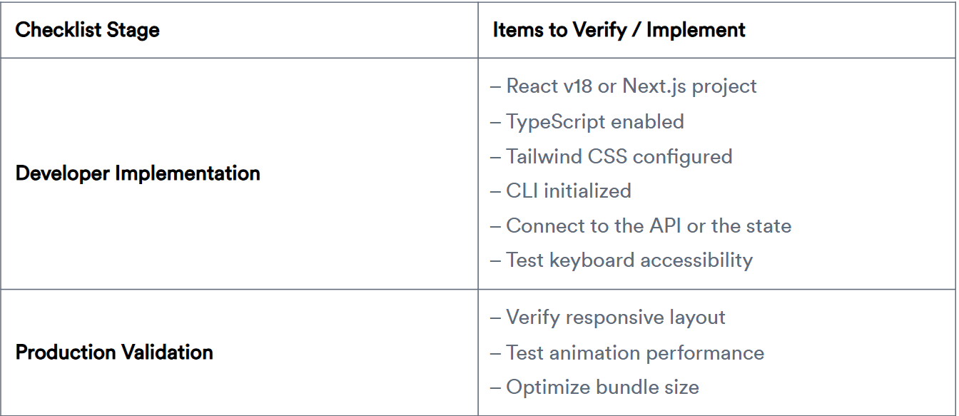
Tech stack used across most components
Most components in this ecosystem follow a consistent frontend architecture.
This stack keeps components lightweight and easy to integrate into existing React projects.
Installing components using CLI
Developers usually install these components using a CLI command.
The CLI can be executed with pnpm, npm, yarn, or bun, depending on the project’s package manager.
Initialize the project:
pnpm dlx shadcn@latest initThis command configures project dependencies and sets up utilities and CSS variables required by the components.
You can also run the same command using different package managers:
npx shadcn@latest init
yarn dlx shadcn@latest init
bunx shadcn@latest init
For more information and clarity, visit our official get-started guide for the CLI.
Add a component
Once the project is initialized, you can install a specific component using:
pnpm dlx shadcn@latest add buttonThe CLI automatically:
installs required dependencies
creates the component files
places them inside the project structure
This works the same way with other package managers:
npx shadcn@latest add button
yarn dlx shadcn@latest add button
bunx shadcn@latest add button
Developers can also install multiple components or all available components using CLI commands.
Top Shadcn UI Components
Explore a curated set of 30+ practical, production‑ready UI components that power modern dashboards, tools, and interfaces.
Marquee Component

A Marquee component renders continuously scrolling content across the screen, typically used for logos, announcements, or feature highlights. It creates a smooth infinite loop animation that keeps content moving without user interaction. Developers can control scroll direction, speed, and pause-on-hover behavior using simple React logic and Tailwind utilities. It’s lightweight and ideal for adding motion to otherwise static sections.
Use cases
Display partner or client logos
Scrolling announcements or updates
Product feature highlights
Testimonials carousel alternative
Tech stack showcase
Best for: Continuously displaying repeated content in a compact animated section.
Animated Text Component

Animated Text enhances typography by adding motion effects such as typing, shimmer, gradient, or rolling. It helps developers emphasize headings, highlight calls to action, or create engaging hero sections. The component supports letter-level or word-level animation control and integrates smoothly with React rendering cycles. It’s designed to keep animation lightweight while maintaining accessibility.
Use cases
Hero section headlines
Interactive landing page slogans
Loading or system messages
Feature highlights
Animated call-to-action text
Best for: Creating dynamic headings and attention-grabbing typography.
Form Wizard Component

Form Wizard divides complex forms into multiple sequential steps. This improves usability when collecting large amounts of data. Developers can validate each step independently before proceeding. The result is a smoother user experience.
Use cases
Onboarding flows
Registration processes
Checkout steps
Multi-step surveys
Application forms
Best for: Handling large forms in a structured, step-by-step manner.
Calendar Component

This open-source Shadcn calendar component provides a fully interactive date selection interface for modern web applications. Developers can implement single-date, multiple-selection, or date-range pickers. It integrates seamlessly with form handling and state management. Accessibility and keyboard navigation are supported by default.
Use cases
Booking systems
Event scheduling
Project timelines
Date filtering in dashboards
Reservation forms
Best for: Applications that require structured date input and scheduling workflows.
Apple Dock Component

Apple Dock replicates the interactive dock effect seen in macOS, where icons scale when hovered. It provides a visually engaging way to display actions or navigation items. Built using smooth hover animations, it improves discoverability while maintaining a clean UI layout. Developers often use it for product demos or portfolio sites.
Use cases
Portfolio navigation
Interactive feature navigation
Product showcase menus
Developer tool launchers
Creative landing pages
Best for: Building highly interactive icon-based navigation.
Read the full article here
Join Vaibhav on Peerlist!
Join amazing folks like Vaibhav and thousands of other builders on Peerlist.
0
8
0