9+ Best Free Shadcn Date Picker Components for React and Next.js in 2026

Most modern apps require date pickers – from SaaS dashboards and booking systems to analytics filters and admin panels.
We tested and reviewed 9 free Shadcn date picker components from real repositories and component libraries. This list focuses on real developer needs, such as timezone handling, date ranges, form integration, and production readiness.
This guide is based on actual component code, GitHub activity, TypeScript support, and integration with React and Next.js.
How We Tested These Components
We installed and tested each react date picker in a modern Next.js App Router project to verify real-world compatibility.
We validated every component for:
Installation inside Next.js App Router
Tested with strict TypeScript mode enabled
Controlled and uncontrolled usage patterns
Integration with react-hook-form
Date range and datetime behavior
Timezone handling (where supported)
SSR and hydration safety
Dependency footprint (react-day-picker, date-fns, etc.)
GitHub activity and maintenance status
We only included components that are actively maintained, reusable, and production-ready.
All components listed here are 100% free and open source.
Across the list, you’ll find support for three primary selection modes:
Date Picker – Select a single calendar date
Date & Time Picker -Allows selection of both date and time
Date Range Picker – Select a start and end date
When you should use a Shadcn date picker
Shadcn date pickers are ideal for:
SaaS analytics dashboards for filtering data by date
Booking and scheduling systems – for single or range date selection
Admin panels with reporting filters
Financial tools that analyze data-based metrics
CRM systems that track activity history
Any application already using shadcn/ui and Tailwind CSS
How to Choose the Right Date Picker
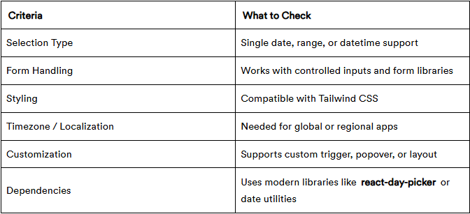
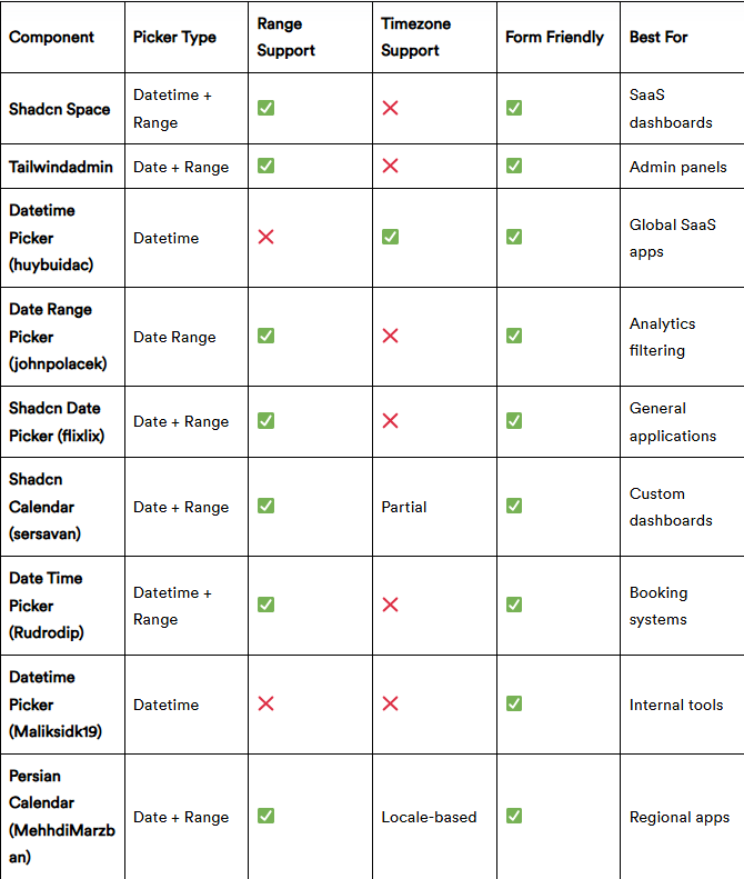
Quick Comparison Table
If you prefer a quick overview before diving into implementation details, here’s a side-by-side comparison:
Best Free Shadcn Date Picker Components
Below is a curated list of free, production-ready Shadcn date picker components. Each component has been thoroughly tested for integration with React, Next.js, TypeScript, and Tailwind CSS.
Shadcn Space Date Picker
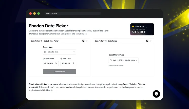
This collection provides multiple ready-to-use date picker components built specifically for shadcn/ui projects. It includes standard date pickers, calendar popovers, and form-integrated pickers. All components follow shadcn component architecture, making them easy to integrate into existing projects.
Tech stack: ShadcnUI v3.5, Base UI v1, React v19, TypeScript v5, Tailwind CSS v4
Last Updated: Feb 2026
Key features:
Includes calendar, popover, and input-based picker patterns
Uses composable shadcn component structure
Clean TypeScript component implementation
Supports form integration with controlled inputs
Compatible with Next.js server and client components
Best for: SaaS dashboards, admin panels, and internal tools
Tailwindadmin Shadcn Date Picker
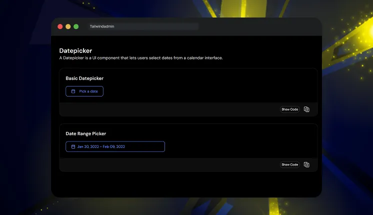
This component provides production-ready date picker examples used in real dashboard interfaces. It includes calendar dropdown picker and input-based picker implementations. The code follows modular patterns suitable for scalable dashboard systems.
Tech stack: ShadcnUI v3.5, Next.js v16, React v19, TypeScript v5, Tailwind CSS v4
Last Updated: Feb 2026
Key features:
Dashboard-focused picker UI patterns
Modular component separation
Clean Tailwind utility usage
Designed for analytics and reporting filters
Works well inside complex form systems
Best for: Admin dashboards and analytics interfaces
Read full article here
Join Vaibhav on Peerlist!
Join amazing folks like Vaibhav and thousands of other builders on Peerlist.
0
8
0