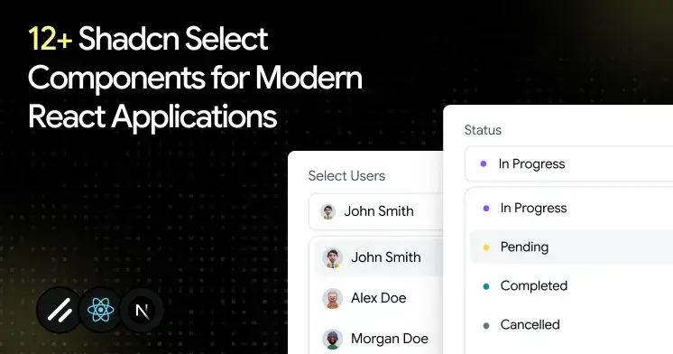
12+ Best Shadcn Select Examples for React & Next.js Apps
Explore modern Shadcn Select examples for React projects. Get inspiration for dropdown menus, forms, filters, and user settings.
A broken select rarely looks broken. It looks fine until a user tabs into it and focus disappears, or the pop-up opens off-screen on a laptop, or a form submits with an empty value because validation never fired. Small bug, big trust problem.
That is why select deserves more thought than most developers give it. You build it once, then it sits inside signup, settings, filters, and dashboards for years. If the base is weak, every screen that uses it inherits the weakness.
This guide walks you through the best shadcn select examples built for real React and Next.js apps.
What is Shadcn Select?
Shadcn Select is a dropdown input that shows a list of options for the user to pick from, triggered by a button. The official shadcn/ui docs describe it that way, and they ship docs for both Radix UI and Base UI primitives.
The difference from older libraries is ownership. The component code lands inside your repo, so you read it, style it, and debug it without fighting a black box.
Accessibility behaviors, such as keyboard navigation and focus handling, come from the underlying Radix UI or Base UI primitives. You start on solid ground, then shape the rest with Tailwind CSS.
Why Select is one of the most used UI patterns
A select does one job well: it lets a user pick one value from many without flooding the screen. That single job shows up almost everywhere you build.
Signup forms need a role or country. Dashboards need status and date filters. Settings panels need a timezone and a language. Each of these is a select waiting to happen.
It also keeps the layout tight. Ten radio buttons eat vertical space, while one trigger and a clean pop-up stay compact. And because the chosen value reads as a simple string or array, it slots into form libraries and validation without extra glue code.
That mix of small footprint and strong form fit is why a React select component shows up in nearly every product I touch.
How these Select components were evaluated
Each select component was evaluated on more than just design. The following criteria were used to ensure they meet the demands of real-world applications:
Install Once, Copy-Paste Everywhere
Every pattern here installs through the Shadcn CLI. You can use pnpm, npm, yarn, or bun, so it fits whatever your team already runs. The flow is a direct copy-paste approach, which means the source code lands in your project and you own every line.
Here is one sample install command for pnpm:
pnpm dlx shadcn@latest add @shadcn-space/select-01Swap the package manager prefix for your setup, and the rest stays the same. The patterns support both Radix UI and Base UI, and they were built with React, Next.js, Tailwind CSS, and Framer Motion.
Best Shadcn Select components and examples
Explore a curated collection of Shadcn select components, patterns, and real-world examples.
Required Select
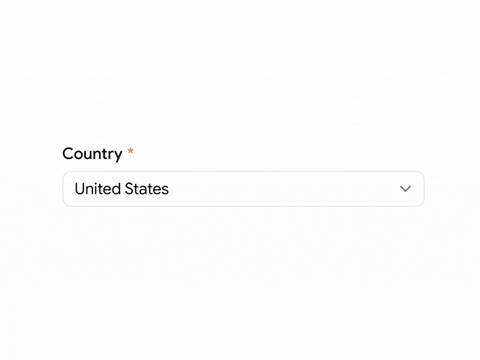
This is the field a user cannot skip, so it displays a required indicator and ties into validation to prevent an empty submission. You own the placeholder and the error state, since the logic sits in your code rather than an external wrapper. Keyboard users move through one trigger into a clean list, with focus returning to the trigger on close.
Use cases:
Signup forms that need a mandatory country
Checkout flows requiring a shipping region
Account setup with a required role
Survey steps that block empty answers
Booking forms need a chosen service type
Best for: Forms where one field must not be left blank.
Select with Icon
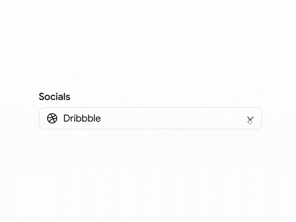
This pattern places a leading icon beside each option, which cuts the time a user spends telling similar labels apart. Icons help most when the text alone is ambiguous, like social platforms or file types. You manage the icon set, so the trigger shows the selected icon and label together, and the state stays obvious at a glance.
Use cases:
Social account pickers with brand marks
File type selectors in upload tools
Payment method choices with card logos
Category filters that need a visual tag
Integration pickers in developer dashboards
Best for: Choices where a visual cue reads faster than text.
Read the full article here
Join Vaibhav on Peerlist!
Join amazing folks like Vaibhav and thousands of other builders on Peerlist.
0
3
1