Top React Animation UI Component Libraries
Explore top-rated animated UI component libraries for seamless web designs. Perfect for developers looking to enhance UI/UX.

Animations help developers explain UI state changes, guide user focus, and improve interaction clarity. Instead of writing complex animation logic from scratch, many teams now use animated UI component libraries built for React.
This guide reviews 6 React animation component libraries based on GitHub repositories, documentation, and real developer adoption.
We evaluated these libraries based on:
GitHub stars and community adoption
Number of components and animation patterns
Tech stack compatibility with React ecosystems
Update activity and repository maintenance
Developer workflow (copy-paste vs package install)
All libraries in this list are open source and actively used in modern React projects.
What are Animated UI Component Libraries?
Animated UI component libraries are collections of prebuilt React components that include motion and interaction effects.
Instead of building animations manually with CSS or JavaScript, developers can reuse components like:
Animated buttons
Hover cards
Animated backgrounds
Loading states
Hero section animations
Most modern libraries use Framer Motion or CSS animations and follow a copy-paste component model, allowing developers to edit the code directly in their project. This approach gives full control over styling and behavior.
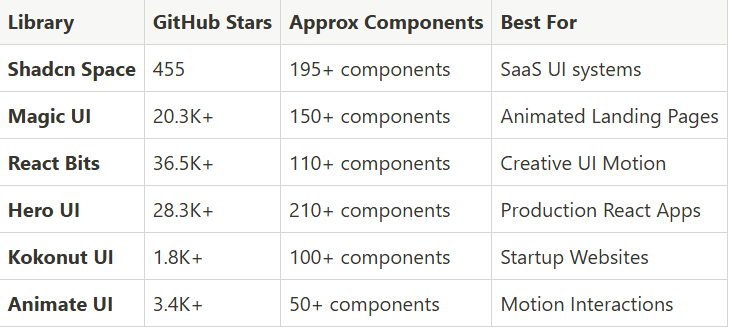
Quick comparison of top React Animated UI Libraries
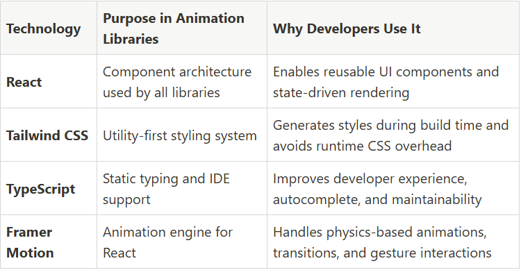
Core tech stack used by most libraries
Most React animation libraries use a similar modern frontend stack. Understanding this helps developers check framework compatibility and integration effort before choosing a library.
Shadcn Space
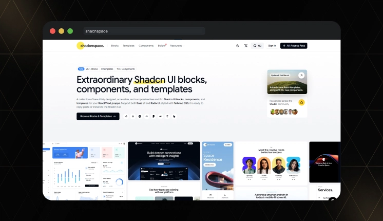
Shadcn Space is part of the Shadcn ecosystem, offering reusable shadcn blocks and animated components. It follows a copy-paste architecture, encouraging developers to insert components directly into their codebase rather than installing heavy packages.
GitHub Stars: 455
Key Features:
195+ reusable UI components
250+ UI blocks for pages and sections
Supports Radix and Base UI Primitives
CLI support for component installation
Figma Files Included
Common Use Cases:
SaaS dashboards
Admin panels
Developer tools UI
Analytics interfaces
Magic UI

Magic UI is an open-source animated component library focused on visually rich UI patterns. It includes effects such as animated beams, glowing borders, and dynamic backgrounds. The library allows developers to copy-paste components directly into their React or Next.js applications.
GitHub Stars: 20.3K+
Key Features:
150+ animation components
CLI installation tool
Animated hero sections
Gradient and beam effects
Minimal dependency structure
Common Use Cases:
Startup landing pages
Product marketing websites
Developer portfolios
React Bits
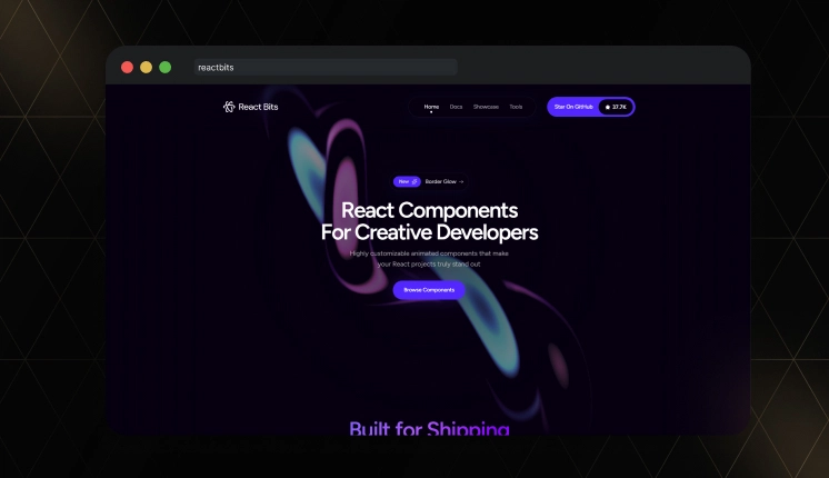
React Bits is one of the biggest animated React component collections in the open source world. The repository contains 110+ components, including UI elements, texts, and background animations. Developers can install components through the CLI or copy the source code directly into their projects.
GitHub Stars: 36.5K+
Key Features:
110+ animation components
Minimal dependencies
Background animation generators
Four component variants (JS-CSS, JS-TW, TS-CSS, TS-TW)
Tree-shakable components
Common Use Cases:
Marketing websites
Product showcases
Creative UI interfaces
Read the full article here
Join Vaibhav on Peerlist!
Join amazing folks like Vaibhav and thousands of other builders on Peerlist.
0
4
0