Best Shadcn Calendar Examples for SaaS Apps
Developer-focused Shadcn calendar guide with real use cases. Build dashboards, booking flows, and forms with flexible components.

Calendars are not just UI elements. They control how users interact with time-based data across dashboards, booking flows, and reporting tools. If the calendar UX breaks, filtering, scheduling, and planning also break.
This guide focuses on practical Shadcn calendar patterns used in real products. Each pattern solves a specific problem developers face while building SaaS apps and admin panels.
What is Shadcn Calendar?
Shadcn Calendar is a set of React components built with Tailwind CSS that helps you implement date and time selection without building logic from scratch.
You get reusable patterns for common use cases like picking dates, scheduling events, and navigating historical data. These Shadcn Components are open source and can be installed using pnpm, npm, yarn, or bun, which fits easily into modern React workflows.
How these calendar patterns were evaluated
These patterns were reviewed based on:
Integration effort in React apps
Flexibility across different UI layouts
Support for real product use cases
Accessibility and keyboard handling
Ability to extend with custom logic
1. Standard Calendar
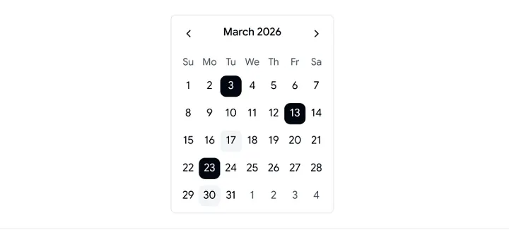
The Standard Calendar handles single or multiple date selection with minimal setup. It fits naturally into forms, filters, and dashboards where date input is required without extra logic.
Key Features:
Single and multiple date selection
Month and year navigation
Custom date highlighting via logic
Keyboard navigation support
Locale-based formatting
Best for:
SaaS analytics dashboards that require quick daily or weekly data filtering.
2. Style Calendar
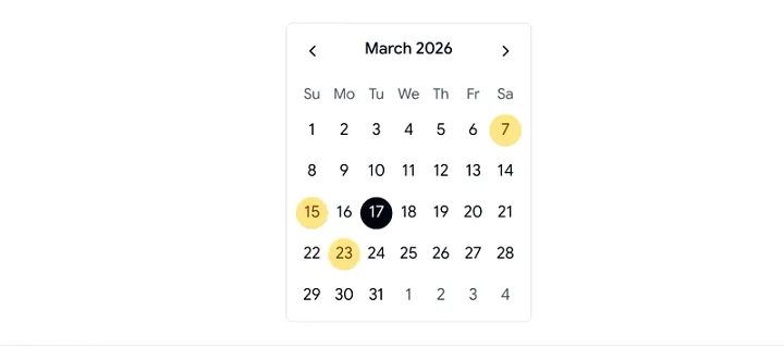
The Style Calendar lets you adapt the calendar UI to match your design system without changing its core behavior. It helps maintain consistency across complex frontend systems.
Key Features:
Prebuilt styling variations
Component-level customization
Hook-based date indicators
Localization support
Smooth UI transitions
Best for:
Design-heavy applications where UI consistency and branding matter across components.
3. Time Calendar
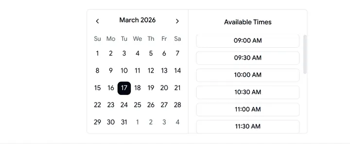
The Time Calendar combines date and time selection into a single flow. It reduces friction in scheduling scenarios where both values are required together.
Key Features:
Combined date and time picker
Configurable time intervals
12-hour and 24-hour formats
Event-driven updates
Easy state and API binding
Best for:
Booking systems, scheduling tools, and SaaS apps that depend on precise timestamps.
4. Dialog Calendar
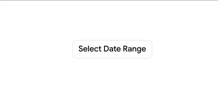
The Dialog Calendar opens inside a modal or popover, keeping the main UI clean. It works well when you need temporary date selection without changing the page context.
Key Features:
Modal or popover rendering
Navigation across day, week, and month
Open and close event hooks
Responsive layout
Seamless form integration
Best for:
Dashboards and admin panels where screen space is limited and interactions need to stay focused.
5. Month and Year Select Calendar
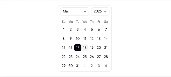
This pattern is optimized for fast navigation across large date ranges. It reduces the number of clicks required to reach a specific month or year.
Key Features:
Direct month and year selection
Multi-year range support
Configurable date limits
Dynamic update handlers
Faster long-range navigation
Best for:
Analytics dashboards and reporting tools that work with historical or long-term data.
FAQs
How do you install Shadcn calendar components?
You can install them using pnpm, npm, yarn, or bun, depending on your setup. Most projects integrate them directly into existing React codebases.
Can these calendars work with React Hook Form or Formik?
Yes. They support controlled and uncontrolled patterns, which makes integration with form libraries straightforward.
Do these calendars support accessibility and localization?
Yes. You get keyboard navigation, ARIA attributes, and locale-aware formatting for international use cases.
Conclusion
Shadcn calendar patterns give you flexible building blocks for handling date and time interactions in React apps. Each pattern targets a specific use case, from simple date picking to complex scheduling and historical navigation.
You can integrate these shadcn components quickly, extend them with custom logic, and align them with your UI system without rewriting core behavior. This reduces development time and keeps the user experience consistent across the product.
Join Vaibhav on Peerlist!
Join amazing folks like Vaibhav and thousands of other builders on Peerlist.
0
2
0