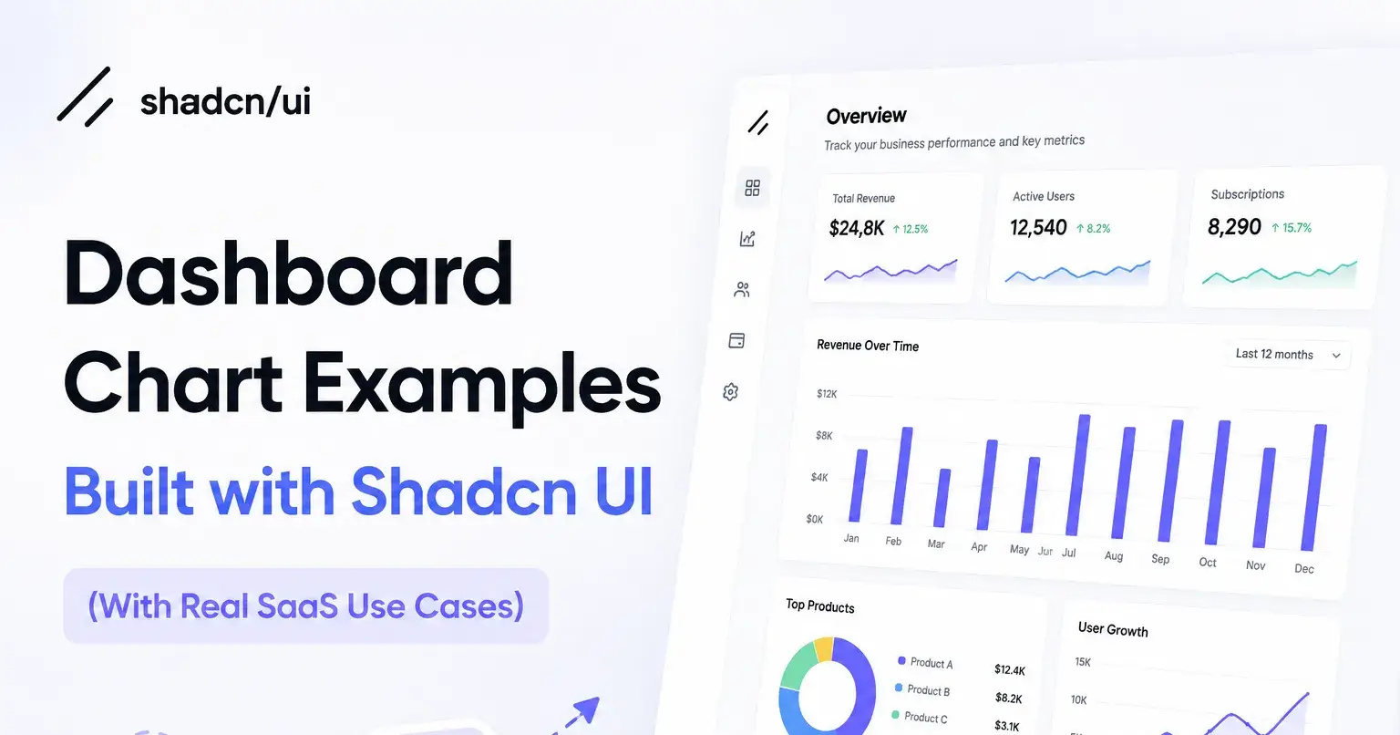
17+ Dashboard Chart Examples Built with Shadcn UI (With Real SaaS Use Cases)
Build stunning Shadcn dashboard charts with Recharts. Copy ready-to-use examples, boost UX, and create modern dashboards faster.
Building a clean dashboard is easy to start and hard to finish. The first bar chart looks fine. Then you add a second series, a tooltip, dark mode, and suddenly your chart code is a mess that fights your design system.
If you work with React and Next.js, you have probably hit this wall. You want charts that match your UI, read well in code, and drop into a dashboard without a rewrite. That is exactly the gap these chart examples fill.
In this guide, I will walk through the Shadcn dashboard chart examples, show how to install them, and explain how to pick the right one for your screen. You will get real use cases and a clear answer for each chart type.
What are Shadcn Charts?
Shadcn charts are copy-and-paste chart components built on top of Recharts. The official chart docs describe them as components you copy into your app and then customize freely. You are not locked into a wrapper, so when Recharts ships an update, you follow the normal upgrade path.
The chart docs were recently updated for Recharts v3, which changed a few things like color tokens and tooltip state. The component layer stays thin on purpose. You compose charts using Recharts parts and only pull in helpers like the tooltip and legend where you need them.
The wider ecosystem supports both Radix UI and Base UI, and ships with Figma files, a CLI, dark mode, theming, and an accessibility layer.
Why You Can Trust This List
I picked these charts by looking at how they behave in a real dashboard, not how they look in a single screenshot. Each one was checked against the same questions: is the code clear, does it cover a real chart type, and will it survive being reused across pages?
Every Shadcn block here is built on React, Next.js, Tailwind CSS, and Framer Motion. Each one supports Radix UI and Base UI, ships with Figma files, works in light and dark mode, and has CLI documentation. Most also include animation effects, which help when numbers update on screen.
These are dashboard charts a developer can actually ship, not demos that fall apart on the second data series.
How I Evaluated These Charts
I used a fixed set of criteria so the picks stay consistent. Here is what I checked for each chart:
Code clarity: Is the component readable and easy to edit?
Chart type coverage: Does it represent a distinct family like bar, line, area, donut, gauge, or radar?
Dashboard fit: Does it sit well inside a card or panel layout?
Reuse potential: Can you drop it into another page with new data?
Theming: Does it respect your tokens and dark mode?
Install path: Can you add it through the CLI with no manual wiring?
Developer workflow: Does the copy-paste flow stay clean?
Across the examples, you get bar, line, area, donut, gauge, and radar charts, plus several multi-series comparisons.
How to Install
Each chart installs through the CLI, so you skip manual setup. The install works with pnpm, npm, yarn, or bun. You add a chart, then paste it where you need it.
Here is the sample install with pnpm:
pnpm dlx shadcn@latest add @shadcn-space/chart-01If you use npm, yarn, or bun instead, run the same command through your package manager of choice. The workflow stays the same: install through the CLI, then copy and paste the component into your project and connect your data.
Best Shadcn Charts Blocks Examples
Below are the chart examples, each with a short description, the best fit, and five practical use cases.
Sales Performance Bar Chart
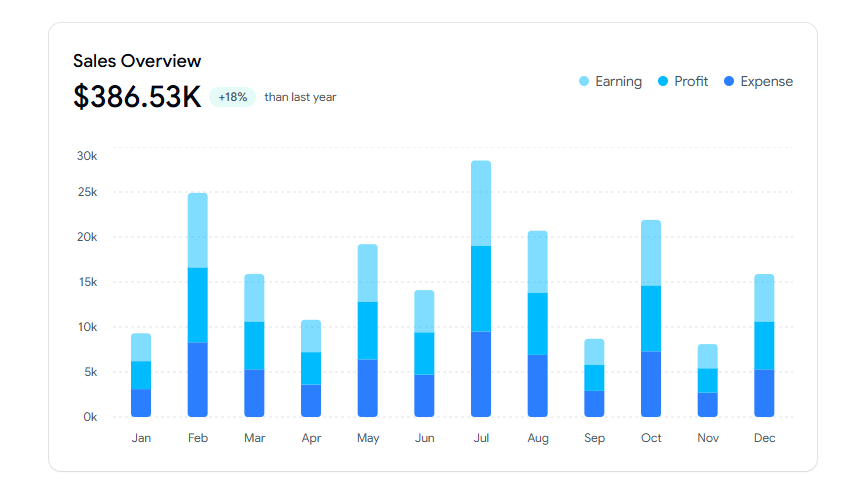
This is an interactive stacked bar chart that shows monthly earnings, profit, and expenses in one view. It is built for admin dashboards where you need to track financial trends at a glance and support data-driven decisions. The stacked layout keeps three series readable inside a single card without crowding the axis.
Use cases:
Show monthly earnings against profit and expense
Track growth trends over a fiscal period
Compare the cost versus the return on one card
Anchor a finance summary section on a dashboard
Support quarterly business reviews with one chart
Best For: Finance overview panels in an admin dashboard.
Earnings Pie Chart - Donut with Text
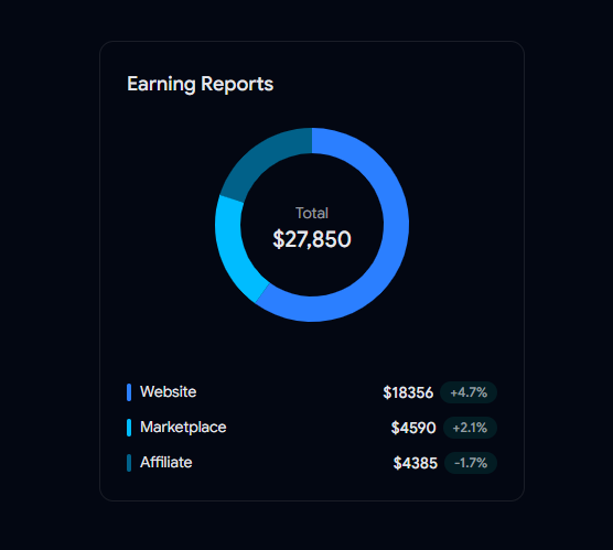
This donut chart summarizes total earnings with a clean source-wise breakdown in the center text. It works well in admin dashboards where you compare revenue streams and want one quick number plus the split behind it. The center label keeps the headline value visible while the ring carries the detail.
Use cases:
Compare website, marketplace, and affiliate income
Highlight total earnings with a single center value
Track growth per revenue stream over time
Fit a compact summary into a sidebar card
Show the share of revenue without a full table
Best For: Revenue source breakdown widgets.
Area Chart Gradient - Yearly Sales Comparison
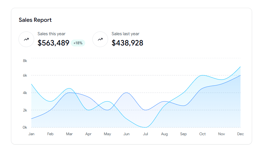
This area chart compares this year against last year's sales with a smooth gradient fill and summary stats. It suits dashboards that need to visualize performance trends and spot seasonal patterns fast. The dual-series view makes year-over-year change easy to read at a glance.
Use cases:
Compare current year sales against the prior year
Spot seasonal peaks and slow months
Pair a headline figure with a trend curve
Track growth direction across twelve months
Support planning reviews with a clean comparison
Best For: Seasonal sales trend tracking.
Bar Chart - Weekly Sales
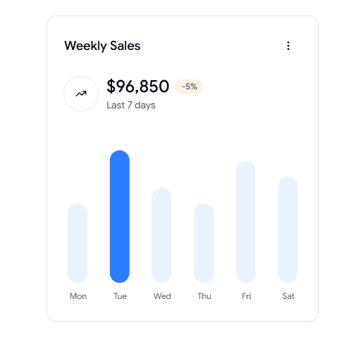
This compact bar chart shows daily sales for the past seven days with a trend indicator. It fits dashboards that highlight short-term performance and need to flag high-activity days quickly. The small footprint makes it a strong fit for a stats row near the top of a page.
Use cases:
Track sales for each day of the week
Flag the strongest and weakest days
Add a quick trend signal to a stats row
Fit a small panel without heavy detail
Support daily standup reporting
Best For: Short-term daily sales monitoring.
Bar Chart - Revenue vs Expenses
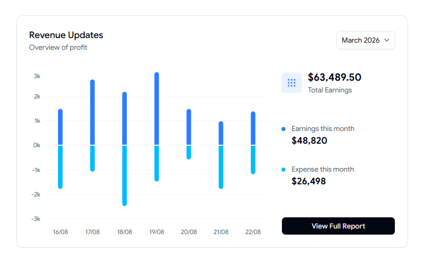
This comparative bar chart places daily revenue against expenses with profit trends and monthly filters. It is built for dashboards that track financial performance and cash flow side by side. The grouped bars and summary stats make the gap between income and cost obvious.
Use cases:
Compare daily revenue with daily expenses
Watch profit move across a chosen month
Filter by month with a built-in control
Surface earnings and expenses together
Drive a finance report with one focused chart
Best For: Cash flow monitoring screens.
Line Chart - Sales & Profit Overview
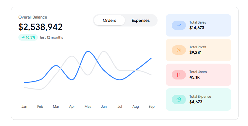
This interactive line chart plots monthly sales and profit with highlighted data points and summary stats. It works for dashboards that analyze growth patterns and overall performance over a year. The marked points make it easy to call out specific months in a review.
Use cases:
Plot monthly sales against profit
Mark standout months with data points
Show users, sales, profit, and expenses together
Track twelve-month performance in one view
Support a leadership growth report
Best For: SaaS analytics growth tracking.
Sales Comparison Area Chart
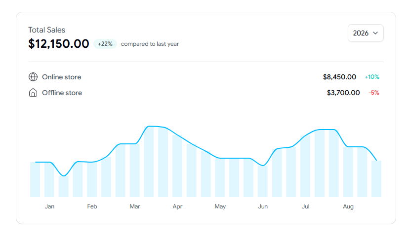
This area chart breaks monthly sales into online and offline channels with year-over-year growth. It fits dashboards that track revenue trends and channel performance in the same panel. The layered areas make the split between channels clear without a second chart.
Use cases:
Split sales into online and offline streams
Track channel growth across the year
Compare current totals with last year
Show channel share inside one card
Support a sales channel review
Best For: Channel performance comparison.
Product Sales Performance Gauge Chart
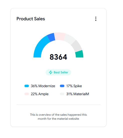
This semi-circle gauge chart shows total product sales with category-wise contribution and a bestseller highlight. It suits dashboards that monitor product performance and monthly sales distribution. The gauge format gives a fast read on the share without a dense table.
Use cases:
Show category share of total product sales
Highlight the current bestseller
Track monthly sales distribution
Give a quick read on product balance
Anchor a product overview card
Best For: Product mix snapshots.
Pipeline Performance Radar Chart
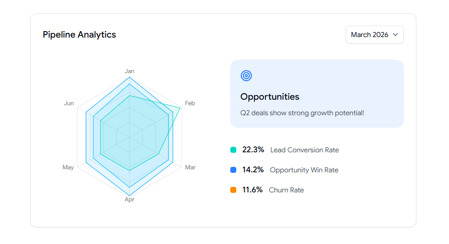
This radar chart compares lead conversion, opportunity win rate, and churn across a month. It is built for dashboards that analyze sales pipeline health and growth opportunities. The radar shape shows several metrics at once, so you can spot weak spots fast.
Use cases:
Compare conversion, win rate, and churn together
Spot which pipeline metric lags
Track the monthly pipeline shape
Support a sales operations review
Show multi-metric health in one panel
Best For: Sales pipeline health analysis.
Marketing Report Donut Chart
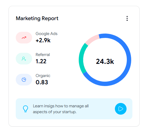
This donut chart displays traffic and acquisition sources such as organic, referral, and ads. It fits dashboards that track channel contribution and campaign performance in a single view. The ring layout keeps several sources readable without a long legend.
Use cases:
Break traffic into organic, referral, and ads
Track channel contribution at a glance
Compare paid against earned sources
Support a marketing performance report
Fit a clean source split into a card
Best For: Website analytics, traffic source views.
Profit & Expense Bar Chart
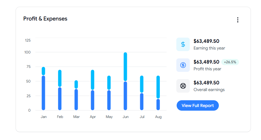
This bar chart compares monthly profit and expense values with yearly earnings summaries. It works for dashboards that monitor financial performance, cost trends, and profitability. The paired bars and summary figures keep the profit story easy to follow.
Use cases:
Compare the monthly profit against the expenses
Track yearly earnings summary on one card
Watch cost trends over the period
Surface profit margin direction
Support a finance health report
Best For: Profitability tracking panels.
Employee Salary Bar Chart
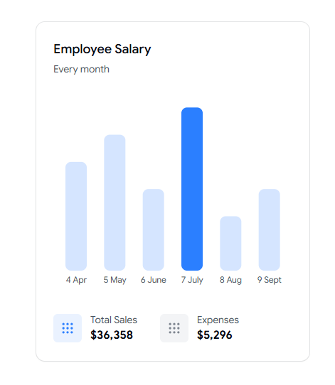
This bar chart shows monthly salary and cost figures with total sales and expense summaries. It fits dashboards that track payroll and operating costs over time. The simple layout keeps headcount cost readable next to the revenue context.
Use cases:
Track monthly salary cost
Compare cost against total sales
Watch expense levels per period
Support an HR or finance cost view
Fit a payroll summary into one card
Best For: Payroll and cost overview.
Product Sales Line Chart
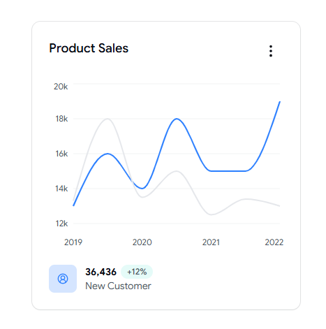
This line chart shows yearly product sales growth with customer increase indicators. It suits dashboards that analyze long-term sales performance and customer acquisition. The single growth line keeps the long view clean and easy to scan.
Use cases:
Plot yearly product sales growth
Show new customer gains alongside sales
Track the demand trend over time
Support an annual performance review
Fit a growth summary into a compact card
Best For: Long-term demand tracking.
Total Settlements Area Chart
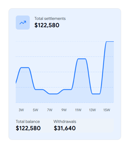
This area chart shows settlement amounts over time with balance and withdrawal totals. It works for dashboards that track transactions, money flow, and account activity. The filled area makes movement in balance easy to read across the period.
Use cases:
Track settlement amounts over time
Show total balance and withdrawals together
Watch money flow across periods
Support a payment or wallet view
Anchor an account activity panel
Best For: Transaction and balance tracking.
Bar Chart - Revenue Forecast
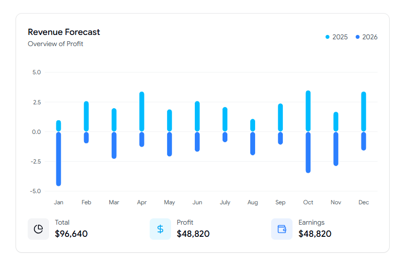
This bar chart compares monthly revenue and profit forecasts across two years. It fits dashboards that track growth projections and future planning. The two-year grouping makes the forecast gap between periods clear.
Use cases:
Compare revenue forecasts across two years
Track profit projections by month
Support a planning or budget review
Show growth direction for the year ahead
Fit a forecast summary into one card
Best For: Forward revenue planning.
Revenue Forecast Line Chart
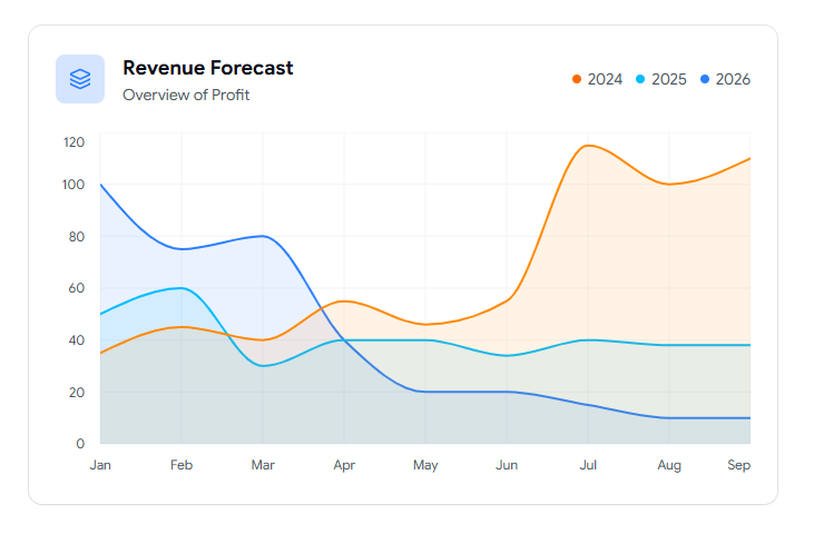
This line chart shows revenue trends across multiple years in a clean layout. It works for dashboards that compare performance and analyze long-range patterns. The multi-year line keeps the bigger picture readable without clutter.
Use cases:
Plot revenue across several years
Compare performance year over year
Track long-term growth direction
Support a strategy or planning review
Fit a multi-year trend into one panel
Best For: Long-range revenue projection.
Revenue Updates Bar Chart
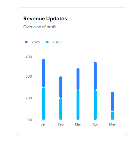
This minimal bar chart compares monthly revenue across multiple years. It fits dashboards that monitor trends and spot growth or decline fast. The clean bars make year-on-year comparison quick to scan.
Use cases:
Compare monthly revenue across years
Spot growth or decline patterns fast
Track performance at a glance
Support a quick executive summary
Fit a trend scan into a small card
Best For: Quick revenue trend scanning.
FAQs
1. How do I add a Shadcn chart component to a Next.js dashboard without manual setup?
Use the CLI. Run the install command with pnpm, npm, yarn, or bun, then copy and paste the component into your project. Connect your own data through the dataKey props and set a height or min-h on the chart container so it renders on first load. Because the components sit on Recharts without a wrapper, you keep full control of the markup.
2. Which shadcn chart example should I use for a SaaS analytics dashboard with multiple data series?
For multi-series analytics, the Line Chart - Sales & Profit Overview and the Bar Chart - Revenue vs Expenses work well, since both handle two or more series in one view. If you need channel splits, the Sales Comparison Area Chart layers online and offline data clearly. Pick based on whether you want trend lines, grouped bars, or stacked areas.
3. Do these shadcn dashboard charts support dark mode and theming with my existing tokens?
Yes. The charts use theming through CSS variables, so they pick up your color tokens and switch with light and dark mode. Reference colors with the var(--color-KEY) format in your chart config, and they stay in sync with the rest of your UI. You can also turn on the accessibility layer for keyboard and screen reader support.
Conclusion
If you build dashboards in React and Next.js, these chart examples save you the painful middle part of charting. You skip the wiring, keep clean code, and get bar, line, area, donut, gauge, and radar charts that already fit a card-based layout.
What makes them worth using is the workflow. You install through the CLI, paste the component, plug in your data, and move on. Because they sit on Recharts with no heavy wrapper, you stay in control and follow normal upgrade paths when Recharts changes.
My advice is simple. Start with one chart that matches your top metric, confirm it reads well in dark mode with your tokens, then reuse the same pattern across pages. From there, layer in the comparison and forecast charts as your dashboard grows.
Join Vaibhav on Peerlist!
Join amazing folks like Vaibhav and thousands of other builders on Peerlist.
0
2
0