These 19+ Shadcn Input Components Every React Developer Should Master
Find production-ready Shadcn Input components for React and Next.js. Real examples, code patterns, and UI inspiration.

Form inputs fail in production more often than any other UI element. Focus states break, validation fires at the wrong time, accessibility gets skipped, and what looked clean in isolation creates friction in a real user flow. If you’re building React apps and keep patching the same input issues, sprint after sprint, the problem isn’t your logic. It’s the patterns you’re starting with.
This list covers Shadcn Input components, which are evaluated based on component quality, practical form use, accessibility behavior, install flow, and how well each pattern holds up in real product scenarios. The goal isn’t to show you what looks good in a preview. It’s to help you pick the right input structure before you write a single line of form logic.
You can trust this list because each component was checked against actual implementation needs: controlled state handling, validation feedback, keyboard accessibility, and use-case fit across SaaS products, admin dashboards, auth flows, and content tools.
These input variants below cover every major input pattern you’ll encounter in a React project. Here’s what each one does and where it actually belongs.
What is Shadcn Input?
Shadcn Input is a structured set of input components built specifically for React applications. Each component in the group is a complete, opinionated input pattern rather than a bare input element you have to build on top of. You get date inputs, currency fields, validation states, file handlers, and more, each as a ready-to-install unit.
The key difference from a generic input library is ownership. Once you install a component using the CLI, the code lives directly inside your project. You control the markup, the styles, and the behavior without fighting a black-box library or overriding nested CSS specificity.
The group currently includes input variants. They’re built on a consistent base, so they behave predictably together inside the same form. That consistency matters more in production than in demos, especially when you’re managing multiple input types across complex layouts.
Installation and Stack Details
Every component in the Shadcn Input supports installation through the official Shadcn CLI. You can use pnpm, npm, yarn, or bun.
Here’s the pnpm install command for the first input variant:
pnpm dlx shadcn@latest add @shadcn-space/input-01 Swap input-01 for the variant number you need. Each shadcn component follows the same CLI pattern, and the approach is a direct copy-paste into your project with no hidden dependencies or wrapper packages.
The components are built with React, Next.js, Tailwind CSS, and Framer Motion. All variants support both Radix UI and Base UI, giving you flexibility depending on your existing component architecture. Free and premium variants exist across the collection.
Developer Checklist Before You Pick a Shadcn Input Pattern
Before you install and wire up a component, run through this list. It saves time and prevents the kind of rework that shows up two sprints later.
Intent and use-case fit
Identify the exact data type the field collects before choosing a pattern. Currency, dates, files, and phone numbers each have a dedicated variant for a reason.
Accessibility requirements
Check that the pattern uses correct label association, aria-required, aria-describedby for errors, and keyboard focus behavior. Do not rely on visual-only cues.
Validation state handling
Decide whether validation fires on change, blur, or submit before picking a component. Real-time validation handles on-change. Input with Error handles the result state. These solve different problems.
Naming consistency
Use the exact component naming (Input with Date, Input with Error, etc.) throughout your codebase. Inconsistent naming across component files creates confusion during code review.
Install path
Confirm you’re using the right package manager command. The CLI pattern is pnpm dlx shadcn@latest add @shadcn-space/input-01. Replace input-01 with your target variant. The code lands directly in your project.
Stack compatibility
These components run on React, Next.js, Tailwind CSS, and Framer Motion. Confirm your project has these in place before installing. Radix UI and Base UI are both supported.
Inline action clarity
Distinguish between Input with End Inline Button and Input with End Button before building. The first embeds the action inside the field visually. The second keeps them separate at the DOM level. This affects focus behavior and styling.
Error state coverage
Every field that accepts user input needs an error state. Use Input with Error as a pattern reference even for fields where you’re building a custom variant.
Content and description quality
Placeholder text is not a label. Every input needs a visible label. Use Input with Label or Input with Floating Label as the structural base for all labeled fields.
Form integration
All components work with React Hook Form. Wire up your form library before customizing the component, not after.
Best Shadcn Input Components and Examples
These patterns cover the full range of input scenarios you’ll hit while building React forms. Each one is worth knowing because the wrong input pattern creates real UX debt, and picking the right one upfront saves debugging time later.
Input with Date
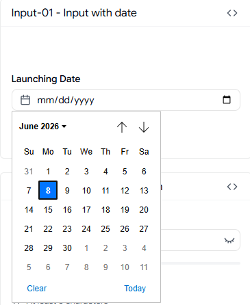
This pattern renders a date input with proper format control so users aren’t guessing whether the field expects MM/DD/YYYY or DD/MM/YYYY. It handles the display format at the input level, keeping your state clean and consistent. For React apps that deal with booking, scheduling, or any date-sensitive form, this eliminates a common category of validation errors before they reach your handler.
Best for: Booking systems, scheduling tools, and admin forms with date-driven records.
Use cases:
appointment booking
task deadline fields
event creation forms
date-range filtering
subscription start date inputs
Input with Time
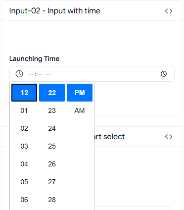
The time input pattern provides a structured time-entry field that restricts input to valid time formats. It removes the ambiguity of free-form time entry in forms where 12-hour vs 24-hour conflicts cause backend mismatches. Pair it with the date input variant to cover datetime capture without building a custom picker.
Best for: Scheduling apps, time-log forms, and reservation flows that need clean time data.
Use cases:
shift scheduling inputs
appointment time selection
event time
fields, time-tracker entries
meeting booking forms
Input with Currency
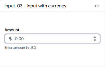
Currency input sounds simple until you need to handle decimal precision, locale formatting, and prevent non-numeric input all at once. This pattern manages input formatting in a controlled state so the value you read from the field is always in a usable format. It’s the right starting point for any billing, invoice, or financial form.
Best for: Billing forms, SaaS pricing inputs, invoice generators, and financial dashboards.
Use cases:
subscription price fields
invoice amount inputs
budget entry forms
product pricing admin
expense tracking forms
Real Time Validation
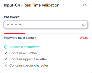
Most validation libraries fire on blur or submit. Real-time validation fires on change, and this pattern shows exactly how to wire that up with clear visual feedback for each rule. It ships with multi-rule support, including character count, uppercase check, number check, and special character check, which makes it immediately useful for password and username fields.
Best for: Auth forms, onboarding flows, and any field where inline feedback reduces drop-off.
Use cases:
password strength validation
username format checking
email pattern validation
phone number format enforcement
signup form fields
Input with Start Select
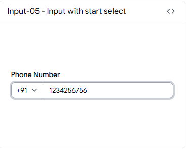
This pattern pairs a dropdown selector before the text input in a single field container. The most common use case is phone number entry with a country code selector. It keeps the UI compact and avoids having two disconnected fields for what is effectively one piece of data.
Best for: International phone number capture in registration and checkout forms.
Use cases:
country code phone inputs
currency prefix selection,
unit-of-measurement selectors
region-based form fields
localized pricing inputs
Input with Character Counter
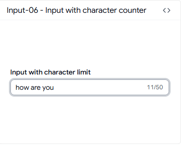
You need a character counter when the field has a hard limit that affects what the user is allowed to submit, not just a soft suggestion. This pattern shows a live character count alongside the input and handles the limit at the component level. It’s the correct pattern for bio fields, short description inputs, and any field where backend storage has a defined cap.
Best for: Profile editors, content tools, and CMS admin forms with field-length constraints.
Use cases:
twitter-style bio fields
SMS message composers
short description inputs
meta title/description editors
product tagline fields
Input with Controls
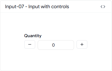
This pattern adds increment and decrement controls directly inside the input for numeric value entry. It’s built for quantity selection, not for arbitrary number entry, which is an important distinction. Using a standard text input for quantity is a frequent UX mistake in e-commerce and admin forms. This pattern solves that.
Best for: Product quantity selectors, seat count inputs, and any numeric field with defined min/max bounds.
Use cases:
cart quantity inputs
ticket count selectors
pagination size settings
team seat selectors
inventory adjustment fields
Input with Add-ons
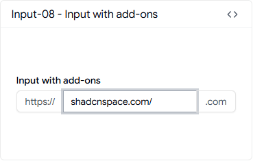
Add-ons attach prefix or suffix elements to the input field, typically as text labels or icons inside the input border. This pattern handles the layout so the add-on doesn’t break when the input resizes or when content overflows. It’s the right structure for URL fields, domain inputs, and any field where a unit or context label belongs adjacent to the value.
Best for: URL entry fields, domain inputs, unit-labeled numeric fields in admin and settings pages.
Use cases:
website URL inputs with protocol prefix
domain name fields with a suffix
percentage fields
currency symbol prefix
API endpoint path inputs
Input with Floating Label
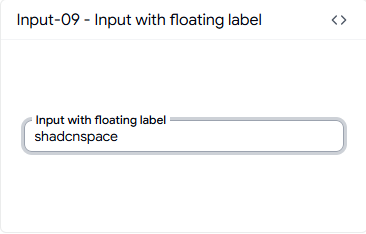
The floating label pattern keeps the label visible above the input after the user starts typing, which solves the common problem of losing context in dense forms. It’s a space-efficient pattern that works well in multi-field forms where a static label above each input adds too much vertical space. The animation is handled without extra configuration.
Best for: Dense multi-field forms in SaaS settings pages, onboarding wizards, and profile editors.
Use cases:
login and registration forms
profile update fields
contact forms
checkout address inputs
settings configuration forms
Input with Clear Button
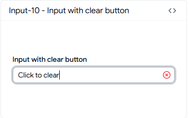
Clearing an input sounds trivial until you handle it with a controlled state properly. This pattern includes an internal clear button that resets the value and refocuses the field correctly, which matters for search inputs and filter fields where the user should be able to reset quickly without reaching for the keyboard. The clear button appears conditionally based on whether the field has a value.
Best for: Dashboard filter inputs, search bars, and any field inside a filterable table or list.
Use cases:
search fields
data table filters
tag input reset
form field quick-clear
address lookup fields
Input with End Inline Button
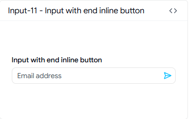
This pattern embeds a button inside the right edge of the input field rather than placing it adjacent to it. The visual result is a single contained element, which is the right choice for subscribe inputs, search triggers, and coupon code fields where the action is directly tied to the input value. It avoids the visual gap that appears when an external button sits beside a standard input.
Best for: Email subscription fields, coupon code inputs, and search trigger inputs in marketing and landing page forms.
Use cases:
newsletter subscription inputs
coupon/promo code fields
search-as-you-type inputs
quick invite fields
single-action form inputs
Input with End Button
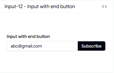
The end button pattern places a button directly after the input as a visually connected element, not inside it. This is the cleaner structural choice when the button needs its own focus behavior separate from the input. It works well for OTP resend triggers, submit-adjacent inputs, and API key reveal actions.
Best for: OTP fields with resend buttons, API key display inputs, and form rows with adjacent submit actions.
Use cases:
OTP input with resend
API key copy inputs
email field with verify trigger
search input with submit button
form row with inline action
Input with File
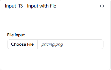
File inputs are broken by default in React because the browser’s native file input is difficult to style and even harder to integrate into a controlled form. This pattern handles the file input display, the selected file state, and the visual feedback cleanly. It’s the right starting point for any upload flow where you want control over the input appearance without building a custom drag-and-drop component.
Best for: Document upload forms, avatar upload fields, and content submission flows in SaaS and admin apps.
Use cases:
profile picture uploads
document submission forms
resume upload fields
image attachment inputs
bulk file upload triggers
Input with Error
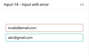
An error input state is not just a red border. It needs to communicate the error clearly without causing a layout shift, and it needs to be accessible to screen readers. This pattern handles the error message display below the input with the correct ARIA attributes so the error is announced to assistive technology. It integrates cleanly with React Hook Form and Zod validation output.
Best for: Form validation flows across auth, onboarding, and any field with server-side error feedback.
Use cases:
login error states
field-level API validation errors
required field enforcement
format mismatch errors
backend rejection messages
Required Input
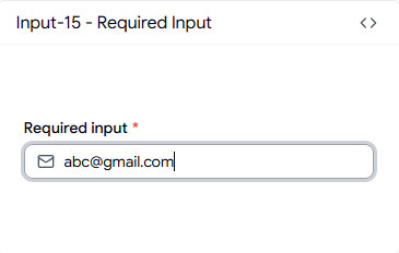
Required field marking is something almost every form gets wrong at the accessibility level. Marking a field as required with just a red asterisk fails WCAG if it isn’t tied to the actual required attribute and a visible legend. This pattern handles the visual indicator and the semantic markup together so your form is both accessible and structurally correct.
Best for: Contact forms, checkout forms, and any form that needs to pass accessibility audits.
Use cases:
required email fields
mandatory name inputs
terms acceptance-adjacent fields
registration required fields
billing detail inputs
Standard Input
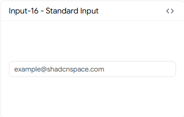
The standard input is the base pattern: a plain text input with no extra decorators. You should reach for this when the field doesn’t need inline actions, prefix elements, or validation feedback built into the component. It’s the right choice for simple data collection fields inside larger forms where complexity belongs at the form level, not the field level.
Best for: Simple data entry fields inside complex form layouts, admin record editors, and internal tools.
Use cases:
notes fields
internal admin inputs
simple text capture
form field placeholders during development
secondary form fields
Input with Label
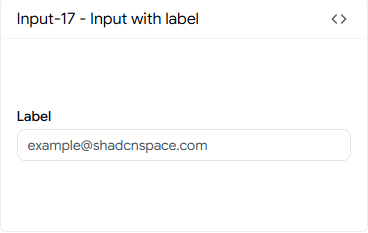
A label-and-input pair sounds basic, but the implementation matters. This pattern wraps the label with the correct htmlFor association so clicking the label focuses the input, and it maintains correct spacing between the label and the field across different font sizes. It’s the proper structural starting point for most form fields.
Best for: General-purpose form fields across all product types where semantic HTML matters.
Use cases:
standard form fields
profile editors
contact forms
settings inputs
any form requiring correct label association
Disabled
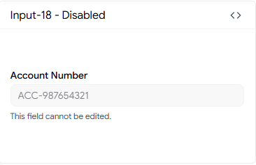
Disabled inputs exist in more situations than most developers account for: read-only account fields, locked subscription tier settings, and form fields that become inactive based on another selection. This pattern uses the correct disabled attribute semantics rather than a visual-only treatment, which means it communicates the disabled state to both the browser and assistive technology.
Best for: Account settings pages, permission-locked fields, and conditional form logic in SaaS admin panels.
Use cases:
read-only account number fields
locked plan settings
conditional form disabling
view-only record display
admin override fields
With Animated Checkmark
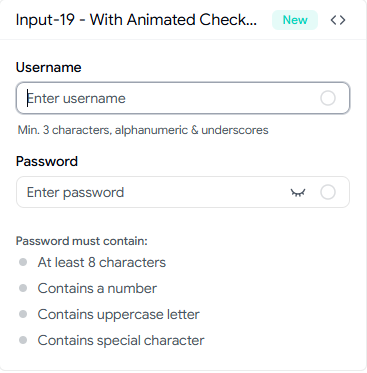
This combines real-time validation with an animated checkmark that confirms when the field value meets all required conditions. It handles both password and username validation in a single component, with animated transitions on each rule as it passes. It’s the right pattern for onboarding flows where you want to reduce user anxiety during signup.
Best for: Onboarding flows, account creation forms, and auth screens where confirmation feedback reduces drop-off.
Use cases:
signup password fields
username availability flows
account creation forms
multi-rule validation inputs
registration confirmation fields
FAQ
1. When should I use Shadcn Input instead of a basic HTML input in a React form?
Use Shadcn Input sections when your form needs features like validation, error messages, prefixes, character limits, clear buttons, or formatted values such as dates and currency. It provides ready-made patterns for these common use cases, making forms faster to build, more consistent, and easier to maintain than using basic HTML inputs alone.
2. How do I install a specific Shadcn Input component using pnpm, npm, yarn, or bun?
Install a Shadcn Input component using the Shadcn CLI with your preferred package manager, such as pnpm dlx shadcn@latest add @shadcn-space/input-01. For npm, use npx; for yarn, use yarn dlx; and for bun, use bunx. Replace input-01 with the variant you need, and the component code will be added directly to your project for full customization.
3. How do I choose the right input pattern for my React form when multiple variants seem similar?
Choose an input pattern based on the data type and required behavior. Use dedicated variants for dates, times, currencies, and files, validation-focused inputs for inline feedback, button-based inputs for connected actions, and floating labels when labels should remain visible while typing. If multiple variants seem similar, first define the specific behavior you need, then select the pattern that best fits it with minimal customization.
Final Verdict
Inputs are the part of your form that users interact with first, and they’re also the part most likely to have accessibility gaps, validation inconsistencies, and layout issues that only surface in production. The patterns in the Shadcn Input cover every real scenario you’ll encounter, from basic labeled fields to animated validation checkmarks, and they’re structured consistently enough to use together in the same form without visual or behavioral conflicts.
The collection is built on React, Next.js, Tailwind CSS, and Framer Motion, with full support for both Radix UI and Base UI. You install each component using your preferred pnpm, npm, yarn, or bun via the Shadcn CLI, and the code is yours immediately.
Pick the pattern that matches your form’s actual data and behavior requirements, install it, and start from a solid structure instead of a blank input. That’s the practical advantage here: fewer decisions during implementation, less debugging later, and form inputs that hold up past the demo.
Join Vaibhav on Peerlist!
Join amazing folks like Vaibhav and thousands of other builders on Peerlist.
0
1
0