6+ Best Shadcn Label Components you can copy today
Discover real-world Shadcn Label components with code examples for signup forms, dashboards, settings pages, and accessible user interfaces.
You write the input. You wire the validation. Then you stop, scroll back up, and realize the field has no clear label. It happens more than most developers admit, and it quietly hurts both usability and accessibility.
This list fixes that gap with label patterns you can drop straight into your forms. I picked them after checking each one against four things: how well they fit a real developer workflow, how cleanly they cover accessibility patterns, how much form clarity they add, and how flexible they are to implement. No filler examples made the cut.
Here is the short version before you read on. You get label patterns, each tied to a real interface need, and each ready to copy into your project without rewriting your setup.
What is Shadcn Label?
A Shadcn Label Component is a small component that describes a form field. It tells the user what an input, checkbox, switch, or textarea expects before they touch it. That sounds basic, but it carries real weight in how people move through a form.
Labels also do the accessibility work that placeholders cannot. A connected label gives screen readers a clear name for the field, so assistive tech can announce it correctly. Placeholders vanish the moment someone types, which leaves users guessing halfway through a form.
Modern forms still depend on labels for the same reason they always did. They hold context in place. When a label sits beside its field with a stable relationship, the user reads less, hesitates less, and finishes faster. That is the whole point.
How Shadcn Label can help developers
Most label work is repetitive. You restyle the same text, match spacing to your design system, and re-link it to the field every time you build a new screen. These patterns hand you the work already done, so you spend your time on logic instead of markup.
Each pattern uses the standard label-to-control relationship, which keeps your forms accessible by default. You get correct htmlFor and field binding out of the box, so screen readers and keyboard users get the behavior they expect.
You also keep full control. The code copies directly into your project, so you own it. Change the typography, swap the spacing, adjust the layout, or rewire the field binding without fighting an external package. Nothing is locked behind an abstraction you cannot edit.
Installation and stack
These Shadcn components are built around React, Next.js, Tailwind CSS, and Framer Motion. That stack keeps the styling predictable and lets the floating pattern animate without extra wiring.
Every label pattern comes in both Radix UI and Base UI versions. Pick the one your project already uses, and the design pattern stays the same across both. The collection includes free and premium options, and both support Radix UI and Base UI.
Installation follows a direct copy-paste approach. You can add a component with the CLI using pnpm, npm, yarn, or bun. Here is the pnpm version:
pnpm dlx shadcn@latest add @shadcn-space/label-01Run the matching command for npm, yarn, or bun, and the component lands in your codebase ready to edit.
Best Shadcn Label Components and Examples
Here are the label patterns in this collection, each tied to a context you build often. Every description carries equal depth, with a clear best-fit use and five practical use cases.
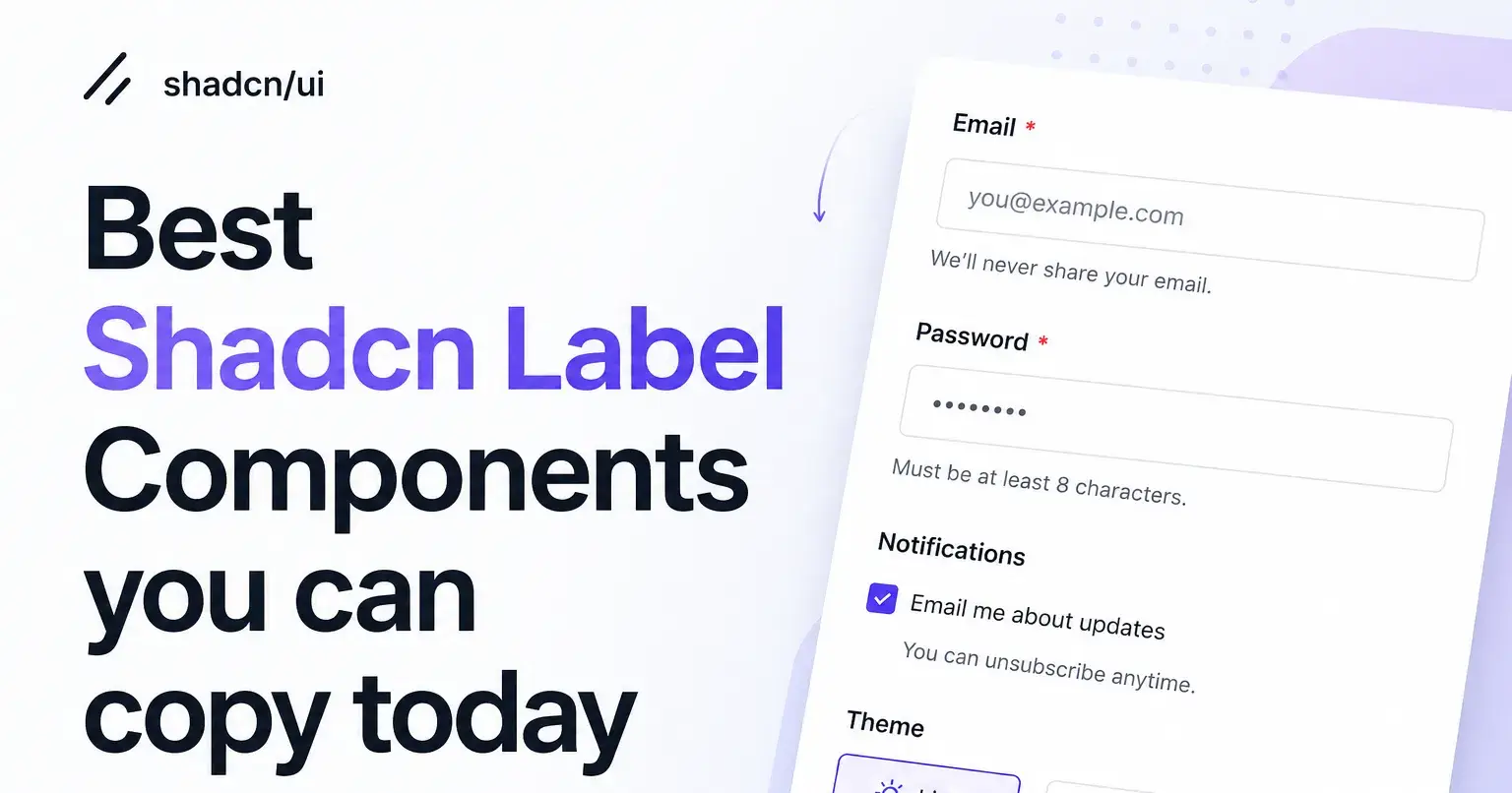
Label With Checkbox
This pattern pairs a label with a checkbox so the choice reads clearly before the user clicks it. It works well anywhere a user accepts, opts in, or selects from a list of options, since the label carries the meaning the checkbox alone cannot. You will reach for it most in registration flows and account settings, where consent and preferences need to be unmistakable. The label and box stay aligned, so the click target and its meaning never drift apart.
Use cases:
Terms and conditions acceptance on signup
Email and notification opt-ins
Multi-select preference lists in account settings
Feature toggles inside admin controls
Filter checkboxes on dashboards
Best For: Consent and preference selection in signup and settings screens.
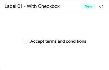
Label With Input
This is the core form pattern: a label sitting directly above or beside a text input. It gives every field a stable name that stays visible while the user types, which removes the guesswork that placeholder-only fields create. You will use it across auth forms, profile forms, and any data-entry screen where clarity matters more than saving a few pixels. It is the safest default when you want a form that any user can complete without re-reading the field.
Use cases:
Email and password fields on login pages
Name and address fields in profile forms
Search and filter inputs
Billing details at checkout
Account recovery and reset forms
Best For: Standard text entry in auth and profile forms.
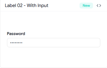
Label With Badge
This pattern adds a small badge next to the label to flag status without extra sentences. A badge like Required, Optional, New, or Active sits inline, so the user reads the field state at a glance instead of scanning helper text. It fits well in settings panels and developer-facing forms, like the webhook example, where an Active badge signals state right beside the label. You keep the form compact while still surfacing the detail that changes how a user treats the field.
Use cases:
Required or optional field markers
New feature flags in settings
Webhook or integration status indicators
Plan or tier labels in billing screens
Beta tags on experimental fields
Best For: Showing field status or state inside settings and config screens.
Label With Textarea
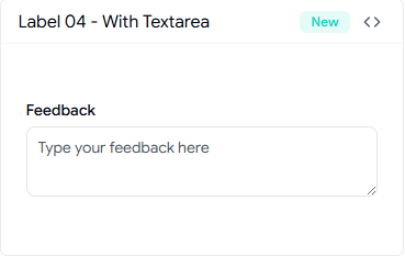
This pattern connects a label to a multi-line textarea for longer input. It signals up front that the field expects more than a word or two, which sets the right expectation before the user starts writing. You will use it in feedback flows, support requests, comment boxes, and any place where freeform text is the goal. The label holds the prompt steady while the user composes, so the context never scrolls out of view.
Use cases:
Feedback and survey responses
Support and contact request messages
Comments and notes in admin controls
Bug reports and issue descriptions
Profile bios and about sections
Best For: Longer freeform input in feedback and support flows.
Label With Switch
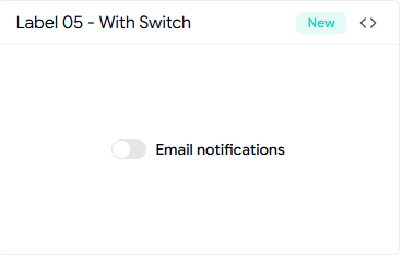
This pattern ties a label to a toggle so the user knows exactly what flipping it does. A switch with no label is a guess, but a labeled switch states the outcome before the action. It belongs in settings panels, notification preferences, and admin controls, where features turn on and off. The label clears up the on-versus-off meaning, which matters most when the switch controls something the user cannot easily undo.
Use cases:
Email and push notification toggles
Dark mode and theme switches
Feature enablement in admin controls
Privacy and visibility settings
Per-account configuration toggles
Best For: Feature and preference toggles in settings and admin screens.
Floating Label
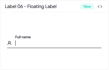
This is the modern pattern where the label starts inside the field and moves up smoothly as the user focuses or types. It saves vertical space while keeping the field name visible at all times, which placeholder-only fields fail to do. It works well in compact auth forms, onboarding steps, and dense forms where space is tight but clarity still counts. The motion gives a polished feel without hiding the context the user needs.
Use cases:
Login and signup fields in tight layouts
Onboarding step inputs
Compact contact forms
Search bars with persistent context
Multi-field forms on smaller screens
Best For: Space-tight inputs in onboarding and compact auth forms.
FAQs
1. Should every form input have a connected label, or can I rely on placeholders instead?
Use a connected label on almost every field. Placeholders disappear once typing starts, so they cannot hold context. A label stays visible and gives screen readers a real name for the field, which keeps your form accessible and easy to complete.
2. Can I use these shadcn label components with both Radix UI and Base UI in the same project?
Yes. Every pattern ships in both Radix UI and Base UI versions, and the design stays consistent across both. Pick the version that matches the rest of your stack, copy it in, and the label behavior stays the same.
3. How do I add a floating label in a React or Next.js form without breaking accessibility?
Install the Floating Label pattern with the CLI, then keep the label bound to the input with the correct htmlFor and field ID. The label animates on focus while staying linked to the field, so screen readers still announce it correctly, and the context never leaves the screen.
Conclusion
Labels are small, but they decide how clearly a form reads. The right label tells the user what a field wants, keeps the context visible while they fill it, and gives assistive tech a name to announce. Skip it, and even a clean form turns into guesswork.
These patterns cover the contexts you build most: consent, text entry, status, longer input, toggles, and compact fields. Each one is accessible by default, ships in both Radix UI and Base UI, and copies straight into your codebase for you to edit.
Pick the pattern that matches your screen, install it with your package manager, and adjust it to your design system. You spend a minute on setup and get back hours you would have lost rebuilding the same label work by hand.
Join Vaibhav on Peerlist!
Join amazing folks like Vaibhav and thousands of other builders on Peerlist.
0
1
0