Shadcn Tabs in React: 9 Real Patterns That Actually Improve Performance
Learn how to use tabs to control rendering, improve performance, and scale your webapp.
Most developers think tabs are just for switching UI.
That idea is wrong.
In real React apps like dashboards, admin panels, and SaaS tools, tabs decide:
What gets rendered
When data is fetched
How fast does your UI feel?
If your tabs are not designed properly, your app becomes slow very quickly.
If they are done right, your app feels fast and clean.
This article will help you understand how Shadcn Tabs really work and how to use them like a production-level developer.
First, What Are Shadcn Tabs?
Shadcn Tabs are a way to organize content into sections where only one section is visible at a time.
They are built on top of Radix UI, which handles accessibility and keyboard behavior for you. But here is the important part.
Shadcn does not control everything for you.
It gives you building blocks, and you decide how things behave.
Understanding the Components (Very Important)
Each Shadcn component tab system has three main parts.
1. Tabs (State Container)
This is the parent component.
It stores which tab is currently active.
You can control it manually or let it handle the state automatically.
Think of it as the brain of the tabs.
2. TabsList (Navigation Wrapper)
This holds all the tab buttons.
It is just a container for triggers.
It controls layout, like horizontal or vertical alignment.
3. TabsTrigger (Clickable Tab)
This is the actual tab button.
When the user clicks it:
It updates the active tab
It tells Tabs which content to show
4. TabsContent (Content Area)
This is where your UI lives.
Each tab has its own content block.
Only one should be visible at a time.
The Biggest Mistake Developers Make
Most developers do this without thinking:
They render all tab content at once.
That means:
All components mount together
All API calls fire together
performance drops
This becomes a serious problem in dashboards.
The Right Way to Use Tabs
Render content only when the tab is active.
<Tabs value={tab} onValueChange={setTab}>
 <TabsList>
 {items.map(item => (
 <TabsTrigger key={item.id} value={item.id}>
 {item.label}
 </TabsTrigger>
 ))}
 </TabsList>

 {items.map(item => (
 <TabsContent key={item.id} value={item.id}>
 {tab === item.id && <HeavyComponent id={item.id} />}
 </TabsContent>
 ))}
</Tabs>
That one condition:
tab === item.idchanges everything.
Now:
Only one component renders
API calls stay isolated
UI becomes faster
You are now using tabs as a render-control system, not just as UI.
Think Like This Before Using Tabs
Before you implement tabs, ask yourself:
Do I need full control over the state?
Am I rendering unnecessary content?
Does each tab fetch its own data?
Are heavy components loaded only when needed?
Will this scale with more data?
Tabs are not a design choice. They are an architectural decision.
9 Real Patterns You Will Actually Use
Now let’s understand these Shadcn tabs real patterns, not just UI variations.
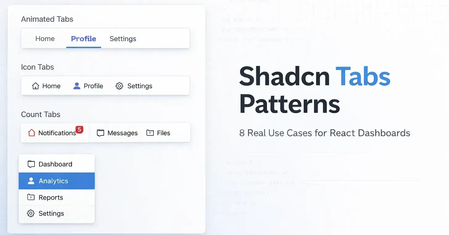
1. Animated Tabs
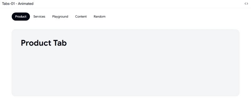
These add smooth movement when switching tabs.
How it works:
uses CSS transforms
no heavy animation libraries
Why it matters:
helps users understand context change
Best use: analytics dashboards where users switch views often
2. Transition Tabs
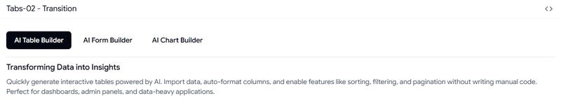
These keep components mounted even when hidden.
How it works:
content stays in the DOM
only visibility changes
Why it matters:
avoids reloading heavy UI
keeps data ready
Best use: admin panels and reports
3. Tabs with Icons
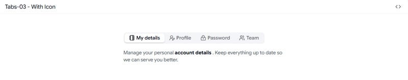
These replace or support text with icons.
How it works:
adds visual indicators
reduces text dependency
Why it matters:
faster navigation
better scanning
Best use: complex dashboards with many sections
4. Tabs with Count
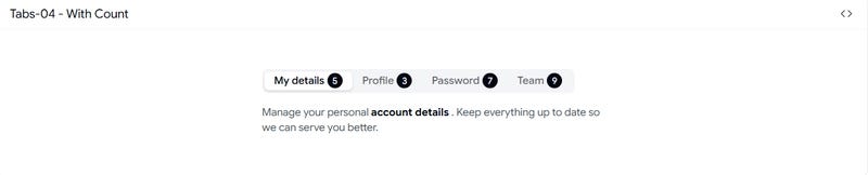
These show numbers inside tabs.
Example:
unread messages
pending tasks
How it works:
The count is separate from the main content
Why it matters:
User sees important data before clicking
Best use: inbox, tickets, alerts
5. Horizontal Tabs
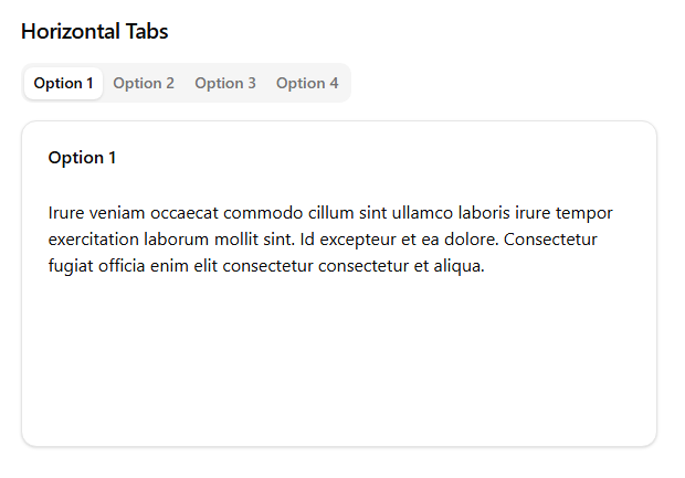
This is the default layout.
How it works:
tabs in a row
content below
Why it matters:
simple and familiar
Best use: top-level navigation
6. Vertical Tabs
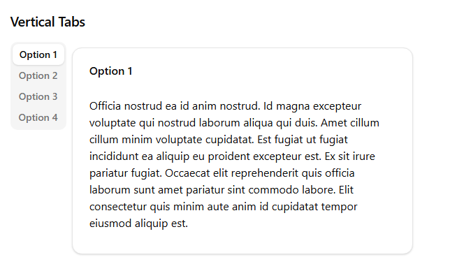
Tabs move to the left side.
How it works:
sidebar navigation
content on the right
Why it matters:
better for structured pages
Best use: settings, CMS, configuration panels
7. Default Value Tabs
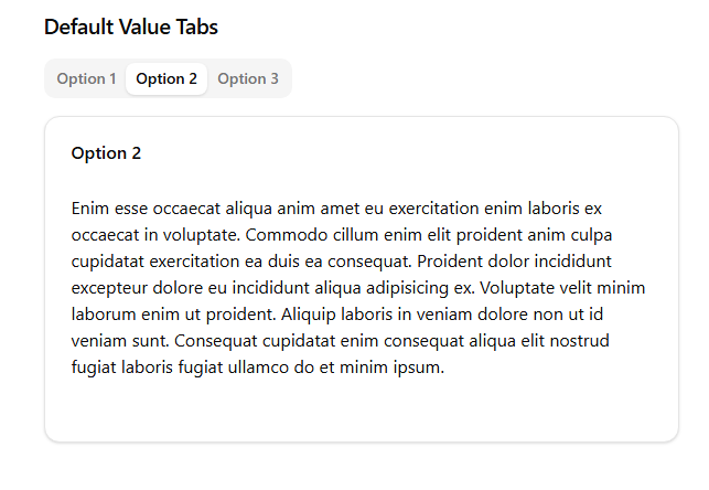
This sets which tab opens first.
How it works:
uses defaultValue instead of full state control
Why it matters:
prevents hydration issues in SSR
Best use: Next.js apps and server-rendered pages
8. Scrollable Tabs
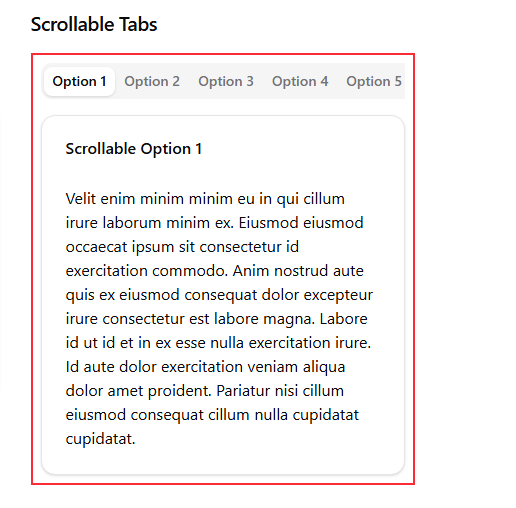
Handles too many tabs.
How it works:
enables horizontal scrolling
Why it matters:
prevents layout breaking
Best use: data-heavy dashboards
9. Legacy Tabs
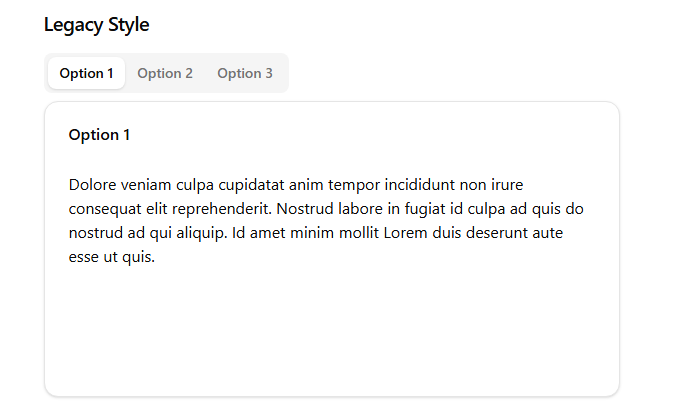
Simple and stable tabs.
How it works:
no animation
minimal logic
Why it matters:
predictable behavior
Best use: old systems and migrations
The Pattern Behind All Patterns
All these tab types solve three main problems.
1. Performance
control rendering
avoid unnecessary work
2. User Experience
improve clarity
guide navigation
3. Scalability
handle more data
support complex layouts
The Most Important Lesson
Do not choose tabs based on design.
Choose them based on how your data behaves.
frequent switching → animated tabs
heavy UI → transition tabs
visible data → count tabs
many tabs → scrollable tabs
complex layout → vertical tabs
Final Thought
Tabs are not simple components.
They are a system that controls:
rendering
data flow
user navigation
If you treat them like UI, your app will slow down.
If you treat them like architecture, your app will scale.
Simple Mental Model
Think of tabs like:
Mini routes inside a single page.
Each tab should:
load its own data
render only when active
stay independent
Once you understand this, your React apps will feel much faster and cleaner.
If you are building dashboards or SaaS products, this is not optional knowledge.
This is the difference between a slow app and a scalable one.
Join Vaibhav on Peerlist!
Join amazing folks like Vaibhav and thousands of other builders on Peerlist.
0
2
0