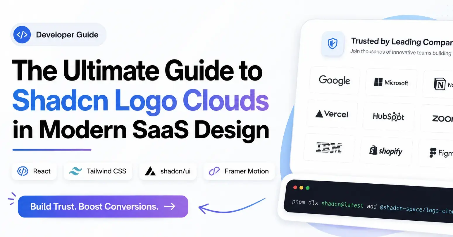
The Ultimate Guide to Shadcn Logo Clouds in Modern SaaS Design (2026 Edition)
Build high-performing logo cloud sections with React and Tailwind CSS. Includes SaaS trust patterns, SEO tips, and developer best practices.
I’ve noticed one common thing across modern SaaS landing pages.
The products that feel trustworthy within the first few seconds almost always use strong visual proof near the hero section. Sometimes it’s customer metrics. Sometimes it’s integrations. But most of the time, it’s a clean logo cloud section.
Users rarely read everything on a landing page. They scan. They judge quickly. A logo cloud helps reduce that friction because recognizable brands instantly create familiarity.
That’s why almost every modern AI startup, analytics platform, developer tool, and B2B SaaS product now uses some variation of a “Trusted By” section.
If you’re building SaaS products using React, Next.js, Tailwind CSS, or Shadcn UI, this guide will help you build logo cloud sections that actually feel modern, lightweight, and developer-friendly, rather than looking like copied marketing blocks from older templates.
Key Takeaways:
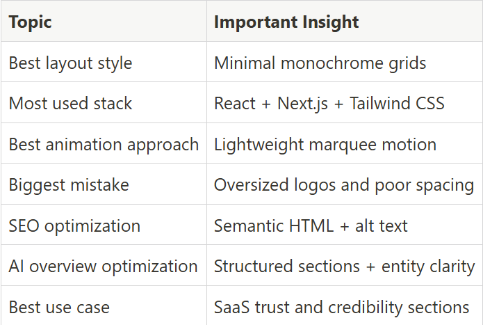
What Is a Logo Cloud?
A logo cloud is a UI section that displays logos of customers, partners, integrations, sponsors, or companies using a product.
In SaaS design, logo clouds mainly work as trust indicators. Instead of telling users that a product is reliable, the design visually showcases recognizable brands.
That matters because users process visual trust signals much faster than paragraphs of copy.
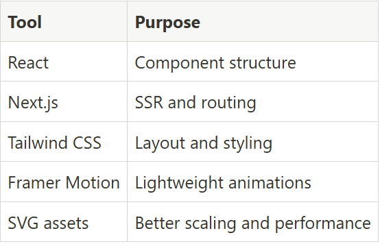
Modern logo cloud components are usually built with:
React
Next.js
Tailwind CSS
Framer Motion
Most shadcn component libraries now support direct CLI installation and copy-paste integration.
Example installation using Base UI:
pnpm dlx shadcn@latest add @shadcn-space/logo-cloud-01
You can also install components using:
npm
yarn
bun
Most setups take less than a few minutes to integrate into an existing SaaS landing page.
How to Build a Logo Cloud Using Shadcn UI + Tailwind CSS
Most developers now build logo cloud sections as reusable React components instead of static image layouts.
That approach makes updates easier and improves consistency across multiple landing pages.
The most common stack includes:
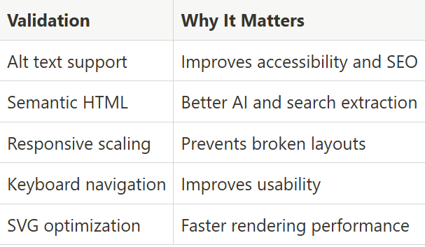
Accessibility Checklist for Developers
A surprising number of logo cloud sections fail accessibility checks.
Most issues happen because logos are added as decorative visuals without a semantic structure.
Important validations:
Why Logo Clouds Increase SaaS Conversion Rates
Logo clouds work because users trust familiar brands faster than marketing copy.
When visitors see recognized companies on a landing page, they automatically associate credibility with the product. This is called credibility transfer.
Here’s why logo clouds improve conversions:
Many SaaS companies place logo clouds above feature sections because users often decide whether to continue scrolling within a few seconds.
Best Logo Cloud Design Patterns
The best logo cloud sections are simple, balanced, and easy to scan. Below are some of the most commonly used logo cloud patterns in modern SaaS design.
Trusted by Leading Companies
This pattern usually uses a structured logo grid with equal spacing and grayscale logos. It works best for SaaS products that want to establish authority quickly on landing pages and pricing screens. Most developers use this layout because it scales well across desktop and mobile without creating visual clutter.
Key Features:
Responsive grid structure
Monochrome SVG logos
Dark mode support
Tailwind CSS layout utilities
Fast rendering performance
Best for: SaaS analytics dashboards and enterprise landing pages.
Powered by Trusted Collaborations
This component style focuses more on integrations, partnerships, and ecosystem relationships instead of customer logos alone. It usually works well for AI products, API platforms, and automation tools where collaboration signals improve product trust.
Key Features:
Integration-focused branding
Flexible logo sizing
Marquee animation support
SVG optimization
Accessibility-friendly layout
Best for: API products and AI workflow platforms.
Trusted by Leaders
This pattern uses slightly larger logo spacing with cleaner typography to create a more premium enterprise feel. Developers often combine it with metrics sections or usage statistics to strengthen trust visually without adding heavy content blocks.
Key Features:
Large spacing system
Enterprise-style typography
Responsive container widths
Framer Motion animation support
Semantic HTML structure
Best for: Enterprise SaaS homepages and product launches.
Trusted by Leading Brands
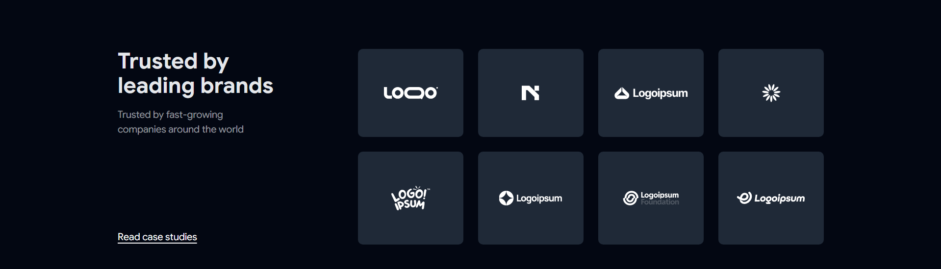
This layout focuses on brand recognition and visual consistency. Most implementations use grayscale logos with subtle hover transitions to avoid distracting users while still maintaining interaction feedback.
Key Features:
Hover grayscale effects
Optimized SVG rendering
Mobile-friendly alignment
Consistent logo sizing
Lightweight CSS animations
Best for: Marketing websites and startup landing pages.
Trusted by Industry Leaders
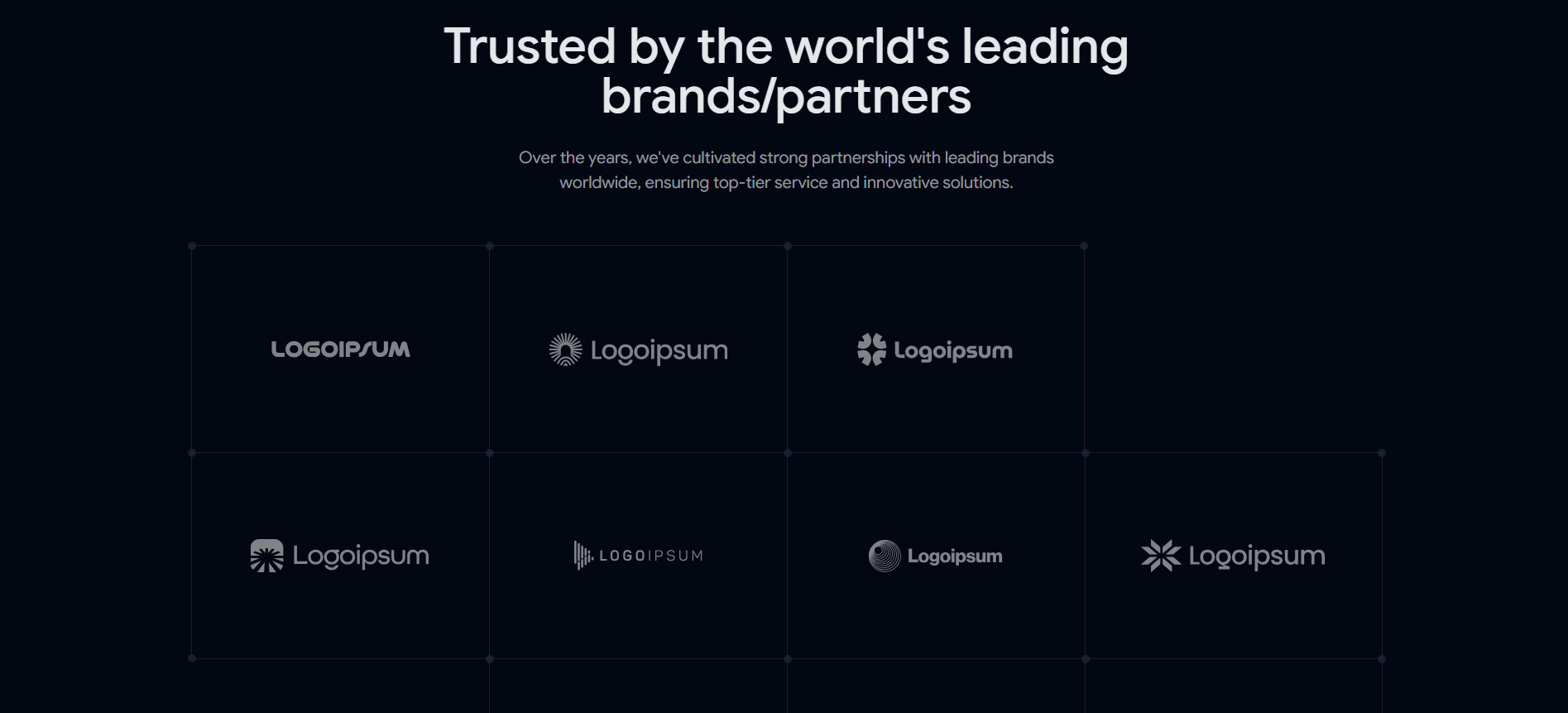
This design pattern is commonly used when products target technical or enterprise-focused industries. The layout usually prioritizes clean spacing and readability over decorative visuals because enterprise users scan trust indicators quickly.
Key Features:
Structured logo hierarchy
Clean spacing patterns
Semantic accessibility support
Grid-based responsiveness
Performance-focused rendering
Best for: B2B SaaS platforms and developer products.
Trusted by Leading Teams
This component style works well for collaborative tools, project management products, and internal workflow platforms. It often combines logos with smaller usage metrics or short supporting text to create stronger product adoption signals.
Key Features:
Team-focused trust layout
Compact responsive grids
Smooth marquee scrolling
Lightweight interaction states
Accessible SVG handling
Best for: Team collaboration tools and workflow platforms.
Worked with Top Companies
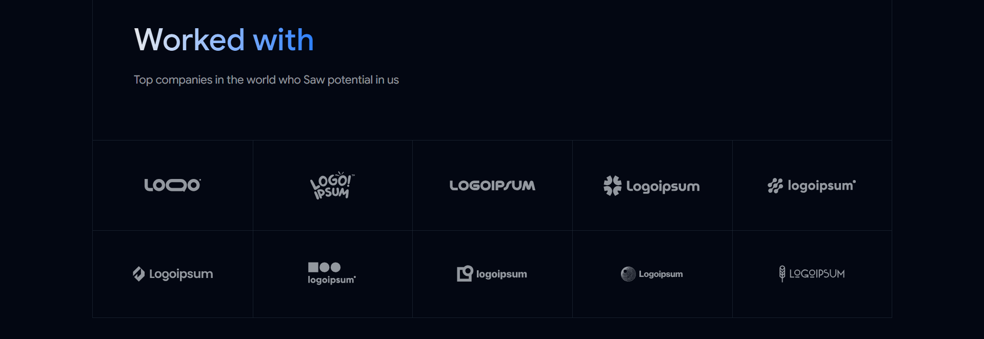
This pattern creates a slightly more personal and portfolio-style trust section. Developers often use it for agency websites, creator products, AI startups, and developer portfolios because it feels less corporate and more experience-driven.
Key Features:
Flexible grid layouts
Minimal UI styling
Dark mode compatibility
Tailwind utility customization
Copy-paste integration workflow
Best for: Agency websites and personal SaaS projects.
Logo Cloud SEO Best Practices
Many logo cloud sections look visually polished but fail technically.
Search engines and AI systems rely heavily on semantic structure and entity understanding. If your logo cloud lacks accessibility, structured HTML, or optimized assets, it becomes much harder for search systems to interpret properly.
Use Proper Alt Text
Avoid generic alt attributes like:
alt="logo"Instead use:
alt="Notion logo"This improves:
Accessibility
Image indexing
Entity recognition
AI overview extraction
Use Semantic HTML Structure
Use proper HTML elements like:
<section><ul><li><figure>
This helps search engines understand the structure of your trust section more clearly.
Optimize SVG Assets
SVG logos are usually better than PNG files because they scale cleanly and load faster.
Good SVG optimization practices include:
Compressing paths
Removing metadata
Using consistent dimensions
Avoiding oversized filters
Lazy loading offscreen logos
Improve Core Web Vitals
Large logo sections can negatively affect performance if not optimized properly.
To avoid this:
Compress SVG files
Reduce unnecessary animations
Avoid loading massive image assets
Use responsive sizing
Minimize layout shifts
Common Logo Cloud Mistakes Developers Should Avoid
A poorly designed logo cloud can reduce trust instead of improving it.
Here are some common implementation mistakes developers still make.
Using Too Many Logos
Showing 40 to 50 logos usually creates visual overload.
Most SaaS landing pages perform better with 6 to 15 recognizable brands.
Poor Mobile Layouts
Many logo grids break on smaller screens because spacing systems were only tested on desktops.
Always validate:
Tablet widths
Small mobile screens
Dark mode layouts
Responsive logo scaling
Inconsistent Logo Heights
Different logo dimensions create messy alignment patterns.
Using normalized SVG containers solves this issue quickly.
Overusing Animations
Heavy marquee animations often hurt readability and performance.
Subtle movement usually performs better than aggressive motion effects.
Missing Accessibility Support
Missing alt text, poor contrast, and incorrect semantic structure reduce usability and weaken SEO quality signals.
FAQ’s
1. What is the best logo cloud style for SaaS websites?
Trusted by Companies and Leading Brands, layouts usually perform best because they improve readability, responsiveness, and visual consistency without distracting users from the core landing page content.
2. How many logos should a logo cloud section include?
Most high-performing SaaS landing pages use between 6 and 15 logos. Too many logos often reduce clarity and create visual clutter on mobile devices.
3. Why do developers prefer SVG logos in logo cloud components?
SVG logos load faster, scale cleanly across devices, and maintain visual quality without increasing layout weight. They also work better with responsive Tailwind CSS layouts.
Final Verdict
Shadcn Logo cloud sections are still one of the simplest ways to improve trust on a SaaS landing page without adding heavy UI complexity.
A properly structured logo cloud helps users instantly understand that real companies, teams, or collaborators are connected to the product. That trust layer matters even more now because users scan landing pages extremely fast.
If you build products using React, Next.js, Tailwind CSS, and Shadcn UI, adding a well-optimized logo cloud component can improve both visual credibility and conversion flow with very little development effort.
The best implementations focus on:
spacing consistency
accessibility
SVG optimization
responsive layouts
semantic HTML
lightweight animation
Simple trust sections usually outperform overly decorative ones. Clean structure, readable spacing, and fast rendering still matter more than flashy visuals.
Join Vaibhav on Peerlist!
Join amazing folks like Vaibhav and thousands of other builders on Peerlist.
0
4
0