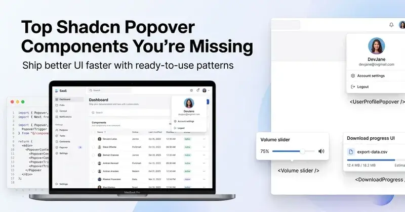
Top Shadcn Popover Components That You're Missing In Your Codebase
Find high-quality Shadcn popover components to create interactive dashboards, forms, and modern web app experiences.
Popover components solve a very specific UI problem. You want to show extra context without breaking the current screen. A modal feels heavy. A tooltip feels too small. That gap is where popovers fit.
If you are building dashboards, SaaS tools, or admin panels, you end up repeating this pattern often. Profile previews, quick settings, alerts, and inline actions all depend on it.
This list is not random. Each component here is picked based on real developer use. The focus is on clean structure, extensibility, and how fast you can ship it in a real project.
What is a Popover Component?
A popover is a small overlay panel that appears on user interaction. It is usually triggered by a click, hover, or focus. It stays attached to a specific element like a button or icon.
Unlike tooltips, popovers can hold complex UI. You can place forms, lists, toggles, or even charts inside them. Unlike modals, they do not block the whole screen.
In modern React apps, popovers are often built using Radix or Base UI primitives. This gives you accessibility, keyboard navigation, and proper focus handling without writing everything from scratch.
Why do developers use this component?
Popover reduces navigation friction. Instead of redirecting users to a new page, you show the action inline. This saves time and keeps context intact.
It also improves UI density. In SaaS dashboards, space is limited. Popovers let you hide secondary actions and reveal them only when needed.
From a code perspective, reusable popovers reduce duplication. Once you set up the structure with Radix and Tailwind, you can scale it across 10 to 15 use cases without rewriting logic.
Quick Checklist
Before adding any popover component, check this:
Uses Radix or Base UI for accessibility and focus management
Clean trigger and content separation
Supports keyboard navigation and escape handling
Easy to control the open and closed state
Works with server components in Next.js
No layout shift issues on render
Animation handled with Framer Motion or CSS
Tailwind classes are structured and reusable
Supports dynamic data injection
Tested inside real dashboard flows
All components listed below follow this structure.
Installation
All components are open source and support Radix and Base UI.
You can install them using any package manager.
Example using pnpm:
pnpm dlx shadcn@latest add @shadcn-space/popover-01The same approach works with npm, yarn, and bun.
Most components follow a direct copy-paste setup with minimal config.
Tech Stack Used
React
Next.js
Tailwind CSS
Framer Motion
Best Shadcn Popover Components
These are some of the most useful Shadcn popover components available for dashboards and SaaS products.
About Popover
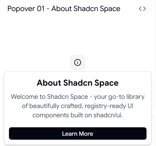
This is the base reference implementation. It gives a clean structure with trigger, content, and positioning logic. Useful when you want full control over UI and behavior.
You get a minimal setup with Radix or Base UI integration. No extra abstraction layer. Good starting point if you plan to build multiple variations.
Key Features:
1 trigger + 1 content structure
Controlled and uncontrolled state support
Keyboard and focus handling built in
Positioning via Radix or Base primitives
Easy Tailwind overrides
Best for: Building custom popover systems across a SaaS dashboard
User Profile Card Popover
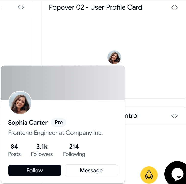
This component shows user details inside a popover. Common in team dashboards, CRM tools, and admin panels.
Instead of redirecting to a profile page, you can show name, role, actions, and stats instantly. This reduces clicks and improves workflow speed.
Key Features:
Avatar + metadata layout
Action buttons inside the popover
Supports dynamic user data
Optimized for hover or click triggers
Works well with API-driven content
Best for: SaaS apps with team management or user insights
Notifications Popover
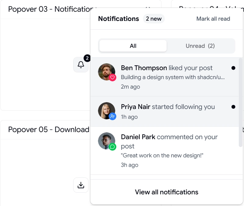
This handles real-time alerts and updates. It replaces a full notifications page with a compact interactive panel.
You can plug it into a bell icon and render a list of updates. Supports unread states and action buttons inside each item.
Key Features:
List rendering with scroll support
Unread indicator handling
Action buttons per notification
Works with real-time data sources
Structured layout for multiple item types
Best for: Apps that need instant user updates without page navigation
Volume Control Popover
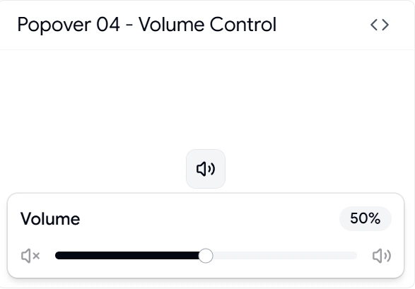
This is a functional popover with interactive controls. It includes sliders and real-time value updates.
Useful in media apps, dashboards with sound alerts, or any tool where inline adjustment is needed.
Key Features:
Slider integration inside popover
Real-time state updates
Compact control layout
Keyboard accessible input
Smooth interaction handling
Best for: Media controls or quick settings inside dashboards
Download Progress Popover
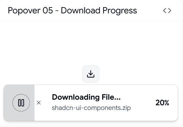
This shows file download or upload progress without redirecting users. Keeps the workflow uninterrupted.
You can show percentage, file name, and status in real time. Works well with async operations.
Key Features:
Progress bar integration
Async state handling
Multiple file support structure
Status updates in real time
Compact UI for background tasks
Best for: File-heavy apps or tools handling exports and reports
Location Popover
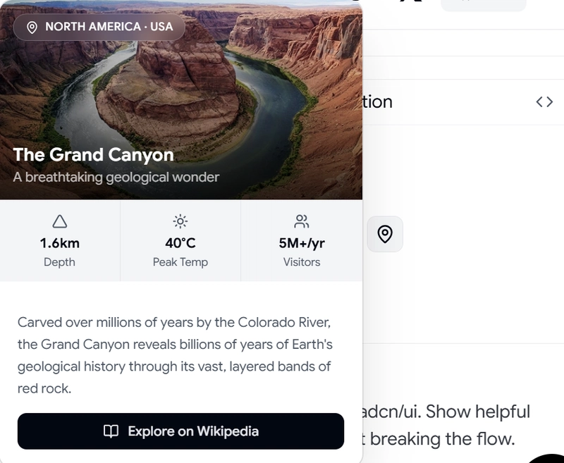
This component is useful when you need quick location input or a preview. It can include maps, coordinates, or simple selection lists.
Common in delivery apps, logistics dashboards, or geo-based SaaS tools.
Key Features:
Input + preview combination
Supports dynamic location data
Works with map integrations
Clean layout for selection
Extendable for API usage
Best for: Apps dealing with user location or geo data
FAQs
1. How to use Shadcn popover in a Next.js project with server components?
Use the popover inside a client component. Wrap it with "use client" and keep state handling local. Radix or Base requires client-side interaction.
2. Can I control popover state manually for complex workflows?
Yes. Use controlled mode with open and onOpenChange props. This helps when syncing with API calls or global state.
3. How to handle dynamic data inside a popover without re-render issues?
Keep data fetching outside the popover. Pass data as props. This avoids unnecessary mounts and improves performance.
Final Verdict
Popover is one of those shadcn components you underestimate until you build a real product. Once you start using it properly, it removes a lot of UI friction.
Each component listed here solves a real use case. Not just UI variation. You can plug them directly into dashboards, admin panels, or SaaS tools without major changes.
If you are building with React and Next.js, this setup gives a solid base: clean structure, accessible behavior, and easy scaling across features.
Join Vaibhav on Peerlist!
Join amazing folks like Vaibhav and thousands of other builders on Peerlist.
0
7
0