If it’s not integrated, it’s dead data.
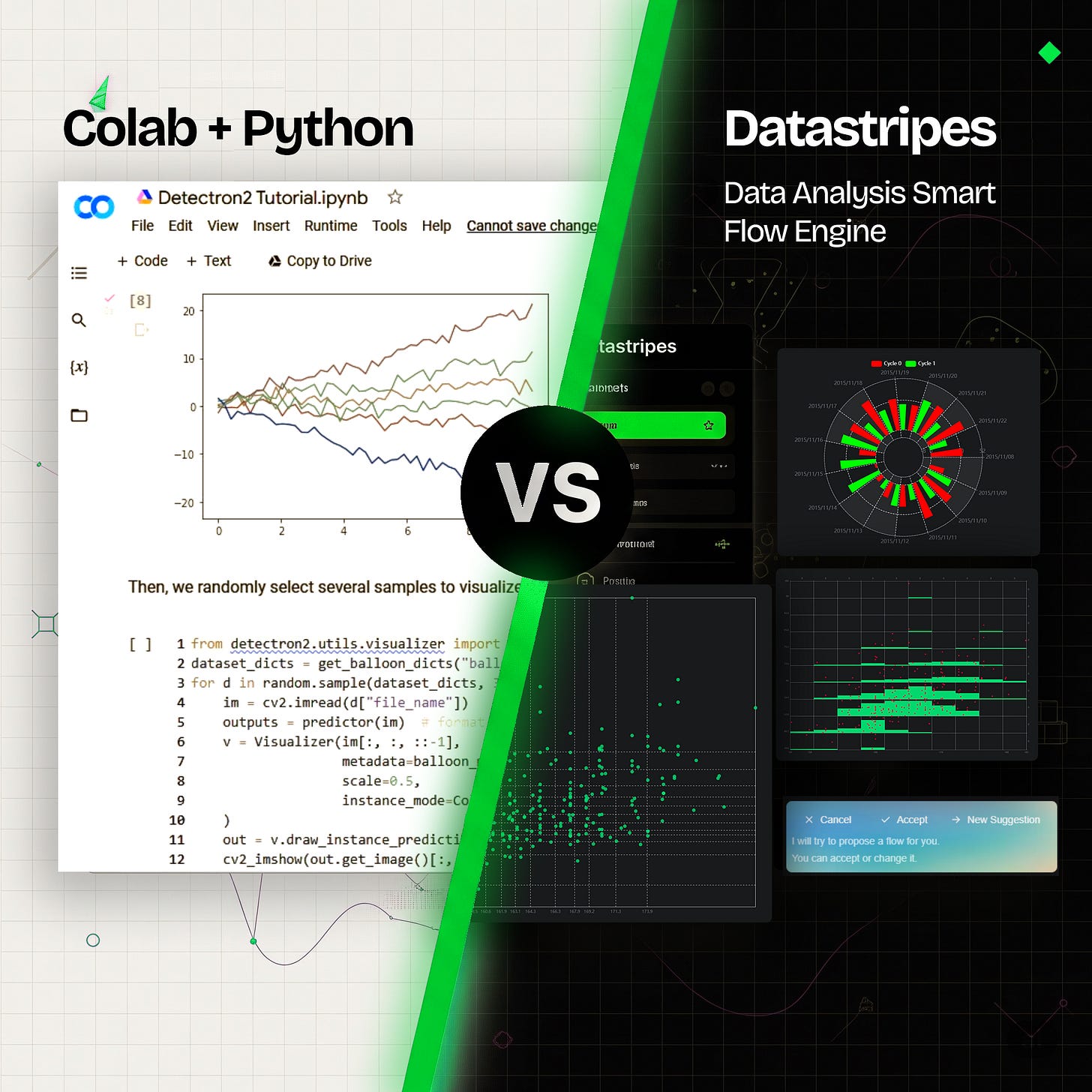
The real problem isn’t visualization. It’s integration. Here’s how we’re fixing it at Datastripes.

The real problem isn’t visualization. It’s integration. Here’s how we’re fixing it at Datastripes.
You’ve seen them.
Those sleek dashboards with crisp charts, fancy filters, and ultra-polished UIs. The kind you proudly show in a slide deck, hoping someone will finally say, “Wow, that’s useful.”
But the truth is, most dashboards don’t do much.
Why? Because behind all the visual shine, the data underneath is often disconnected, outdated, or just plain wrong.
The system looks alive, but it’s really a ghost town. No traffic. No insights. Just stale numbers nobody trusts.
At Datastripes, we’ve been on both sides of this struggle, building tools, and trying to make sense of them. And we’ve come to a blunt conclusion:
A system not integrated is a system already dead.
It doesn’t matter how pretty your report looks.
If it can’t speak to the tools your team actually uses, in real time, and without endless hand-holding from data engineers, then it’s already failed.
Data work today: it’s a broken loop
Here’s what working with data often looks like in practice:
You ask a question — maybe about sales trends, campaign performance, or customer engagement. To get the answer, you open a dashboard… but it’s not updated. Or worse, it’s showing numbers that no one can explain.
So you ping someone on the data team. They look into it. They write a custom SQL query. They export a CSV, tweak it in Excel, and send back a screenshot. It’s good… for about 10 minutes. Then something changes, and the whole thing breaks again.
Weeks later, you’re back to square one, this time with slightly fancier filters.
That cycle kills momentum. It wastes time. And it makes people slowly lose trust in their own data.
We knew there had to be a better way.
What if data just… worked?
That’s the question we asked ourselves when building Datastripes.
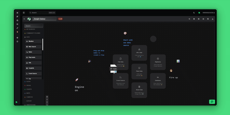
Instead of giving teams yet another blank dashboard canvas or code-heavy analytics tool, we focused on creating something radically simple: ready-to-go data flows that just work out of the box.
These flows connect to the business platforms you actually use every day, like Shopify, GA4, SuiteCRM, SAP, and let you generate insights in minutes. No scripts. No waiting. No “can you send me the latest version?” drama.
They’re designed for real-world use cases, and they don’t require a technical background. You don’t need to know SQL. You don’t need to write Python. You don’t even need to wait for someone else to do it for you.
Just pick a flow, plug in your data, and explore.
From data to insight instantly
We’re rolling out a series of powerful flows to start with. Each one solves a concrete problem, and is built for speed, clarity, and flexibility.
For example:
🔍 SuiteCRM sales pipeline overview
This flow gives sales teams a real-time snapshot of their open opportunities. You can see what deals are stuck, track rep performance, and pinpoint bottlenecks without waiting for an end-of-quarter review. It’s about giving teams clarity when they need it, not when it’s already too late.
🛍 Shopify + GA4 E-commerce integration
Marketing and product teams often struggle to connect behavioral data (what people do) with commercial data (what people buy). This flow does it for you. See how campaigns impact conversions, where customers drop off, and what changes actually move the needle.
🌍 GA4 geographical sales analysis
Expanding into new regions? Running localized campaigns? This flow helps visualize engagement and revenue by country or region. It’s perfect for teams thinking about geo-targeting or optimizing across markets.
🏭 SAP Sales Order Analysis Pro
For enterprise teams buried in SAP complexity, this flow cuts through the noise. Analyze order timelines, fulfillment delays, and customer patterns straight from SAP’s data structures, no ETL nightmares required.
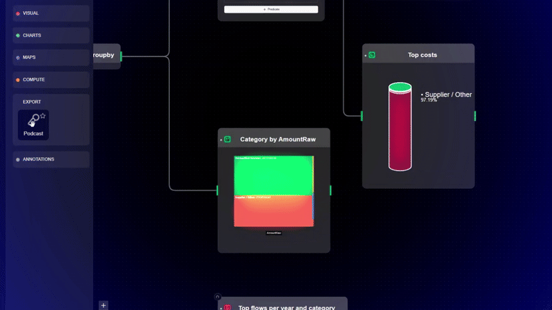
Built for the way you work
These flows aren’t static. Our paradigm is clear:
Repeatable, so you can run them again whenever new data comes in.
Editable, so you can tweak filters, add steps, and shape the story.
Exportable, so you can share insights via PDF, slides, dashboards, HTML widgets, or even audio summaries.
And private by design because your raw data should never leave your device unless you say so.
We’ve focused on usability, speed, and control. Because data should work for you, not the other way around.
No more broken reports. No more waiting.
What we’re building isn’t just a tool, it’s a shift in how teams work with data.
We’re done with the slow loop of build → break → rebuild.
We’re done with dashboards nobody reads.
We’re done with 1:1s that start with “can someone explain this number?”
Datastripes gives you a new path: insight in, insight out, in minutes, not months.
Last big thing? Data to Podcast
Imagine you’ve just completed an epic journey through your data. You’ve prepped, cleaned, mapped, categorized, and mined those precious insights like a modern-day data prospector. Your dashboards glow with clarity. Your charts tell the story. But then comes the kicker:
How do you share this treasure with your CEO, your team, or your clients, in a way that actually gets heard?
Because let’s be honest, a 20-page report, endless spreadsheets, or even a polished slide deck can be daunting, easy to ignore, or just plain boring.
Now, imagine if your data could speak directly to your audience. What if your insights could be packaged as a crisp, engaging podcast episode, delivered in 90 seconds, that anyone can listen to while commuting, walking the dog, or sipping their morning coffee?
It’s Datastripes, and it’s a total game-changer.
Listen here:
Be part of the launch
We’ve just opened our early access, free and unlimited at app.datastripes.com
We’re also launching on Product Hunt, and we’d love to hear what you think.
👉 Check us out here
If you work with data, or just want to stop fighting with it, this is your chance to try a new approach.
Join the waitlist. Explore the flows. Share your first insight in minutes.
And if you’ve ever stared at a broken dashboard and thought, “There has to be a better way” you’re exactly who we built this for.
Join Vincenzo on Peerlist!
Join amazing folks like Vincenzo and thousands of other builders on Peerlist.
0
5
1