

The Real Bottleneck in Branding Was Never the Logo
The Real Bottleneck in Branding Was Never the Logo
Everyone focuses on logo design. But the actual friction point in brand work happens after the mark is done — when you need to show how it lives in the world.
A logo on a white background tells nobody what the brand feels like. Clients want to see signage, cards, packaging, booths, social posts, and product surfaces. That part — turning a symbol into a believable brand system — traditionally eats half a day or more of production work.
That gap is what made me curious about Image 2.
What I tested
I uploaded two very different logos into Image 2 and asked a straightforward question: can this tool generate a coordinated set of brand proposal visuals fast enough to change how we build presentations?
After running both tests, my answer is yes — at least for early-stage brand proposals and direction-setting.
The framework that makes it work
Random generation produces random results. What works better is defining categories first:
Logo material and finish studies
Single branded item mockups
Combined brand material sets
Spatial and environmental scenes
Human or usage scenarios
Social media visuals
That structure matters because not every brand should appear in the same kinds of scenes. A developer-facing AI platform should not be visualized the same way as a family nature park.
A practical planning prompt:
I already have a logo. The industry is [industry]. The brand personality is [keywords]. Based on the uploaded logo, help me plan a complete logo mockup generation set. Include: 1) logo material variations, 2) single brand applications, 3) combined brand materials, 4) spatial scenes, 5) human or usage scenarios, and 6) social media visuals. For each category, provide the recommended visual direction, aspect ratio, and prompts that can be used directly in Image 2.
Case 1: Evolink — a tech brand that needed to feel real
Evolink is an AI model aggregation platform. The brand inputs: professional, stable, developer-friendly, enterprise-ready, connected.
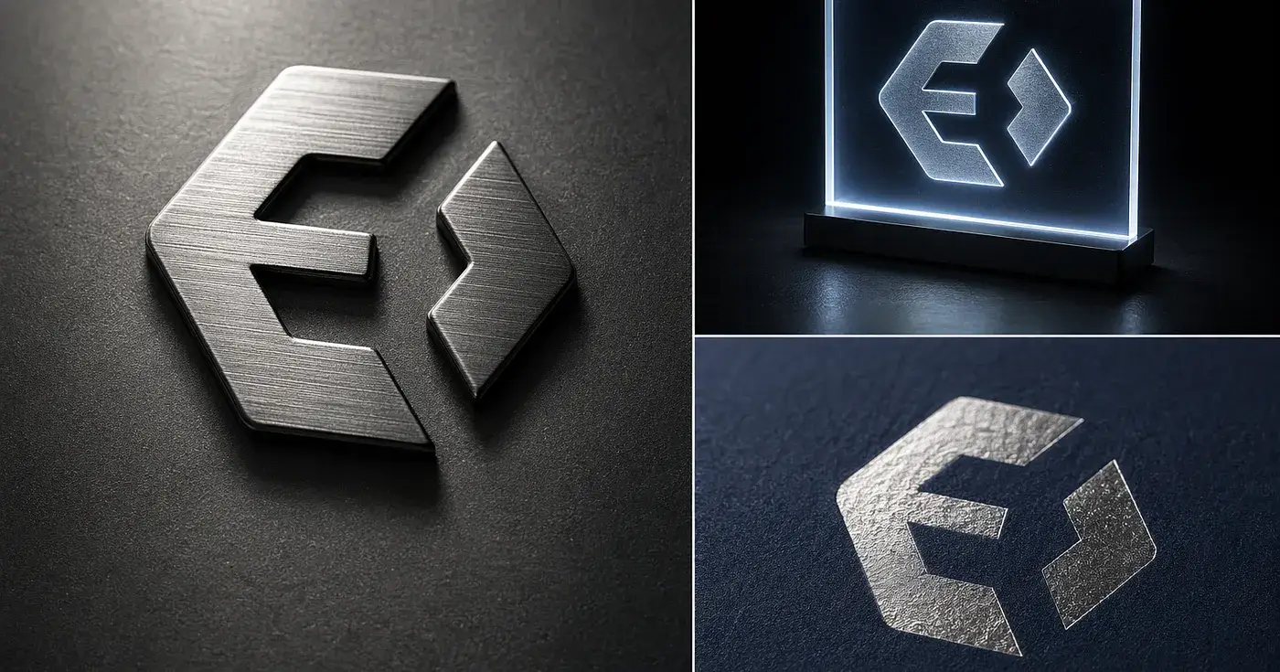
From there, Image 2 mapped those qualities onto mockup directions — logo finishes, interface materials, developer badges, documentation covers, and booth-style spatial visuals.
Press enter or click to view image in full size
Press enter or click to view image in full size
Press enter or click to view image in full size
Press enter or click to view image in full size
Press enter or click to view image in full size
Press enter or click to view image in full size
Press enter or click to view image in full size
After one round, Evolink no longer reads as just a geometric black logo. It starts to feel like a real company — one that could exist across booth design, dashboards, API documentation, and product announcements.
Case 2: MoriJoy — proving the workflow adapts
To test whether this holds outside of tech, I tried MoriJoy, a parent-child nature park. The logo combines a smiling treehouse and a small sapling, with wood tones, cream, and light green.
The mockup planning naturally shifted: entrance signage, membership cards, staff name tags, children’s drinkware, sticker sets, tote bags, and family activity spaces.
Press enter or click to view image in full size
Press enter or click to view image in full size
Press enter or click to view image in full size
The workflow stays the same. The visual language changes completely. Evolink comes out structured and enterprise-oriented. MoriJoy comes out soft, natural, and emotionally warm.
Why this matters more than speed
For early brand presentation work, speed is only part of the story. The bigger advantage is clarity.
Clients react much better when they can see the identity in context — on real surfaces, inside spaces, across materials. A strong mockup set makes the brand feel less theoretical and more deployable.
That does not mean AI replaces the entire branding process. It means the exploration phase becomes much faster. You can test more directions, compare moods earlier, and move into presentation-ready visuals without manually building every scene.
What changes next
If this workflow keeps improving, the biggest shift may not be image generation itself. It may be the collapse of the gap between a finished logo and a convincing brand proposal.
That gap used to require a lot of manual production. Now, with the right prompt structure and a clear sense of brand personality, it compresses into a much faster visual iteration loop.
Try Image 2 for your next brand mockup set: https://evolink.ai/gpt-image-2
Join dong on Peerlist!
Join amazing folks like dong and thousands of other builders on Peerlist.
0
0
0