I Built My Own Bookmark Manager (Because Nothing Else Worked)
How I built Alam, a minimal tool for my scattered digital life
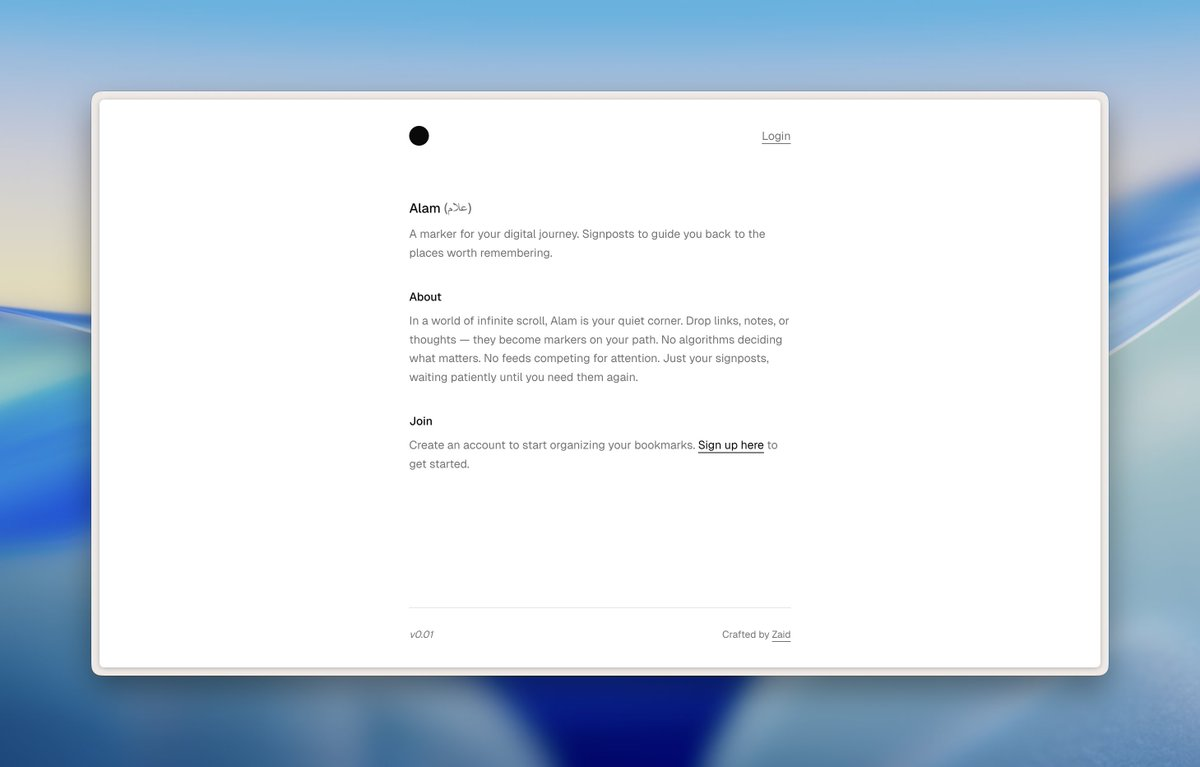
Why I Built This
I've tried everything. Pocket, Raindrop, browser bookmarks, Notion databases, even text files. Nothing stuck. Either they were too feature-heavy (I don't need teams, analytics, or AI summaries), too ugly, or too slow. I just wanted a fast, clean way to save links and actually find them later.
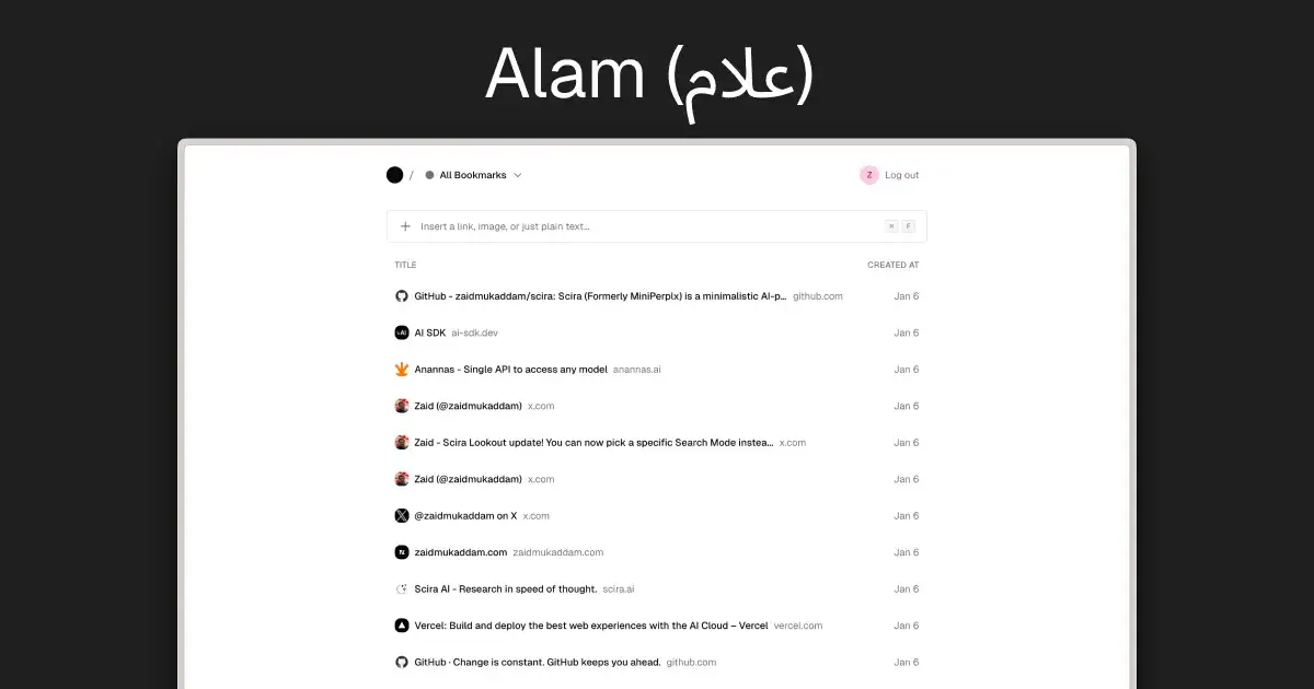
So I built Alam (علام). It's Arabic for "marker" or "signpost." It's my personal bookmarking tool, designed exactly how I want it.
What I Wanted
Fast - Instant feedback, no loading spinners
Keyboard-first - I hate reaching for the mouse
Clean - No clutter, no notifications, no "engagement"
Smart - Fetch metadata automatically, extract links from screenshots
Mine - No tracking, no social features, just my stuff
What I Built
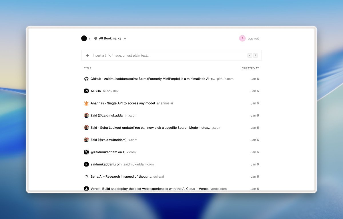
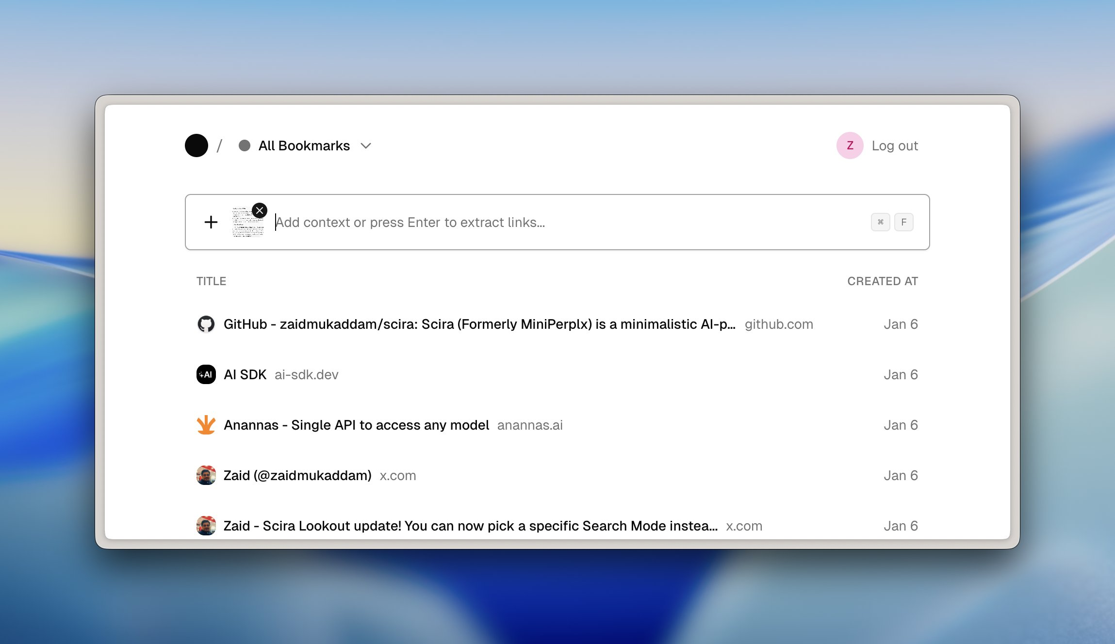
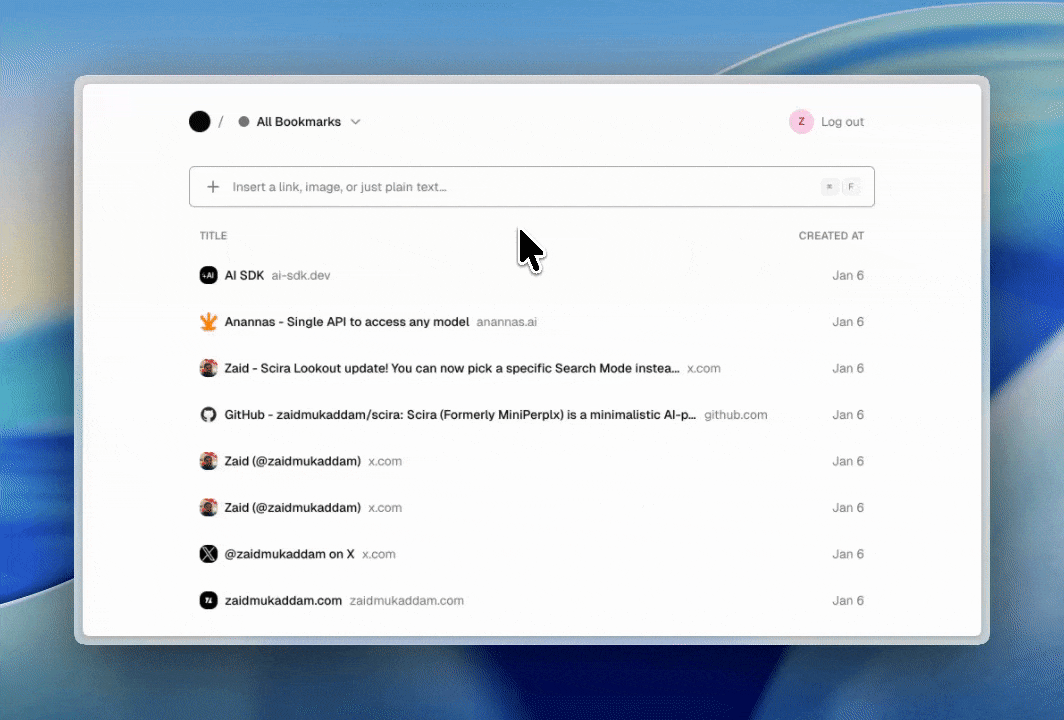
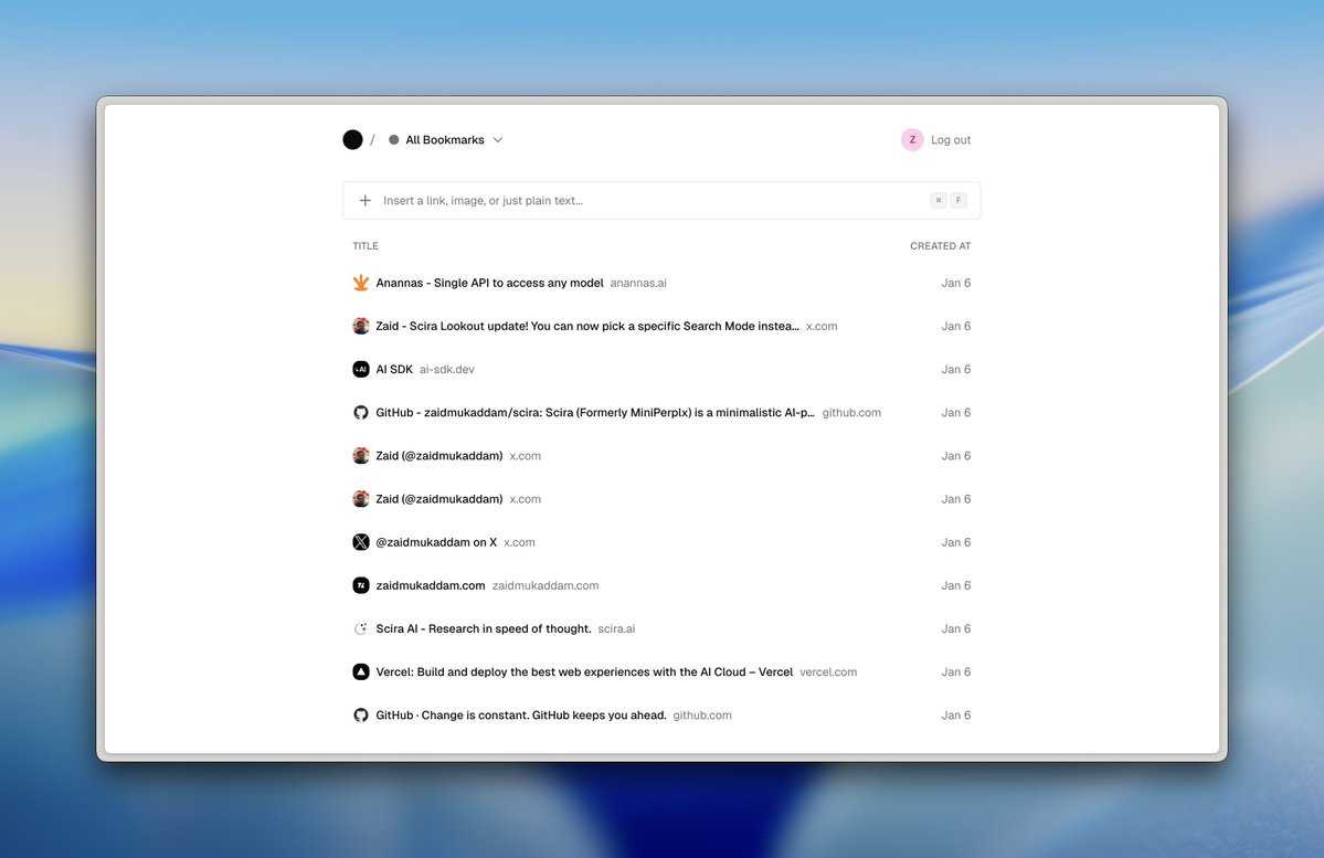
The Input Bar Paste a URL and hit Enter. That's it. Alam fetches the title, favicon, and preview image in the background.
If I paste a wall of text with multiple URLs (like research notes or Twitter threads), AI extracts all the links and saves them individually.

I can even paste screenshots with visible URLs. The AI reads the image and pulls out the links. This is perfect for mobile screenshots or design inspiration.
Search That Actually Works Press Cmd+F to search. No separate search page, no modal. The input bar just switches to search mode. Results filter as I type, searching through titles, URLs, and descriptions.

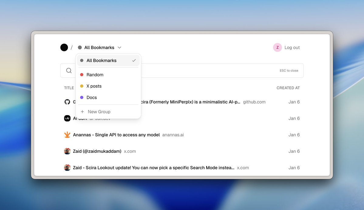
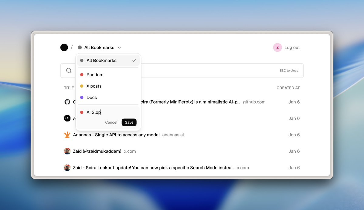
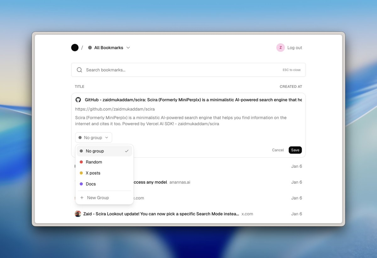
Groups (Not Folders) I organize bookmarks into color-coded groups. Not nested folders. Just simple, flat categories. The dropdown shows counts, lets me create new groups, and I can drag to reorder bookmarks.
Full Control I can edit everything. Titles, descriptions, URLs, group assignments. Sometimes metadata comes back wrong, or I want to add context. No need to delete and re-add.
Technical Choices
I built this with:
Next.js 16 - App Router, Server Components, fast by default
Supabase - Postgres database with built-in auth and RLS
Vercel AI SDK - For link extraction from text and images (using Gemini 2.5 Flash Lite)
Tailwind + shadcn/ui - Clean, minimal design without custom CSS hell
Everything feels instant because I use optimistic UI updates. The UI responds immediately, then syncs to the database in the background. If something fails, it rolls back silently.
Design Philosophy
I wanted this to feel like a tool, not an app. Inspired by Raycast, Arc, and the brutalist web movement:
Muted grays and neutrals
System fonts only
Clean borders, minimal shadows
Lots of whitespace
Hover states that feel responsive
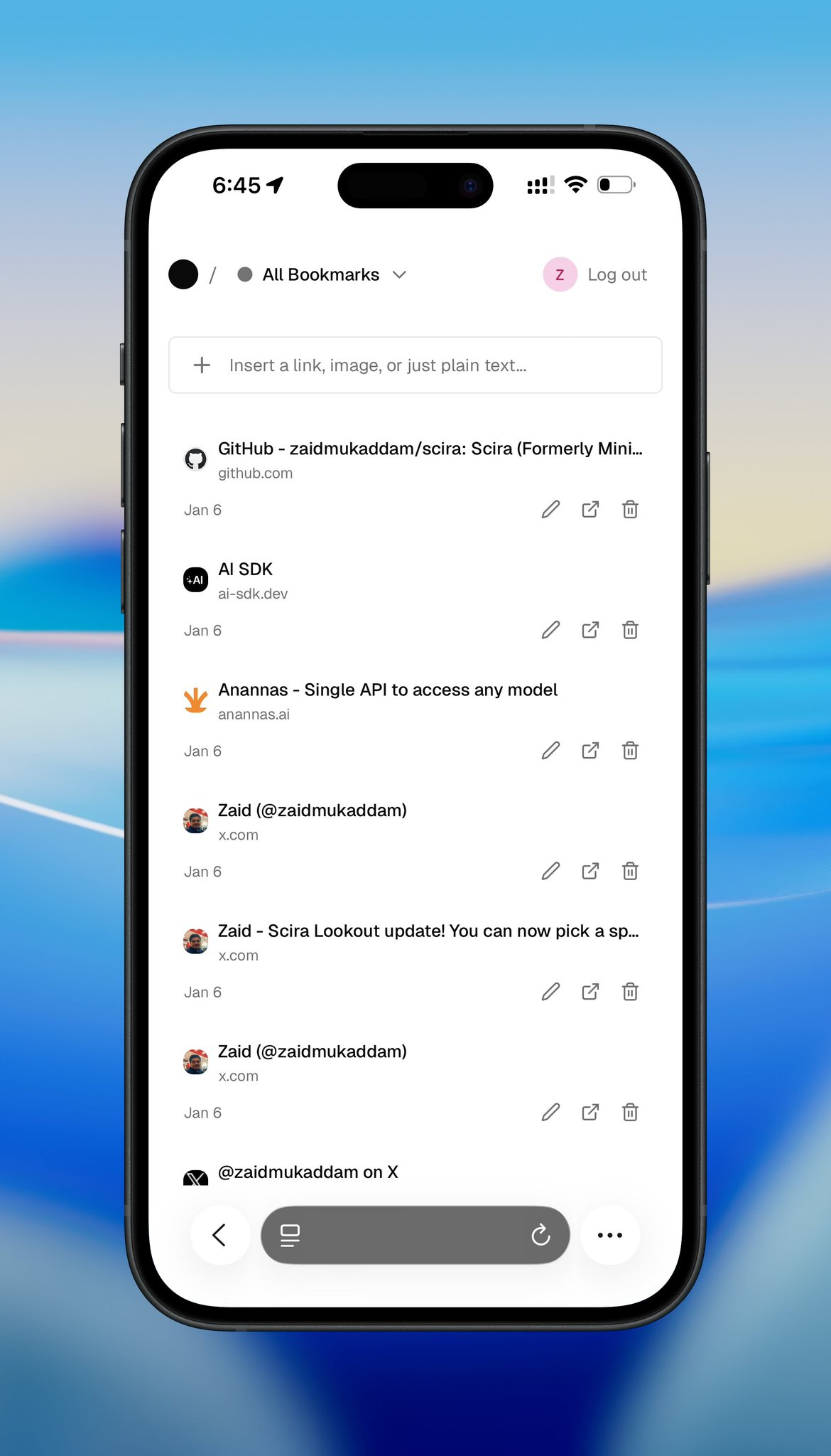
On mobile, the layout stays just as clean. Everything stacks vertically with touch-friendly tap targets and plenty of breathing room.
What I Learned
1. Build for yourself first I stopped asking "what would users want?" and just built what I wanted. It's liberating.
2. Constraints force better decisions By refusing to add features I didn't need, the core experience got stronger.
3. Optimistic UI is everything People forgive slow backend syncs if the UI feels instant. Every action updates the UI first, then hits the database.
4. AI for structure, not magic Vision models are great at extracting structured data (like URLs from images), but you need clear prompts and good error handling.
5. Mobile is hard Touch interactions need more space and thought than desktop hover states. I had to rethink the entire layout.
What's Next
For now, Alam is staying personal. Just for me, but not for too long.
Eventually, I might:
Make it live - very soon, for a price.
Open-source it - So others can self-host their own version
Add a few refinements - Keyboard shortcuts, bulk actions, maybe tags
But honestly, it already does what I need. That's the point. Personal software for the win!
Join Zaid on Peerlist!
Join amazing folks like Zaid and thousands of other builders on Peerlist.
8
14
3