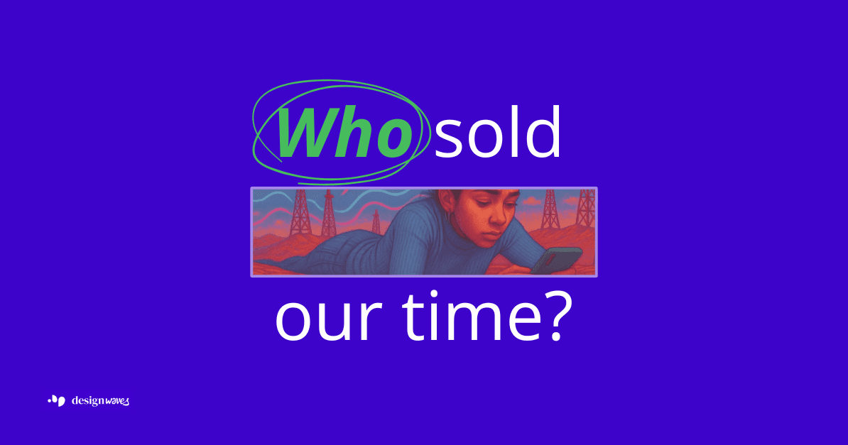
The scroll that sold our time
Can We Topple Economies by Design? — Part 3: Design as Extraction
Design didn’t “go bad.” Capital taught it what to optimize.
We often think design = delight.
But what if delight was just the sugar that helped extraction go down?
The design that shipped an economy
“We shape our tools and thereafter our tools shape us.” - John Culkin, 1967
Design doesn’t only ship features.
It ships incentives.
It writes rules.
It decides who profits from your time.
And sometimes… design becomes an economy.
That’s exactly what happened when feeds, likes, autoplay, and “pull to refresh” rewrote the web’s business model. Not by accident… by design.
In the late 2000s and early 2010s, a handful of interface patterns rewired the web around one KPI: time ... and to be more precise - the extraction of time.
Like became the atomic unit of engagement
(rolled out on Facebook, 2009).Infinite scroll eliminated natural stopping points ... no end, no closure, only more seamlessness without friction to maximise consumption.
(popularised by Aza Raskin, circa 2006, who since has warned about what that invention does to human attention).Pull-to-refresh made “maybe there’s more” a thumb reflex ... digital slot machine lever triggering a dopamine response that fuels the urge of compulsive checking.
(Tweetie, 2008/09).Watch-time as currency: YouTube’s 2012 shift to ranking by watch time instead of clicks locked the industry onto attention as the core metric and currency.
Recommendation engines then learned to maximise that currency.
This is economic design. It didn’t just change interfaces; it changed incentives, and incentives changed the market.
It's in its core a masterfully designed cognitive colonialism, that traps us in a feedback loop of our own biases.
The design that swallowed the universe
We think of colonialism as a relic of history ... a struggle over land, resources, and tangible goods. Yet a new colony has been established in the intimate space between our thoughts.
Its territory: your attention.
Its capital: your data.
Its primary tool of extraction: The Feed.
The most radical design weapon of the 21st century is an infinitely scrolling, algorithmically-sorted stream of content. Based on 4 core pillar building the attention-swallowing machine:
Centralisation
Power doesn’t multiply at the edges; it funnels to the feed.Invisibility
Manipulation doesn’t wear a villain’s cape. It looks clean, minimal, inevitable.Engagement over outcomes
If time-on-site is the goal, well-being is a rounding error.Symbol meets function
The “Like” was never just a button. It was a currency.
This changed not only how we use the internet ... but how we think, decide, relate, and perceive reality itself.
The economy of the self
Shoshana Zuboff calls it surveillance capitalism: platforms harvest behavioural data to predict and nudge future behaviour, selling targeted access to our attention.
In this system, you are both the labor and the product.
Your
likes,
shares,
pauses,
scrolls,
are the raw materials … the digital cotton … shipped to the data mills and refined into predictive models. The "experience" isn't the product; it is the factory. And you are working the line for free.
Take the introduction of autoplay ... a tiny default removing the conscious moment of choice.
New research finds turning autoplay off measurably reduces viewing time ... proof that a tiny defaults steer human behaviour at scale.
The Cost of “More”
Gandhi’s spinning wheel (from part 1) was a tool to opt out of an extractive economic system. The Feed is the ultimate tool to keep us opted in.
We were sold the narrative that it connects us. It also conditions us.
We were told “time on site” means value. It also means time not lived elsewhere.
What did it extract to pay for that “more”?
Our focus. Our civic patience. Our sleep. Our mental peace.
Our kids’ unmonetised boredom ... the soil where imagination grows.
We built behavioural mills and called them platforms.
We clocked in voluntarily. We forgot to clock out.
From patterns to deceptive patterns
What began as “clever UX” became the default brief, the gospel of Silicon Valley, and the core curriculum taught by bootcamps.
Clever became coercive ... it slid into manipulative choice architecture.
In 2010, user experience expert Harry Brignull coined the term “Dark Patterns” to give a name to this creeping malignancy: designs that trick, mislead, and manipulate users for corporate gain.
For over a decade, Western regulation was largely performative. The EU’s Digital Services Act (DSA) and the U.S. FTC issued statements and slow-moving cases, debating ethics while permitting the extraction to continue.
Then, one country changed the game. India.
A law against manipulation
India is the first major economy to preemptively outlaw the weaponisation of design with enforcable law.
Why? As hundreds of millions of new users came online, they became the primary targets. Confronted with evidence that 40% of its citizens had been deliberately tricked by specific patterns, the response was non negotiable ... the law exists because India quantified the harm.
These patterns were not "aggressive growth tactics" but predatory practices causing demonstrable financial and psychological damage.
The Ministry of Consumer Affairs did not wait for a global consensus and led the way to protect its citizens from what it classified as unfair trade practices.
In 2023, the amended Consumer Protection Act, issued national guidelines naming and banning 13 specific dark design patterns and methods of psychological manipulation:
False Urgency (Faking scarcity)
Basket Sneaking (Adding hidden items to your cart)
Confirm Shaming (Guilting you into compliance)
Forced Action (Making you sign up to checkout)
Subscription Trap (Easy sign-up, impossible cancellation)
Interface Interference (Hiding information you need)
Bait and Switch (Advertising one thing, delivering another)
Drip Pricing (Hiding fees until the last step)
Disguised Advertisement (Faking news or user posts)
Nagging (Bombarding you with interruptions)
Trick Questions (Using confusing language to mislead)
Saas Billing (Taking recurring payments without clear consent)
Rogue Malwares (Tricking users into installing malware)
India didn't regulate the economy of attention.
It declared its core mechanics illegal.
The new design brief is about integrity
Toppling this economy doesn’t require a violent uprising.
It requires a design rebellion. It requires intentional design.
Better design ... rejecting the principles of extraction and designing for sovereignty.
Even Apple built “Screen Time” into iOS in 2018, showing the industry the defaults can be renegotiated.
The feed colonised our attention. It’s time to declare independence.:
Using metrics as morals in numeric form.
Thinking of patterns as invisible policy-shapers.
There’s a counter-movement.
Building friction back in and designing for conscious use.
Data and Experience Sovereignty
Put stops back in and think of end-of-life
Design for data frugality
Design for recovery, not stickiness.
Where do You draw the line?
Between “that converts” and “that coerces.”
Between friction that protects and friction that traps.
Ask, relentlessly:
Are my defaults (infinite scroll, autoplay, black-box ranking) extracting time or restoring choice?
Do my metrics reward obsession or outcomes?
Is leaving easy? Is pausing respected? Are recommendations explainable?
What am I legitimising with what looks like “just a product”?
The attention economy didn’t “just happen.”
We built it ... one clever pattern at a time.
We can build its replacement, too.
If metric wins and the human loses = extraction.
If the human wins and the metric follows = design.
🔥 Dear designers: you are not neutral
Whether you're shaping onboarding flows, service pathways, or policy levers —
your work carries consequence.
Every design is a decision.
And every decision either upholds a system ... or begins to dismantle it.
Design products that end.
Feeds that breathe.
Metrics that measure meaning.
When design shifts from screens to systems, autonomy is no longer a feature ... it's a future!
The question is: are you willing to step into the power that design grants you?
← Previously
Part 2: Design as Recovery | Designing autonomy and the rebellion that healed itself
→ Up next
Part 4: Design as Solace | The mirror that never sleeps
Join Stefi on Peerlist!
Join amazing folks like Stefi and thousands of other builders on Peerlist.
0
14
1