

Why Don't Customers Believe You? The Anatomy of a DTC Landing Page
I read through Reddit and Amazon reviews to understand why people don't trust supplement brands—then turned that into a step-by-step landing page design.
In the DTC health and cognitive supplement market, the biggest barrier to conversion usually isn't the product itself—it's the gut-level skepticism people feel before putting something new in their body. When someone evaluates a supplement online, the primitive part of their brain switches into 'is this a trap?' mode: doubt, threat detection, fear of wasting their money.
The Flaw in Abstract Neuro-CRO:
Calling cognitive resistance 'invisible' is misleading. It isn't abstract at all—it's already written out, word for word, in Amazon reviews, Reddit threads, and forum posts. When someone's skeptical about a new supplement, the question in their head is specific: 'Is this just expensive caffeine?', 'Does shipping really take three weeks?', 'Is that refund policy even real?"
True Biopsychological CRO doesn't fight System 1 in the abstract.
So instead of starting from an abstract theory of System 1, I started with real customer objections—scraped the Voice of Customer data and mapped it straight onto the page design.
Below is the complete structural deconstruction of Focura, a fictional botanical cognitive supplement landing page engineered to neutralize cognitive friction, build immediate trust, and optimize for long-term subscription LTV.
1. The Hero Section — Building Trust in the First 3 Seconds
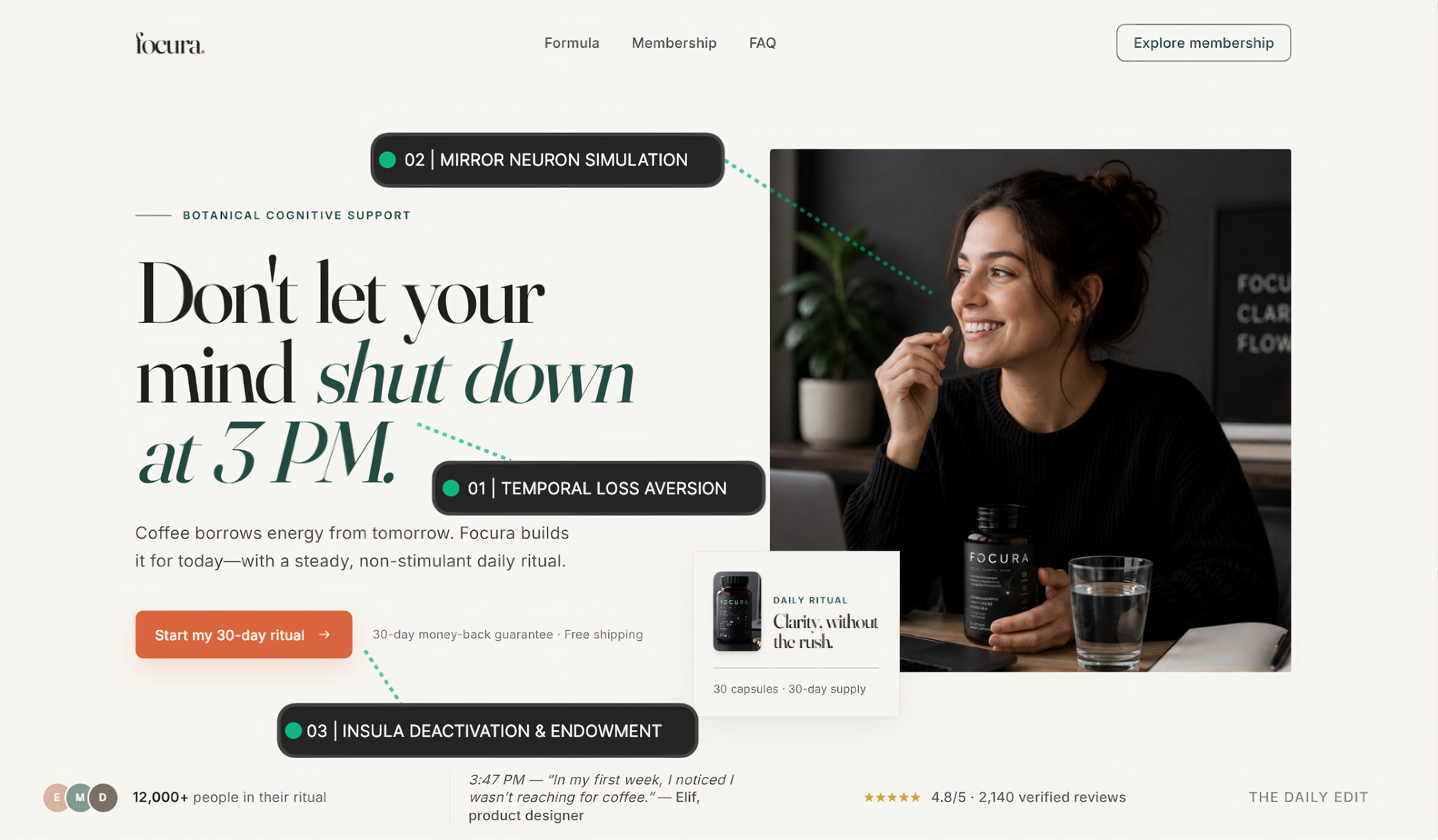
Key Biopsychological Mechanisms:
Temporal Loss Aversion: Instead of pitching abstract benefits like "Mental Clarity," the headline anchors to a hyper-specific temporal pain point: "at 3 PM." This triggers episodic memory in System 1, forcing the user to subconsciously recall their daily mid-afternoon energy crash.
Competitor Reframing (Coffee Rivalry): The subheadline ("Coffee borrows energy from tomorrow. Focura builds it for today...") validates the user's daily habit while highlighting its long-term cost (caffeine jitter/crash cycle).
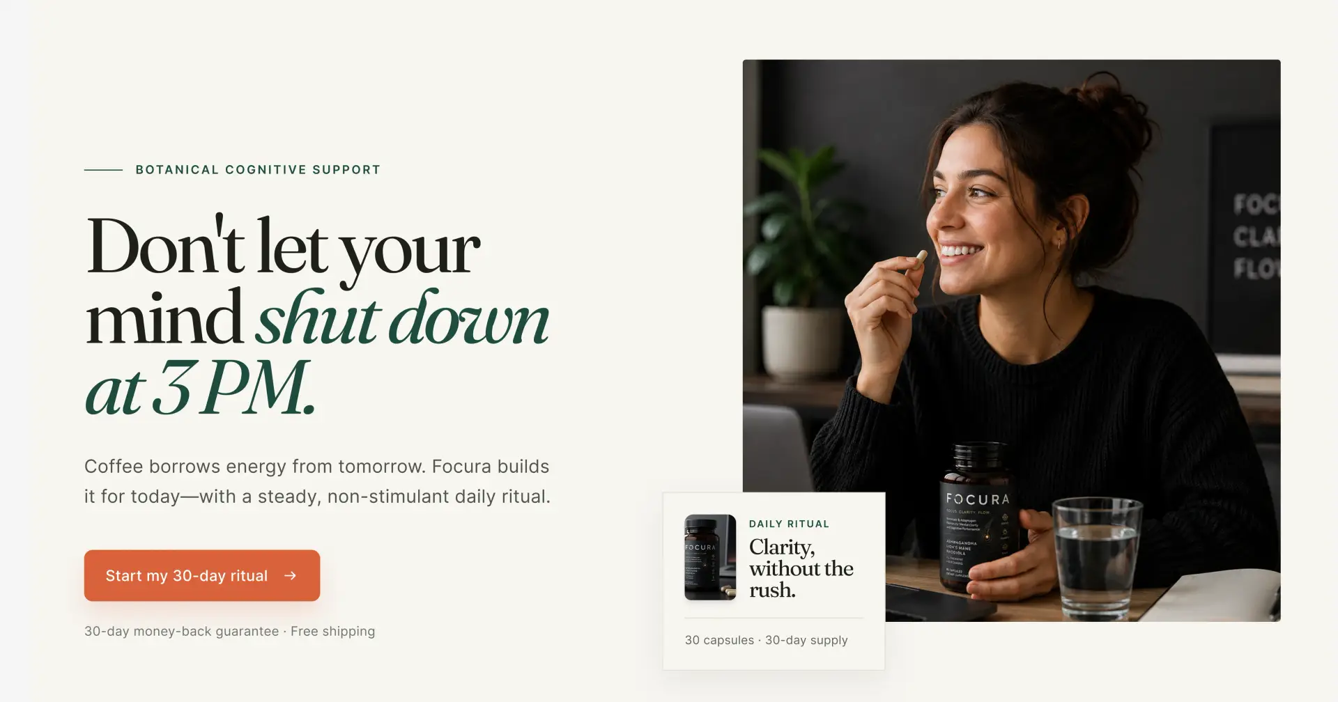
Mirror Neuron Simulation: The hero image wasn't an accident either: the person in the shot takes the capsule calmly, glass of water in hand, soft natural light. The goal wasn't an energy-drink jolt—it was a sense of calm, controlled productivity.
Real-Time Social Proof Ticker: Positioned directly below the hero viewport is a dynamic live quote ticker ("3:47 PM — In my first week, I noticed I wasn't reaching for coffee." — EM, product designer) paired with verified rating counts (4.8/5 from 2,340 reviews).
2. The Contrast Engine: Reframing the Habit Loop
Directly below the fold, the user encounters a side-by-side comparative matrix designed to shift decision-making from emotional impulse to logical justification (System 2).
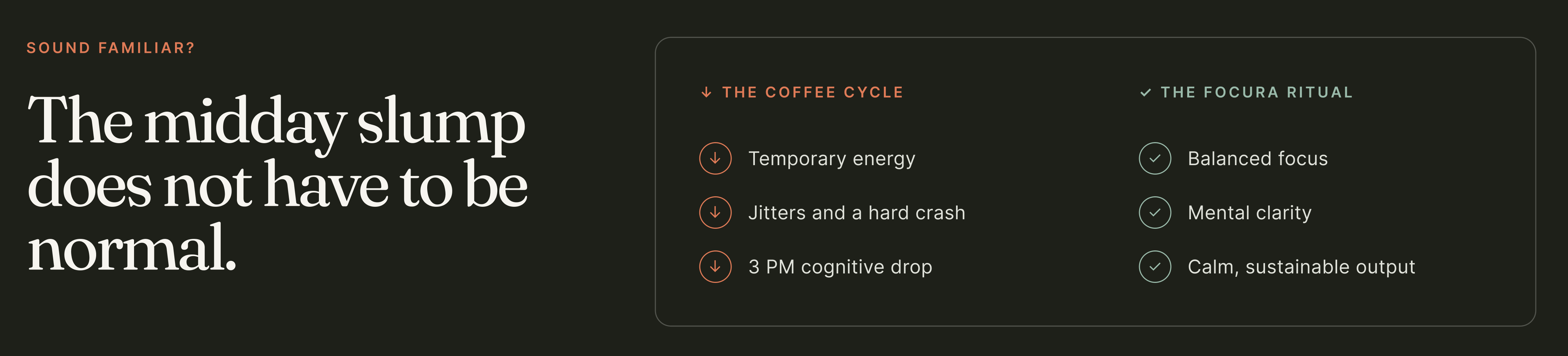
CRO Insight: Comparing the "Status Quo" directly against the "Desired Outcome" reduces cognitive effort. The user doesn't have to calculate the value proposition—it is visually mapped out for them.
3. Biomechanical Transparency: Ingredient De-risking
Supplement buyers are increasingly analytical. Concealing dosages behind "proprietary blends" is an immediate trust-killer.
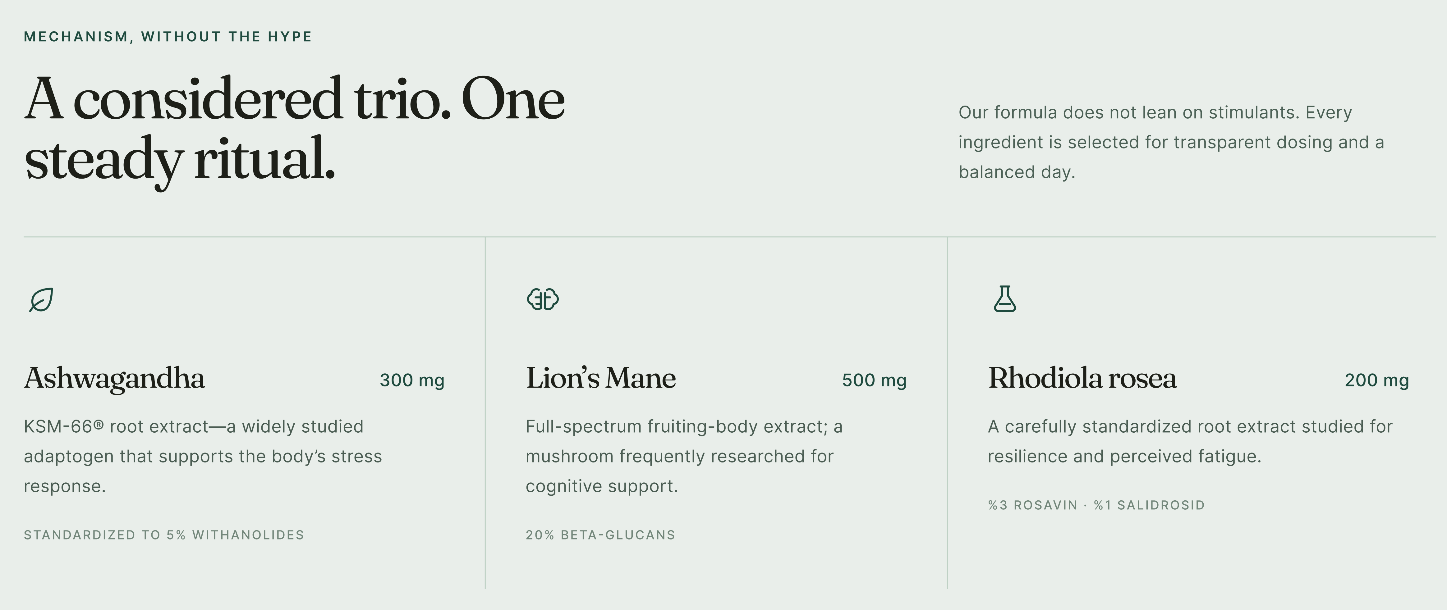
Standardized Active Compounds: Each card explicitly highlights standardized bio-actives (e.g., 5% Withanolides, 25% Beta-Glucans, 3% Rosavin). This positions the brand as a clinical-grade daily tool rather than a generic herbal mix.
Dosage Transparency: Exact milligram counts (300 mg, 500 mg, 200 mg) eliminate ambiguity and establish medical-grade authority.
4. Subscription Architecture & Pain-of-Paying Neutralization
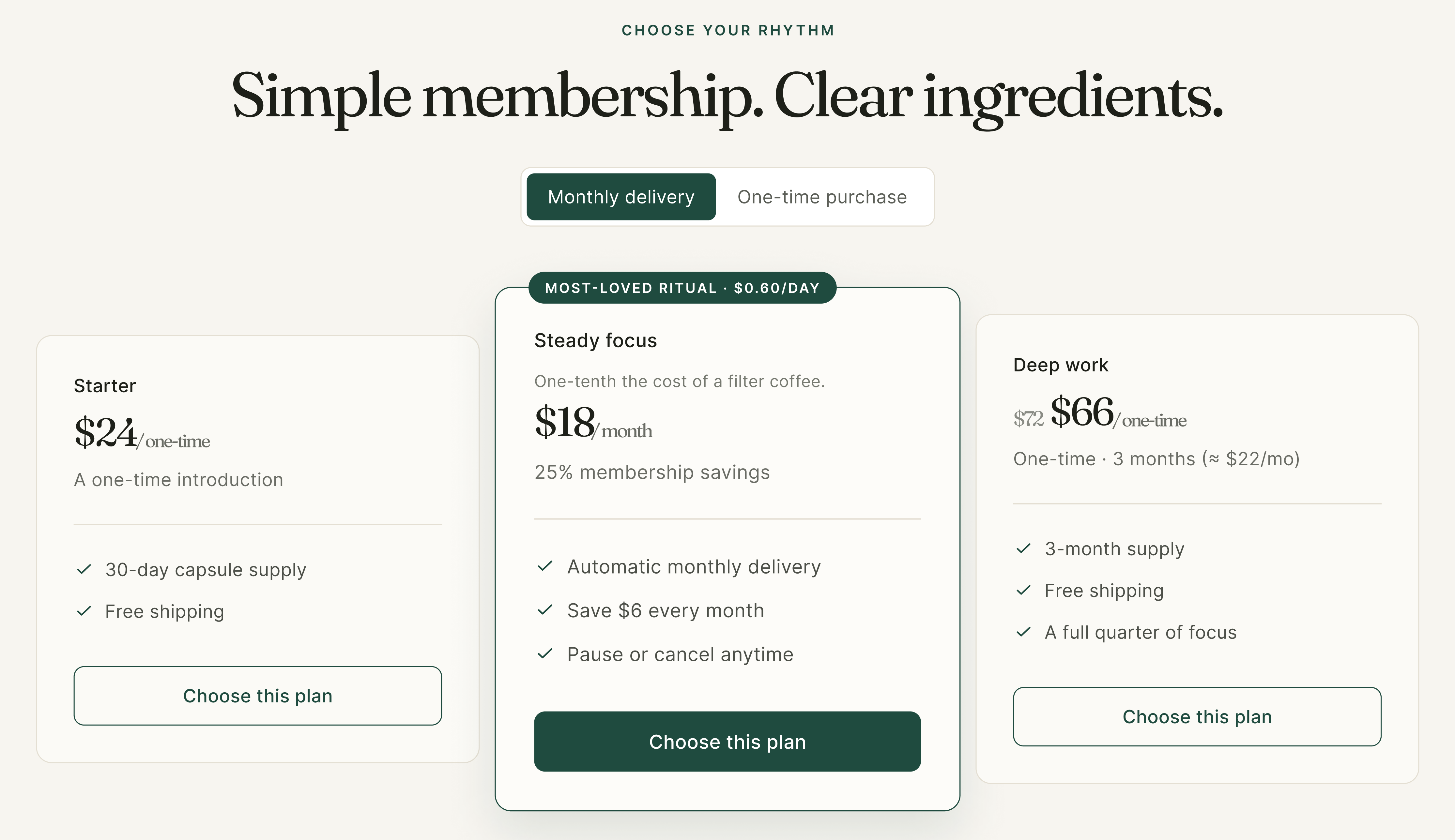
The offer section converts one-time buyers into recurring subscribers through strategic price framing and micro-copy guarantees.
Behavioral Pricing Tactics:
Micro-Framing ($0.60/Day): Framing the monthly cost as "$0.60/day" (annotated as "One-tenth the cost of a filter coffee") bypasses the brain's price-pain threshold in the Insula region.
Default Subscription Toggle: The interactive toggle defaults to "Monthly delivery," locking in the 25% savings tier as the perceived "smart choice."
Endowment CTA Copy: The primary action button avoids generic verbs like "Buy Now" or "Subscribe," using ownership-driven phrasing instead: "Start my 30-day ritual".
Trust Badges: Third-party testing (Batch by batch), manufacturing standards (GMP made), and formulation purity (Transparent formula) are stacked directly beneath the checkout cards.
5. Friction Neutralization & Public Objection Inversion
As the user scrolls into the FAQ section to resolve lingering logical doubts, we replace standard generic questions with Literal Objection Inversion based on scraped forum data.
Objection Inversion Accordion: Rather than answering "How do I take this?", copy directly mirrors raw customer anxieties identified across public discussions:
Raw Objection: "Is this just an overpriced caffeine pill that will give me jitters?"
➔ UI Defense: Explicitly highlighting zero-caffeine adaptogenic blends and non-stimulant energy mechanisms.
Raw Objection: "Am I going to get trapped in a hidden monthly subscription?"
➔ UI Defense: Zero-friction 1-click pause/cancel toggle visually placed directly beside the primary CTA.

Persistent Conversion Path: The floating footer maintains a zero-click barrier to checkout regardless of scroll depth, catching drop-offs right as their lingering questions are answered in the FAQ.
Actionable CRO Hypotheses for Testing
If deployed in a live environment, this design should be evaluated through a structured experimentation program. The following hypotheses represent an initial testing baseline; projected outcomes are directional estimates rather than validated results and should be assessed through statistically robust A/B tests.
Hypothesis 1 — Hero-message relevance:
Anchoring the hero message to a recognizable, time-specific use case—such as the “3 PM slump”—may generate stronger immediate relevance than a broad benefit-led headline such as “Boost Your Brain Power.” The primary success metric would be hero CTA click-through rate, with an anticipated relative uplift of 15–20%.
Hypothesis 2 — Subscription value framing:
Presenting the subscription price in daily terms (for example, “$0.60 per day”) may make the purchase feel more accessible than communicating only the monthly total (“$18 per month”). The key metric would be the subscription-selection rate relative to one-time purchases, with a target uplift of more than 22%.
Hypothesis 3 — Mobile conversion recovery:
A persistent mobile sticky bar, particularly while users navigate long-form FAQ content, may provide a timely return path to the purchase flow. This variation should be measured against a non-sticky control, with the objective of recovering 10–12% of users who would otherwise leave without progressing.
Hypothesis 4 — Objection-led copy versus generic benefit copy:
Copy that directly reflects real customer concerns—such as “No Caffeine Jitters” or “No Hidden Loops”—may be more persuasive than generic, benefit-oriented messaging such as “Boost Your Daily Brain Power.” Testing should evaluate bounce rate and checkout completion, with a directional expectation of a 14–18% reduction in bounce rate and up to a 20% improvement in checkout completion.
These hypotheses should be prioritized according to expected commercial impact, implementation effort, and available traffic volume. Test results should be interpreted using pre-defined success criteria, adequate sample sizes, and segmentation by device, traffic source, and new versus returning visitors.
Interactive Prototype & Full Case Study
Want to test the live interaction flow, micro-animations, and full Figma component architecture?
👉 Check out the full Focura Project on Peerlist
Which CRO hypothesis would you test first on this page?
👇 Let’s discuss in the comments below
#Neuromarketing #Biopsychology #CRO #BehavioralDesign #LandingPage #DTC #UIUX #Figma

Join İsmail on Peerlist!
Join amazing folks like İsmail and thousands of other builders on Peerlist.
2
1
0