

Even Linear Makes CRO Mistakes: A Neuromarketing Teardown of an Iconic Hero Section
Motivation is there, the trigger isn't: dissecting Linear's most beautiful page through BJ Fogg's behavior model.

You know Linear. It's the design darling of the tech world right now. Dark mode aesthetics, buttery micro-interactions, keyboard-first speed that makes everything else feel clunky. It's basically the gold standard everyone points to when they say "this is how you do UI/UX."
But here's the thing — looking good and working well aren't the same thing. There's actually a name for this trap: the Aesthetic-Usability Effect. Our brains subconsciously assume that if something looks polished, it must also be usable, even when the underlying conversion mechanics are quietly falling apart.
So I got curious. What happens if you run Linear's hero section through the lens of behavioral economics, cognitive neuroscience, and good old CRO? I spent about three minutes tearing it apart, and here's what I found. 🧠
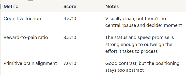
The Scorecard First
Let's start with the numbers, then I'll walk you through why:
Where Did the Button Go?
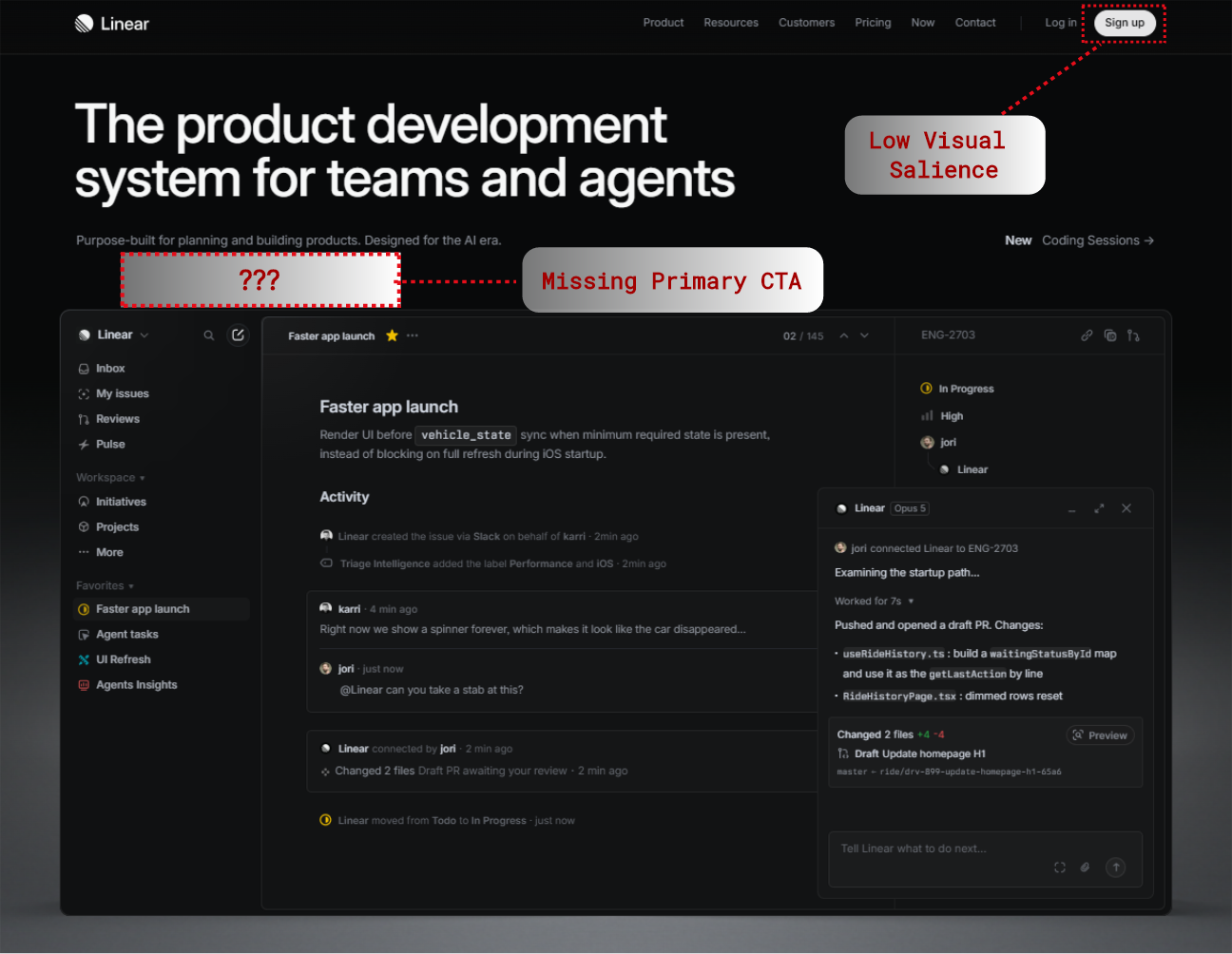
BJ Fogg's behavior model says three things have to line up for someone to actually act: motivation, ability, and a trigger. Linear nails motivation — the aesthetics and social proof do a lot of heavy lifting there. But there's no primary call-to-action sitting in the center of the hero visual.
Watch where your eye actually goes: headline, sub-headline, and then... nothing. Your primitive brain expects an immediate, frictionless next step right below the value proposition. Instead, you have to hunt for a tiny "Sign up" button tucked in the top-right corner. That's unnecessary friction — both motor and cognitive.
Defining a Category vs. Naming the Pain
The current headline reads: "The product development system for teams and agents." Sounds professional, sure. But your limbic brain is fundamentally selfish — it's scanning for an immediate survival or efficiency payoff, and it just tunes out abstract category labels.
Linear's audience — engineers and product leaders — is dealing with a very specific pain: Jira burnout, bureaucratic bloat, and watching their engineering momentum evaporate in the AI era. The current copy tells you what the product is. It doesn't tell you what pain it removes. Small distinction, huge impact.
The Hero Visual Is Asking You to Do Homework
The hero mockup shows live logs, PR branches, tiny code status text. It's a great demonstration of depth and functionality. But it's also forcing your "System 2" brain — the slow, deliberate, effortful one — to decode technical micro-copy in the first three seconds. What it should be doing instead is giving your "System 1" brain an instant, gut-level hit of speed and clarity.
There's an interesting gap between what's being said and what's actually being felt here. On the surface, the message is "modern project tracking for modern engineering teams" — purely functional. But underneath, what's really being communicated is status, autonomy, and velocity: "You're not a bureaucratic ticket-pusher, you build at Silicon Valley speed." The first version offers utility. The second one triggers dopamine and a sense of belonging. Guess which one converts better.
Before and After: The Neuro-Optimized Version
Let's turn that abstract noise into a signal your brain actually responds to.
Current version (high friction, abstract):
Headline: "The product development system for teams and agents"
Sub-headline: "Purpose-built for planning and building products. Designed for the AI era."
CTA: Nowhere in the center, buried in the nav
Optimized version (limbic-targeted, action-oriented):
Headline: "Build products at the speed of thought. Powered by AI agents."
Sub-headline: "Eliminate project management bloat. Plan, build, and ship autonomous code 3x faster."
Primary CTA: "Start building with Linear — Free →"
Risk-reducer micro-copy: "Free for small teams • No credit card required"
Social proof: "★★★★★ The speed standard at OpenAI, Vercel & Cursor"
Three Takeaways Worth Stealing
If you're building a product page, here's what I'd walk away with:
Aesthetics ≠ conversion.No matter how gorgeous your interface is, it can't replace a clear behavioral prompt.
Name the pain before the category.Speak to the emotional friction your user is feeling before you explain what your product technically is.
Protect System 1.Don't turn your hero section into a reading comprehension exercise. Point the eye straight at the outcome.
So, what's your take, does Linear's brand status earn them a pass on classic conversion principles, or are they quietly leaving high-intent signups on the table? Curious to hear what you think 👇

Join İsmail on Peerlist!
Join amazing folks like İsmail and thousands of other builders on Peerlist.
0
0
0